Ask any seasoned frontend developer which native HTML element they hate the most, and you will get the same answer: the <select> dropdown. For thirty years of the web's existence, that humble control has stood as an unbreakable wall between designers and browser engines.
Browsers rendered dropdowns using the operating system's native UI primitives. Changing the background color, rounding corners, or neatly aligning text was off-limits, forcing developers to hide the native tag and build clunky custom menus out of a dozen <div>s in JavaScript. Users paid the price: those fake dropdowns broke keyboard navigation, glitched when zooming on mobile, and turned into gibberish for screen readers like VoiceOver. We saw a similar battle for native web capabilities in Firefox 157 and Native Tooltip Styling: New Web Platform Features, where popovers finally ditched third-party positioning libraries.
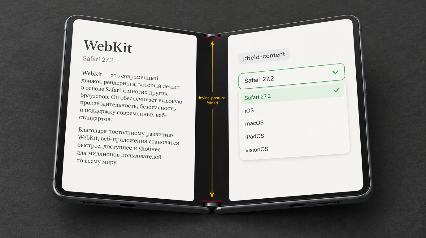
The second front of change is device form factors. Foldable phones with flexible or dual screens (including hardware announcements like the iPhone Duo) threw responsive layouts a curveball: how is a website supposed to know whether the user folded the screen like a tent or opened it flat like a book?
The fall releases of WebKit in Safari 27.1 and 27.2, spearheaded by Jen Simmons, tackle both challenges by bringing W3C standards straight into CSS.
Foldable Screens: Device Posture API and Environment Variables
Until now, responsive design only understood viewport dimensions and pixel density. Foldables broke that simple model: there might be one physical display, yet a hinge splits it into two independent visual segments.
The Device Posture API specification introduces new CSS media queries that report the device's physical posture:
(device-posture: folded)— the device is bent at an angle (book or laptop mode);(device-posture: continuous)— the screen is unfolded completely flat into a single plane.
Alongside it, the Viewport Segments API reports the exact geometric split of the display. Browsers expose (horizontal-viewport-segments: 2) for a vertical fold (like an open book) and (vertical-viewport-segments: 2) for a horizontal fold (like a laptop on a desk).
To spare designers from calculating hinge coordinates in JavaScript, WebKit ships six standard environment variables: env(viewport-segment-width x y), viewport-segment-height, plus top, bottom, left, and right offsets.
Hands-On: Dual-Screen Book Layouts with CSS Media Queries
Let's see how cleanly you can adapt an e-reader or storefront UI for a dual-screen foldable without writing a single line of JavaScript:
/* Base responsive layout for standard phones and desktop monitors */
.book-reader {
  display: flex;
  flex-direction: column;
  padding: 16px;
}

/* Check device posture: if the screen is folded in half like a book */
@media (device-posture: folded) and (horizontal-viewport-segments: 2) {
  .book-reader {
    display: grid;
    /* Split the UI along the physical geometry of the two screen halves */
    grid-template-columns:
      env(viewport-segment-width 0 0)
      env(viewport-segment-width 1 0);
    gap: env(viewport-segment-left 1 0);
  }

  .left-page {
    grid-column: 1;
    padding-right: 24px;
  }

  .right-page {
    grid-column: 2;
    padding-left: 24px;
  }
}
When someone holds a folded phone, Safari automatically splits the content across two virtual columns, neatly stepping around the physical hinge. In JavaScript, the current state is available on navigator.devicePosture.type, which fires a change event whenever the hardware is bent or flattened.
The End of Custom Dropdown Hacks: The ::field-content Pseudo-Element
Safari 27.2 takes a huge step toward finalizing the Customizable Select specification. Back in Safari 27.0, developers got appearance: base-select, unlocking full styling of the dropdown control. Styling the selected option's text, however, still required wrapping markup inside a special <selectedcontent> tag.
Safari 27.2 introduces the native ::field-content pseudo-element. Now styling a native select feels just as natural as styling a standard text input:
<!-- Native semantic checkout form without custom div wrappers -->
<form class="checkout-form">
  <label for="delivery-service">Служба доставки:</label>
  <select id="delivery-service" class="modern-select">
    <option value="express">Экспресс-курьер (доставка сегодня)</option>
    <option value="standard">Стандартная доставка (2-3 дня)</option>
    <option value="pickup">Самовывоз из пункта выдачи</option>
  </select>
</form>

<style>
/* Enable deep customization mode on the native control */
.modern-select {
  appearance: base-select;
  font-family: inherit;
  font-size: 15px;
  padding: 10px 14px;
  border: 1px solid #e2e8f0;
  border-radius: 8px;
  background-color: #f8fafc;
  color: #334155;
  width: 100%;
}

/* Style the selected option text using the native pseudo-element */
.modern-select::field-content {
  font-weight: 600;
  color: #0f172a;
  text-overflow: ellipsis;
  white-space: nowrap;
}
</style>
The ::field-content pseudo-element automatically inherits text truncation (text-overflow) from its parent. Meanwhile, the dropdown arrow is styled via ::picker-icon, which now uses flex: 1 for clean spacing inside the button.
Safe Alignment for Popovers and Grid Lanes fit-tolerance
Beyond selects and foldables, WebKit brings two welcome layout improvements:
- Safe Alignment: Adding the
safekeyword to alignment rules (likealign-self: safe center) guarantees that if a popover or dialog overflows a small screen, the browser scrolls gracefully instead of clipping the top edge off-screen; - Grid Lanes Refactoring: The
flow-toleranceproperty has been renamed tofit-tolerance. It sets a column-height tolerance (defaulting to1em), letting the browser balance adjacent grid lanes without breaking logical Tab-key focus order. We touched on similar native CSS momentum in Web Platform Transformation: Custom Scrollbars in Chrome 154, MCP Protocols, and Chrome 155 Features.
Because Device Posture API and appearance: base-select are rolling out gradually across browsers, always wrap custom select styles in @supports (appearance: base-select). Browsers without support will fall back to their reliable native system control without breaking form submissions.