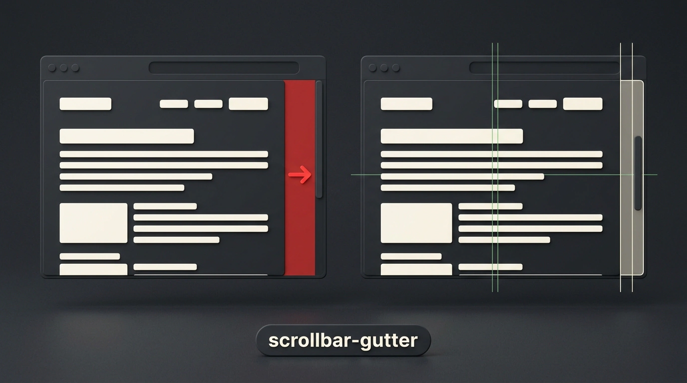
You've definitely run into this annoying visual glitch: you open an online store or an article feed, start scrolling down, another batch of cards loads in—and the entire layout suddenly jerks to the left. Buttons shift, headings jump, and if you were about to click a link, your cursor misses the target.
The culprit behind this chaos is a plain old scrollbar suddenly appearing at the edge of the browser window.
Why the Layout Jumps—and What Your OS Has to Do With It
On desktop operating systems like Windows and many Linux distros, when you use a mouse, browsers render classic scrollbars. Unlike mobile devices or macOS trackpads—where the scrollbar floats as a translucent overlay on top of the page—a classic scrollbar physically carves 12 to 17 pixels out of your container's width.
The moment page content grows taller than the viewport, the browser has to shrink the available layout width on the fly, triggering a layout shift. In web analytics, that jump directly hurts your CLS (Cumulative Layout Shift) score in Google Core Web Vitals, which can drag down your site's search rankings.
For years, frontend devs working on MacBooks had no idea how bad this was for their users. On macOS, overlay scrollbars don't take up space in the document flow, so everything looks rock-solid until someone opens the site on a Windows work machine.
Back in the day, we had to resort to clunky workarounds:
- Forcing
overflow-y: scrolleverywhere, leaving an inactive pale-gray track permanently stuck on short pages; - Computing
100vw - 100%with negative margins via CSScalc(); - Writing JavaScript snippets to measure the system scrollbar width on DOM load.
The Declarative Rescue: scrollbar-gutter
Thankfully, the W3C CSS Overflow Module Level 3 spec gave us a clean, standardized fix: the scrollbar-gutter property.
According to the spec, a scrollbar gutter is reserved space between the inner border edge and the outer padding edge of an element. When no scrollbar is present, that space is simply painted with the parent container's background.
The syntax couldn't be simpler:
/* Base container with stable space reservation */
.scroll-container {
  max-height: 28rem;
  overflow-y: auto;
  scrollbar-gutter: stable;
}
The stable value tells the browser: reserve empty space for a scrollbar on the right edge ahead of time, even if the content currently fits on screen. When more data loads and the scrollbar appears, it slides smoothly into the pre-allocated gutter without shifting your text or neighboring blocks by a single pixel.
Perfect Symmetry with both-edges
What if your layout is strictly centered or built from multiple columns where one column stays static while another scrolls dynamically?
If you only apply stable, the space is reserved on the right side (in left-to-right languages), nudging the page's center axis slightly off-balance. That's why the spec includes the both-edges keyword:
/* Symmetrical reservation for a perfectly centered layout */
.main-wrapper {
  max-width: 72rem;
  margin-inline: auto;
  overflow-y: auto;
  scrollbar-gutter: stable both-edges;
}

/* Synchronizing adjacent columns */
.sidebar {
  overflow: hidden;
  scrollbar-gutter: stable;
}

.content-feed {
  overflow-y: auto;
  scrollbar-gutter: stable;
}
Adding both-edges instructs the browser to reserve a matching mirror space on the opposite side as well. As a result, your layout stays dead-center no matter how the scroll state changes.
To see how scrollbar-gutter actually behaves on a Mac, open macOS System Settings: 'Desktop & Dock' -> 'Show scroll bars' and switch the toggle to 'Always'. That simulates a classic Windows scrollbar right inside your browser.
The property reached Baseline Newly Available status after Safari 18.2 shipped support in December 2024 (Chromium and Firefox had already supported it earlier). Today it's a rock-solid tool that lets you keep your UI calm and predictable with a single line of CSS.