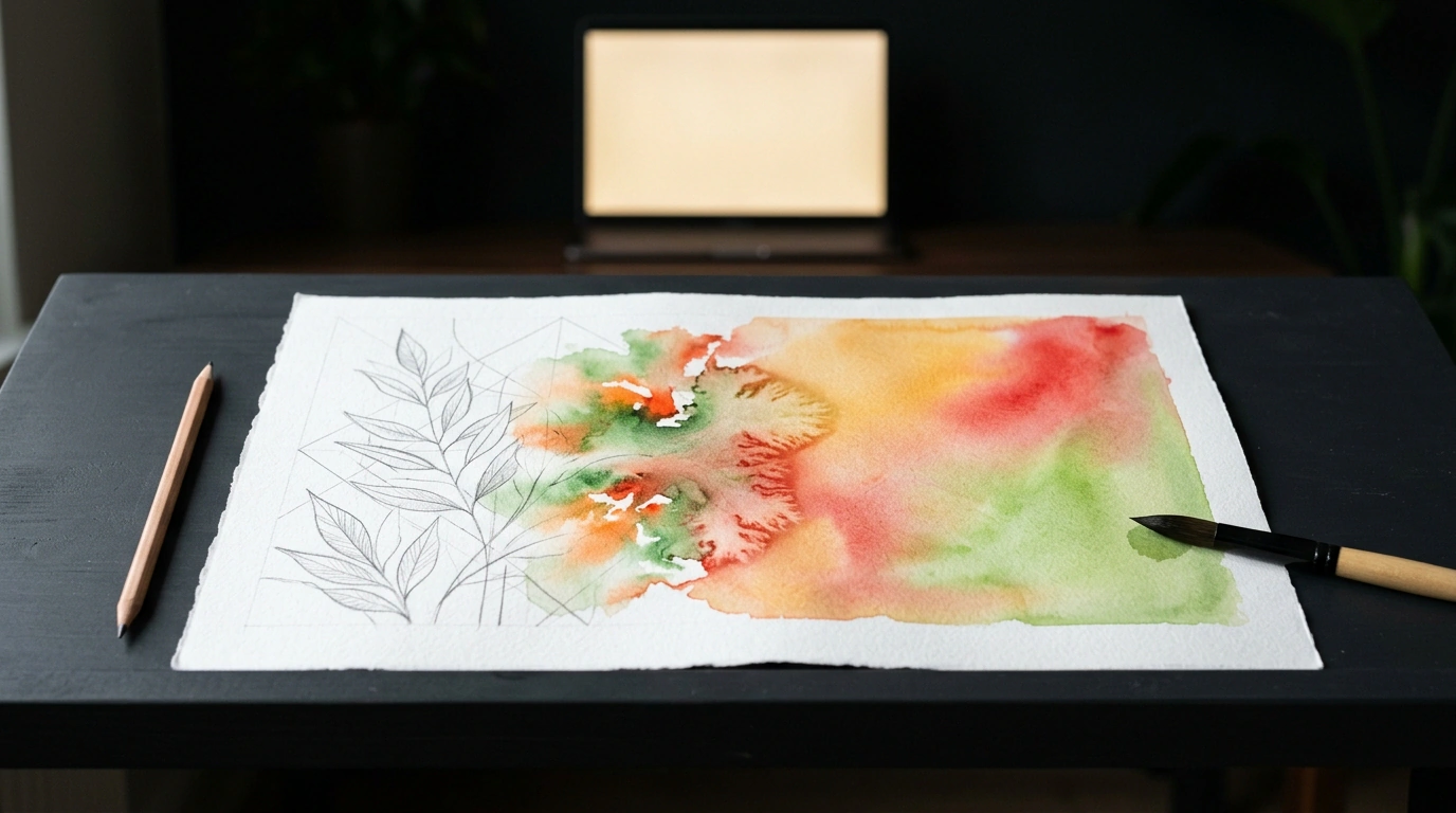
Whenever a frontend developer needs to build an expressive interactive card or promo landing page, their hand automatically reaches for the heavy artillery: Three.js, Pixi.js, complex Canvas scenes, or a multi-megabyte video file.
I used to think myself that creating a living hand-drawn effect—starting with a quick pencil sketch of the outlines, followed by watercolor bleeding across paper fibers to the soft rustle of a brush—was impossible without WebGL shaders or pre-rendered video.
Yet developer Boris0525's project (repository apostol0525/for-you) proves otherwise. This entire visual show runs on pure web standards: declarative SVG, mathematical distortion filters, SMIL, and procedural sound synthesis via the Web Audio API. Better yet, the markup and styles weigh in at just a few kilobytes while staying razor-sharp on any display.
Let's break down how the mechanics work under the hood.
Anatomy of the Scene: Two Layers in Tight Sync
The graphic scene consists of two layers stacked on top of each other inside a shared container:
- Bottom layer (watercolor): a raster color image (
<image>), hidden behind a dynamic SVG maskmask="url(#wc-mask)". - Top layer (pencil outlines): a vector set of
<path>strokes with no fill (fill: none), drawing the line art on top of the wash.
So the vector lines never drift away from the color washes when the window resizes, both layers live inside a single viewBox="0 0 1410 752" with a shared scaling attribute:
<svg viewBox="0 0 1410 752" preserveAspectRatio="xMidYMid slice" class="stage">
  <!-- Bottom layer with fill mask -->
  <image href="color.webp" width="1410" height="752"
         preserveAspectRatio="xMidYMid slice"
         mask="url(#wc-mask)" />

  <!-- Top layer of vector lines -->
  <g class="lines" preserveAspectRatio="xMidYMid slice">
    <!-- Set of outline <path> elements -->
  </g>
</svg>
In SVG, xMidYMid slice works just like CSS object-fit: cover: it centers the graphic and scales it proportionally without distortion.
The pathLength Trick: Animating Strokes Without Extra JavaScript
The classic way to animate line drawing in SVG is with stroke-dasharray and stroke-dashoffset. Normally, though, you'd have to write JavaScript to loop over every <path> tag and call path.getTotalLength() just to know how long each curve is.
The project's author pulled off a neat SVG 2 trick instead—the pathLength="1" attribute:
<path d="M120 340 C 150 200, 280 180, 310 320 ..." pathLength="1" />
Setting pathLength="1" normalizes the entire curve length to 1, regardless of its actual size in pixels. That lets you move the whole stroke animation into pure CSS:
.lines path {
  fill: none;
  stroke: #5C4A38;
  stroke-width: 1.2;
  stroke-linecap: round;
  stroke-dasharray: 1;
  stroke-dashoffset: 1; /* Line is hidden */
}

.lines.draw path {
  animation: drawStroke 2s cubic-bezier(0.45, 0, 0.25, 1) forwards;
}

@keyframes drawStroke {
  to { stroke-dashoffset: 0; }
}
So the sketch doesn't draw all at once like a robot, a small JavaScript loop assigns a slight style.animationDelay to each stroke.
Organic Watercolor Edges: The Magic of feTurbulence and feDisplacementMap
Once the pencil sketch finishes, the watercolor starts bleeding in. Liquid pigment soaks into the uneven paper grain, forming organic, feathered edges.
Infographic diagram of the SVG organic watercolor edge filter: displacing a sliding mask boundary with Perlin noise via feTurbulence and feDisplacementMap.
The reveal mask is built on a sliding block whose edge gets warped by Perlin noise using feTurbulence and feDisplacementMap:
<defs>
  <!-- Organic watercolor edge filter -->
  <filter id="wc-edge" x="-35%" y="-35%" width="170%" height="170%"
          color-interpolation-filters="sRGB">
    <feTurbulence type="fractalNoise" baseFrequency="0.010 0.016"
                  numOctaves="4" seed="11" result="noise" />
    <feDisplacementMap in="SourceGraphic" in2="noise" scale="150"
                       xChannelSelector="R" yChannelSelector="G" result="displaced" />
    <feGaussianBlur in="displaced" stdDeviation="7" />
  </filter>

  <mask id="wc-mask">
    <g filter="url(#wc-edge)">
      <rect x="0" y="0" width="1410" height="752" fill="white">
        <animate id="a-color" attributeName="x" from="-1410" to="0"
                 dur="2.5s" begin="indefinite" fill="freeze"
                 calcMode="spline" keyTimes="0; 1"
                 keySplines="0.45 0 0.25 1" />
      </rect>
    </g>
  </mask>
</defs>
Here's how the pipeline works:
feTurbulencegenerates a static matrix of fractal noise. SettingbaseFrequency="0.010 0.016"mimics the fibers of cotton paper.- The white mask rectangle sweeps from left to right via SMIL
<animate>. feDisplacementMapshifts the moving rectangle's edge along the noise channels by up to 150 pixels (scale="150"), making the boundary ripple and bend organically in real time.
The color-interpolation-filters="sRGB" attribute is crucial: without it, browsers compute filters in linearRGB, leaving the edges looking washed out.
Procedural Brush Sound with the Web Audio API
Instead of loading external MP3 files with preload delays, the soft rustle of the brush is synthesized procedurally right in the browser when the user taps the screen:
function playBrushSound(audioCtx) {
  const now = audioCtx.currentTime;
  const duration = 1.4;

  // 1. White noise buffer
  const buffer = audioCtx.createBuffer(1, audioCtx.sampleRate * duration, audioCtx.sampleRate);
  const data = buffer.getChannelData(0);
  for (let i = 0; i < data.length; i++) {
    data[i] = Math.random() * 2 - 1;
  }

  const source = audioCtx.createBufferSource();
  source.buffer = buffer;

  // 2. Lowpass filter simulating brush pressure
  const filter = audioCtx.createBiquadFilter();
  filter.type = 'lowpass';
  filter.frequency.setValueAtTime(360, now);
  filter.frequency.linearRampToValueAtTime(1500, now + duration * 0.45);
  filter.frequency.linearRampToValueAtTime(480, now + duration);

  // 3. Volume envelope
  const gain = audioCtx.createGain();
  gain.gain.setValueAtTime(0.0001, now);
  gain.gain.linearRampToValueAtTime(0.075, now + 0.4);
  gain.gain.linearRampToValueAtTime(0.0001, now + duration);

  source.connect(filter).connect(gain).connect(audioCtx.destination);
  source.start(now);
  source.stop(now + duration);
}
This function uses zero network bandwidth, fires instantaneously inside a pointerdown handler, and nails the tactile feel of a brush gliding across paper.
Performance and Accessibility
Both feTurbulence and feDisplacementMap are computed pixel by pixel. To keep a smooth 60 frames per second on mobile devices:
- Keep
numOctavesat 4 or lower, otherwise the math doubles for almost no visible gain; - Hide finished layers with
display: noneonce the animation wraps up; - To replay the SMIL animation in Chrome, clone the
<animate>node withcloneNode().
And don't forget accessibility: disable the motion for users with @media (prefers-reduced-motion: reduce) and show the finished artwork right away.
This project is a great reminder of just how far native web standards can take you when you put declarative SVG and platform filters to work.
