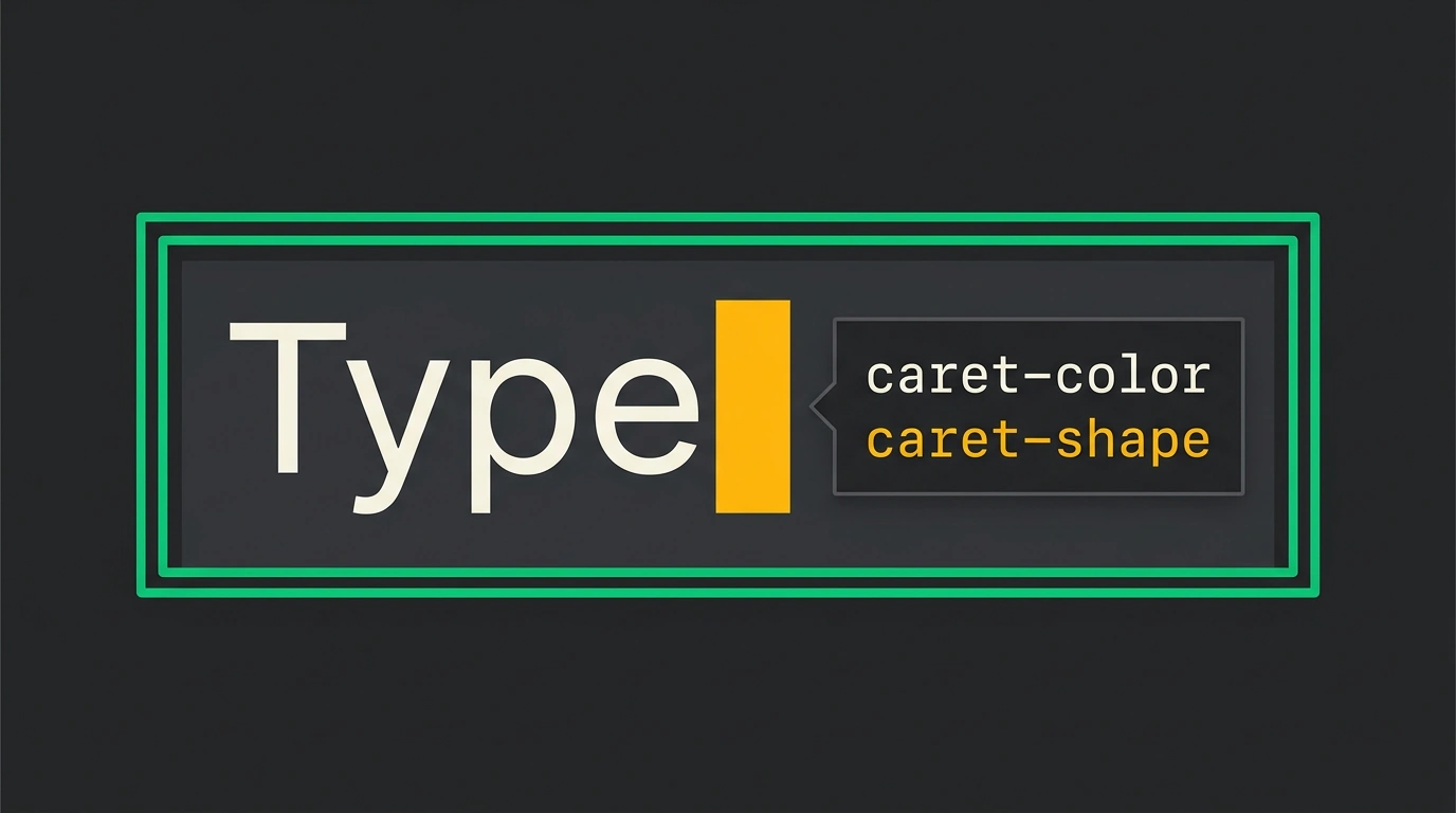
When you design accessible focus states on a page, almost all your attention goes to outline, input borders, and button highlights, while the blinking bar inside a text field is an afterthought. Yet browsers actually maintain two distinct text cursors: the insertion caret inside <input>, <textarea>, and contenteditable, and the navigation caret that appears over ordinary text when you press F7 in Chrome, Edge, and Firefox (Safari has this mode too, though the cursor itself stays invisible). Remove the focus ring in a redesign, and that thin line becomes the sole focus indicator — even for people clicking with a mouse.
To see how to customize the cursor without breaking keyboard navigation or contrast standards, I walked through Sara Soueidan's research on caret-* properties (also flagged by Web Standards). Using a dark-theme .search-input field as our working example, let's look at how caret-color, caret-shape, and caret-animation behave, where they clash with OS settings, and how to hold at least a 3:1 contrast ratio.
How caret-* properties work and where block shape falls short
By default, the browser uses currentColor (auto) for the caret — matching the color of the text beneath it. That's why in F7 caret browsing mode, the cursor switches from black to blue the moment it lands on a link. The CSS Basic User Interface module gives you three properties to override that behavior: caret-color, caret-shape, and caret-animation, plus the caret shorthand such as caret: red block manual.
Take our dark-theme .search-input on a #121212 background: let's style it with a bright #00ffaa caret and a block shape while keeping a clear focus ring.
.search-input {
  background-color: #121212;
  color: #ffffff;
  border: 1px solid #444444;
  padding: 8px 12px;
  font-size: 16px;

  /* High-contrast caret color well above the 3:1 threshold on #121212 */
  caret-color: #00ffaa;
  caret-shape: block;
}

.search-input:focus-visible {
  outline: 2px solid #00ffaa;
  outline-offset: 2px;
}
Here, #00ffaa against #121212 clears the 3:1 minimum contrast ratio with room to spare, and :focus-visible adds a two-pixel outline so users aren't left relying on a thin caret alone.
I wouldn't rush caret-shape into production, though. The spec defines three shapes: the default vertical bar, a block rectangle over the next character, and an underscore. Right now, caret-shape and caret-animation only work in Chromium, with caret-shape still gated behind chrome://flags/#enable-experimental-web-platform-features. Worse, Chromium renders block semi-transparently so the character underneath shows through — which turns even a black cursor gray and drops its contrast against both background and text.
The second trap is scope. While browsers apply caret-shape only to the insertion caret, caret-color has broad support and styles both carets at once, including the F7 navigation caret. A global rule on body can quietly ruin contrast on light or accent sections elsewhere on the page, so it's safer to scope the selector to editable elements:
textarea,
[contenteditable="true"],
input[type="text"],
input[type="password"] {
  caret-color: #9C0C60;
}
With that scoping, someone browsing with F7 still sees familiar currentColor over articles and links, while your brand #9C0C60 (high-contrast against white) applies strictly inside form fields. If your interface supports multiple themes, you can coordinate caret and surface palettes using techniques from our overview of dynamic themes with light-dark() and contrast-color().
OS settings conflicts and EN 301 549 boundaries
What stood out to me most in Sara Soueidan's testing is how author CSS collides with operating-system accessibility preferences:
- macOS (Accessibility > Motion > Prefer Non-Blinking Cursor): Safari, Chrome, Firefox, and Chromium Edge honor this toggle and stop both carets from blinking.
- Windows (Settings > Accessibility > Text Cursor): the OS offers colored end-markers (Text Cursor Indicator), cursor thickness, and blink-rate controls all the way down to zero. Browsers show the indicators only for the insertion caret, and completely ignore Windows thickness and blink-rate settings on web pages.
Meanwhile, CSS still has no media query for OS text-cursor preferences. prefers-reduced-motion only covers general UI animation: a user may leave interface motion enabled while turning off cursor blinking specifically so they don't lose their place in long text. Custom caret-shape and caret-animation: manual override that choice by force.
That violates the web platform's Priority of Constituencies (user needs over author preferences) and conflicts with the European accessibility standard EN 301 549 v4.1.1, updated in September 2026. Clauses 9.7 and 11.7 (NOTE 6 explicitly cites the text cursor) prohibit blocking or overriding platform accessibility settings. So the practical line today is clear: in standard forms, stick to a high-contrast caret-color, and if you introduce a custom shape or animation, give users a toggle to restore the system cursor.
WCAG criteria: 3:1 contrast, focus, and flash safety
Default browser carets and focus rings pass accessibility checks out of the box. The moment you customize cursor color in CSS, three WCAG requirements kick in:
- WCAG 2.4.7 Focus Visible (Level AA) requires at least one visible keyboard focus indicator — leaving a caret without an
outlineis risky. - WCAG 1.4.11 Non-Text Contrast (Level AA) requires at least
3:1contrast against the adjacent background. If there is no other high-contrast focus indicator,caret-coloritself must meet that threshold (and under a global rule, against every background the navigation caret touches). RemembercurrentColor, too: muted text produces a muted default caret. Even then, for WCAG 2.4.13 Focus Appearance (Level AAA), a single caret — even inblockshape — isn't enough because its area is smaller than a 2px perimeter around the field. - WCAG 2.3.1 Three Flashes or Below Threshold (Level A) caps flashing at three flashes per second (
3 Hz). Adrian Roselli warns that under screen magnification, a blinkingcaret-shape: blockfills a substantial portion of the viewport, meaning the small-area exception (G176) no longer protects against photosensitive seizures.
To create a gentle color transition without harsh flashes, caret-animation: manual disables the browser's built-in blink and hands timing over to @keyframes wrapped in prefers-reduced-motion: no-preference:
@media (prefers-reduced-motion: no-preference) {
  .custom-caret-input {
    caret-animation: manual;
    animation: caret-fade 1.5s ease-in-out infinite;
  }
}

@keyframes caret-fade {
  0%, 100% {
    caret-color: #00ffaa;
  }
  50% {
    caret-color: #0077ff;
  }
}
In this snippet, a 1.5-second animation smoothly shifts the caret from #00ffaa to #0077ff, staying well below the 3 Hz threshold. We used the same motion query in our piece on accessible <dialog> modals, though for carets that check alone isn't enough: if you animate the cursor at all, include a manual toggle on the page to turn it off.
Pre-ship checklist for custom caret styles
-
caret-colorcontrast againstbackground-color(and every background if scoped globally) is at least3:1. -
:focus-visiblekeeps a visibleoutline, not just the caret. - With
caret-shape: block, the character under the semi-transparent cursor remains legible. - The field has been tested with
Tabkeyboard navigation andF7caret browsing.
Coming back to .search-input: adding caret-color: #00ffaa and a 2px outline takes two minutes, yet before merging, ask yourself — after checking Tab, F7, and a 3:1 contrast calculator, does your custom color, shape, or animation genuinely help people orient themselves, or does it just override their system preferences?