Why pay for smartphone clicks if half of your visitors close the page before they ever see a price or a single floor plan?
That is exactly what the agency Formula Klika found in an August 2026 analytics breakdown for a real estate developer. Half of all mobile visits—52.3%, to be exact—ended at zero seconds. Only 0.35% of smartphone visitors reached the apartment catalog, compared to 2.31% on desktop. That was a 6x to 7x drop out of thin air, and a second developer's site showed the same pattern.
To avoid guessing where ad money goes, look at how analytics defines this. In Yandex Metrica's Knowledge Base, a bounce is a single-page visit under 15 seconds with no goal actions. A "0 seconds" mark means a harsh scenario: the tracking script fired, then the user closed the tab immediately or gave up waiting for a heavy first screen to load.
You can check your own project in two minutes. Open Metrica's "Technology → Devices" report and compare page depth between desktop and smartphones. Then open Session Replay (Webvisor), filter by mobile devices and 0-second duration, and watch which screen element trips up your visitors.
Why Someone Clicked Your Ad and Left Without Seeing a Floor Plan
In an ordinary furniture showroom, shoppers act simply: they walk in to check sofa prices and installment terms. If instead of price tags there's a clerk at the door with a tablet asking for a phone number for a callback tomorrow, shoppers turn around silently and head next door where prices are visible.
Mobile ad clicks work the exact same way. A buyer scrolls a feed, taps an ad for a residential complex, and gives the page two minutes at most. In that short window, they want answers to three specific questions: what the project is, how much an apartment costs, and what the monthly mortgage payment looks like.
On developer mobile sites, five common barriers block those answers. The first hits before the screen even renders: designers put heavy 3D renders and background videos in the hero block that crawl over mobile data. While the screen loads, the user closes the tab at zero seconds.
If the page does open, a widget traffic jam takes over the small display. A promo ticker, cookie banner, call button, and lead-capture pop-up all stack on top of the headline at once. In that clutter, useful content disappears.
Next comes the old habit of hiding costs behind "price on request." Without knowing the budget, buyers don't want a sales call, so they jump to Cian, Avito, or Domclick where every unit's price is shown upfront.
Those willing to scroll further get worn out by endless branding blocks. To reach floor plans, they have to swipe past long sections about concept, architecture, and neighborhood vibe. If someone still makes it to a form, the mobile UI delivers a final blow: chat widgets pop open, input fields slide past the right edge, and the on-screen keyboard covers the Submit button.
Slapping a quiz on every ad campaign hurts the funnel even more. When a page lacks prices and layouts, a quiz turns into a paywall: hand over your phone number just to see ballpark numbers. In one developer's RSYa campaign, 70% of quiz leads turned out to be unqualified. Contacts poured into the CRM, yet people only wanted a price list and had no plan to talk sales.
Three Tools for Different Buyer Stages
Formula Klika dropped the model of dumping all paid traffic onto a heavy homepage or a blind quiz. Instead of cramming everything into one window, they split three tools by task.
The main website stayed for buyers already researching the complex in depth: neighborhood infrastructure, permits, construction progress, and project details. Quizzes were kept strictly for scenarios where a visitor is ready to talk and needs quick segmentation. Meanwhile, ad clicks were routed to dedicated conversion pages built for a specific complex or campaign.
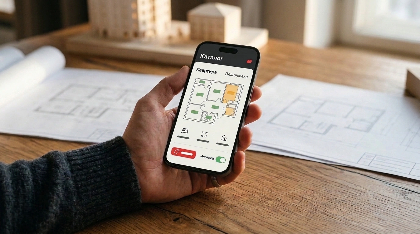
These landing pages skip extra sections and menu wandering. The first screen states one clear goal, shows the core offer, and offers two obvious actions, pushing secondary details lower down. Smartphone visitors immediately see open prices, floor plans, and a mortgage calculator with a short jump into the catalog.
Page formats match the buyer's stage. A story-style landing page introduces a complex fast; a calculator screen handles monthly payments; a showcase page compares multiple projects; and a separate page lists current promos with full terms. All apartment prices and discounts pull from one shared table so numbers never go stale across pages.
Sales follow-up changes alongside the page because the CRM receives full context. Data flows via API to amoCRM, Calltouch, or Telegram with browsing details attached: which complex the buyer viewed, which floor plan they opened, and which payment they calculated. Ad tags and Metrica goals tie that journey to the deal, so a rep starts the call discussing a specific unit instead of asking a generic "what are you looking for?"
Nor is the lead form left floating in a vacuum. When a buyer clicks through from a unit card to leave their contact, the form headline and fields continue the conversation about that exact apartment instead of resetting to a generic consultation.
What a Rebuild Delivers and Why You Shouldn't Cut Ads Too Early
To judge results fairly without cherry-picking numbers, let's separate the different projects from Formula Klika's article. While the August 2026 stats exposed the problem on one site, the agency measured fix impact on two other developers.
The first case is a Moscow-region developer whose mobile lead conversion sat at 0.55%. Instead of rewriting the entire mobile site from scratch, the team ran a UX audit and shipped 18 of 32 recommended fixes. Conversion climbed to 1.49%—a 2.7x jump on the same traffic and the same cost per click.
The second case is MR Group launching lightweight Turbo Pages for a specific residential complex in RSYa. The stripped-down page opened 15 times faster than the developer's regular site. RSYa inquiries jumped 80%, with four out of five leads coming from smartphones.
This same logic applies far beyond real estate. In car dealerships, custom furniture, apartment renovation, or complex equipment sales, mobile visitors also look for price, specs, and monthly payments. As long as the first screen hides basic numbers behind a "leave a request" pop-up, mobile traffic will drop off at zero seconds in Metrica and flee to aggregators.
When evaluating such a relaunch, respect the long sales cycle: people take weeks to buy an apartment or a major renovation. Check reports on new landing pages every two weeks so you don't kill a working campaign based on misleading early days.
What to Check in Your Mobile Funnel Right Now
- Compare bounce rates and catalog click-throughs between smartphones and desktops in Yandex Metrica ('Technology → Devices').
- Watch 0-second mobile visits in Session Replay (Webvisor) to spot which element blocks the screen or fails to load.
- Keep one main goal, open prices, and a direct step to the catalog on the first screen with no pop-up forms.
- Make sure quizzes don't replace your price list and only target visitors ready to talk.
- Send the viewed unit, floor plan, and mortgage calculation to your CRM alongside the client's phone number.