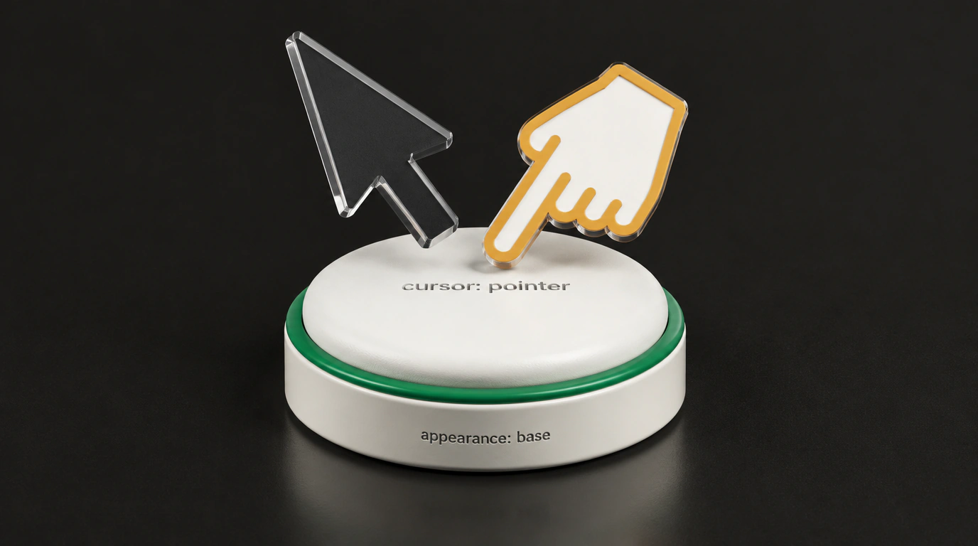
In web development, there are holy wars that drag on for decades. One of the longest and most absurd is the battle over the mouse cursor on buttons. At the dawn of the web, browser vendors locked in a strict purist rule: the pointer cursor (the pointing hand) is shown exclusively on hyperlinks (<a>) leading to other web pages. On buttons (<button>), toggles, and checkboxes, browsers hardcoded the standard arrow (default).
The real web quickly went another way, however. Across millions of interfaces, a button means an interactive action, and users grew used to it: if an element can be clicked, the cursor should turn into a hand. Every popular design system — from Bootstrap and Material UI to Tailwind — started with the exact same ritual reset: button { cursor: pointer; }.
In the discussion on working group issue w3c/csswg-drafts #14251, initiated by Elika Etemad (fantasai), the W3C finally acknowledged de facto industry practice and codified an official cursor standard for next-generation form elements using the appearance: base property value.
CSSWG consensus: "Pointer means clickable"
The appearance: base specification is being developed under the broader Open UI initiative. Its goal is to strip away musty Windows 95-era system bevel styles and give developers a clean, easily styleable skeleton for form controls (including the long-awaited customizable <select>).
When appearance: base is enabled, browsers are now required to apply predictable cursors automatically:
/* Standard cursor assignment in appearance: base */
select, option, button,
input[type=button], input[type=submit], input[type=reset],
input[type=checkbox], input[type=radio],
input[type=color], input[type=image],
::file-selector-button {
  cursor: pointer; /* Clickable elements get the pointing hand by default */
}

input[type=range] {
  cursor: grab; /* Range sliders get an open hand */
}

input[type=range]:active {
  cursor: grabbing; /* When pressed, the hand closes */
}
For inactive and locked states, the working group also introduced clear rules:
- all disabled elements with
:disabledreceivecursor: not-allowed; - read-only elements with
:read-only(such as non-editable text fields) display the standard arrowcursor: default.
Frontend developers will no longer have to copy dozens of lines of cursor resets into their CSS files: the browser will handle it natively.
Progressive adoption in layouts
The CSSWG decision has been added to the working draft of the CSS Basic User Interface Module Level 4 specification. For backward compatibility, the legacy appearance: auto mode preserves familiar system cursors so twenty-year-old web pages don't break.
In modern projects, you can already use base controls today via @supports, following the broader shift toward declarativeness in modern CSS trends:
/* Progressive enhancement: next-generation native cursors */
@supports (appearance: base) {
  button,
  select,
  input[type="checkbox"],
  input[type="radio"] {
    appearance: base;
    /* The engine pulls the pointer cursor from base automatically */
  }

  input[type="range"] {
    appearance: base;
    /* Native grab / grabbing with no extra classes */
  }
}

/* Safe fallback for older engines */
@supports not (appearance: base) {
  button,
  select,
  input[type="checkbox"],
  input[type="radio"] {
    cursor: pointer;
  }

  :disabled {
    cursor: not-allowed;
  }
}
Codifying native cursors in the base stylesheet isn't just visual comfort for sighted mouse users. Semantic separation of :disabled (not-allowed) and :read-only (default) states helps assistive technologies interpret form element availability more accurately.
In the end, a 25-year debate concluded with a victory for common sense: the web platform officially recognized the real habits of hundreds of millions of users.