In 1894, at an exhibition in Lyon, Édouard Michelin stopped beside a stack of car tires, squinted, and told his brother: "With arms, it would look like a man." Four years later, Bibendum grew out of that passing joke. More than 120 years have passed, eras have changed, and ads have moved from paper posters to short vertical videos, yet the chubby white tire man still sells rubber around the world.
Conversations about brand identity still often stop at a logo and a couple of brand colors. A static mark can only sign a banner in the corner, like a nameplate on an office door. A lively character works differently. It greets people at the entrance, cracks jokes, explains confusing terms in simple words, and stays in memory even when the company name flashes by in a split second.
How a Mascot Differs from a Logo and Why People Trust It More Than Celebrities
In marketing, a mascot is a signature character that represents a company and speaks to customers on its behalf. It can be an animal, a real person, a living object, or a completely fictional creature. The main line between a logo and a mascot is character. A logo has no voice or reactions; it just sits in a website header. A mascot has a role, facial expressions, habits, tone of voice, and clear boundaries on what it jokes about and where it never goes.
In terms of perception, this gives a noticeable head start over standard ad formats. To see how Russian audiences respond, look at recent data from research agency ORO (its 2026 Mediavzglyad report) and a joint survey of 1,100 people by SberMarketing and Invite.
Audience Attitude Toward Mascots in Advertising and Brand Communication
The picture is telling. Nearly half of respondents welcome brand characters warmly, while outright irritation comes from only a small slice of skeptics. Even more interesting: in the trust ranking, an illustrated or fictional hero beat live brand ambassadors, actors, and influencers.
There is a practical reason behind this, well documented by analysts at the British research firm System1. They use the term fluent device for a recurring character that moves from ad to ad and links stories to a brand without extra title cards. According to System1, people remember ads with such a character six times better than spots with just a logo, and twice as well as celebrity endorsements. An analysis of the long-term IPA Databank also showed that campaigns with recurring characters are 73% more likely to drive major profit growth.
The secret is simple and a bit harsh for celebrities. A popular actor advertises a bank today, a mobile carrier tomorrow, and food delivery the day after. Their emotional capital gets spread thin across a dozen clients, and there is always a risk the star gets into a scandal and drags the brand down with them. Your own character belongs to your company completely. It won't leave for a competitor for double the fee, and it won't say anything live that you didn't write into its rules.
Five Practical Jobs Companies Hire a Mascot to Do
A good mascot doesn't appear just because a founder wanted "some fun little animal on the website." Companies hire it for a specific job, just like a sales rep or a social media editor. In practice, there are five such jobs.
Stand out in identical search results. Open any mass-market category on Ozon or Wildberries. You'll see twenty product cards in a row with restrained fonts, studio photos on white backgrounds, and promises of "premium quality." The eye slides right past them like a gray fence. When a distinctive character appears on the packaging or in the corner of a card, attention locks onto it automatically. If you don't swap the hero out every month, shoppers start spotting your product in search before they even read the brand name.
Conceptual contrast on a marketplace shelf: among a row of identical faceless boxes, one bright package stands out with the silhouette of a friendly mascot.
Make interfaces feel warmer. Characters left banners long ago and moved straight into products. They greet users at sign-up, ease awkward loading pauses, and soften the frustration of error screens. A telling moment happened in July 2026 in the MAX messenger: users were given an option to remove the pet image from their avatar. The discussion quickly showed that for many people, that character was no longer just decoration, but a familiar, warm part of their daily interface. Still, a cute face alone doesn't buy loyalty. If a product lags and support stays silent, a smiling mascot only makes users angrier.
Lock in recognition without a giant logo. A recurring character works as a visual anchor. Viewers see a familiar silhouette or signature detail in their feed and know whose ad it is within a second, even if the company name sits quietly in the caption. Just don't fall into an illusion: having a mascot won't automatically slash your cost per click. You still have to measure its real impact on cost per lead and conversion with split tests.
Translate complex, boring topics into plain language. Banking, insurance, utilities, enterprise software — in these niches, people yawn by the second paragraph of a pricing page. A lively character takes on the role of translator. The drier and harder the product is, the stronger the contrast works. Instead of a stiff instruction like "open a savings account with monthly capitalization," a relatable character explains in everyday terms where your money goes by the end of the month.
Become a living voice on social media. On a banner, a mascot just stands there. On Telegram, VK, or in short videos, it replies in comments, jokes about trending news, and runs interactive polls. Subscribers stop seeing it as a corporate megaphone and treat it like an independent character worth following. That is how brands build organic reach that paid targeting alone cannot buy.
Classics That Sell for Decades: Bibendum, Mickey Mouse, and Seven More Long-Runners
To avoid reinventing square wheels, it helps to look at how real brand characters behaved over the long haul. Behind them are decades of trial, error, and clear commercial lessons.
Start with Bibendum (the Michelin Man), whom we met at the beginning. His name comes from the Latin phrase Nunc est Bibendum ("Now is the time to drink"). In the late 19th century, Michelin's earliest posters looked fairly grim by today's standards: the figure resembled a bandaged mummy raising a goblet packed with nails and broken glass. The metaphor was instant: Michelin tires "drink up" every obstacle on the road. In the 1920s, the brand moved into the mass market, so cigars and alcohol were removed from his hands and the character shifted toward sports and family trips. Incidentally, his white color dates back to the days when rubber was naturally light — carbon black, which made tires black, was added later. Bibendum rarely speaks in ads; gestures and an unmistakable silhouette do all the work on billboards and at events.
Bibendum, the Michelin brand mascot, at the IAA 2021 exhibition (Source: Wikimedia Commons, CC BY-SA 4.0)
The second veteran, Mickey Mouse, taught the industry as much about legal savvy as about drawing. He arrived in 1928 after a painful lesson: Walt Disney lost the rights to his previous hero, Oswald the Lucky Rabbit. Disney learned fast and registered the new mouse at the patent office right away. He originally wanted to name him Mortimer, but his wife rejected the pretentious name and suggested simple "Mickey." In 1932, Disney won an honorary Oscar for him, and Mickey later became the first animated character to get a star on the Hollywood Walk of Fame. His "good guy" personality — getting into trouble and smiling his way out — paired with a simple three-circle silhouette let Disney license watches and toys by 1929, followed by comics and books in the 1930s. As Disney once said, "I only hope that we never lose sight of one thing — that it was all started by a mouse."
If a fictional animal feels too playful, look at Colonel Harland Sanders from KFC. He was the real founder who started frying chicken using his own recipe in the 1930s. He sold the business in 1964, yet his face in a white suit remained the brand's core asset. Over time, the strict older restaurateur evolved into an ironic ad character, but the main job never changed: he connects fast food directly to a living story and a specific recipe.
Mr. Clean (known as Mr. Proper in some markets), created by illustrator Richard Black for Procter & Gamble in 1958, works very differently. The idea was pure fairy tale: a genie from a bottle, a bald muscular man with an earring who shows up, makes everything shine, and disappears. He has no detailed social media backstory or topical jokes, yet strict visual consistency for over sixty years keeps the instant link alive: see the earring and bald head, think of cleanliness.
Ronald McDonald operates on another scale. The red-haired clown debuted on local Washington television in 1963 and later grew a full McDonaldland universe with friends like Grimace and Mayor McCheese. The biggest leap, however, was stepping beyond ads into charity through Ronald McDonald House programs for families with sick children. The character stopped being just a burger salesman and became a symbol of joy and care.
Sometimes one character isn't enough, so a team steps onto the stage. The first black-and-white M&M's commercials with talking candies aired back in 1954, though the real breakthrough came in 1995 after a relaunch with BBDO New York. Red got a cynical, overconfident personality; Yellow became simple-hearted and kind. The clash between two opposites (and two flavors, chocolate and peanut) gave writers an endless supply of plots for decades.
Among long-running animal mascots, three cases show distinct mechanics. Quicky the Nesquik Bunny debuted at Nestlé in 1973 when the drink was called Quik. At first he was pink with a Q medallion to promote strawberry flavor; after the 1999 rename to Nesquik, he turned chocolate brown with an N, put on jeans, a yellow T-shirt, and a baseball cap. In the 2020s, Nestlé modernized him again with slightly older proportions while keeping his long ears, silhouette, and energetic traveler vibe. Over fifty years on the job, with zero break from his roots.
The Duracell Bunny (not to be confused with the rival Energizer Bunny) was born in 1973 as a simple wind-up drumming toy for a single commercial. The visual hit so hard that the bunny gradually became more human-like, resembling an endurance athlete. His trick is simple: he never lectures viewers about battery capacity. He just keeps beating his drum after every other toy dies. The character literally demonstrates the product feature.
Finally, Chester Cheetah from Cheetos (Frito-Lay / PepsiCo) is a reminder about regulatory limits. Chester arrived in 1986 to replace the Cheetos Mouse, who had represented the brand from 1971 to 1979. Art director Brad Morgan created the look, Stephen Kane wrote the early scripts, and three-time Oscar winner Richard Williams — the animator behind Who Framed Roger Rabbit — directed the 24-frame animation. Starting as a sly, clumsy chaser of other people's snack bags, by 1997 he evolved into a confident, cool, and later ironic character, even starring in Sega Genesis and SNES video games. Yet in 1992, his own Fox Kids show Yo! It's the Chester Cheetah Show! had to be pulled before launch after Action for Children's Television protested advertising junk food disguised as a kids' program. When targeting younger audiences, check market regulations before drawing a single storyboard.
Digital Stars and Major Pitfalls: SberCat, Duo the Owl, Clippy, and Waiter
In the smartphone and social media era, mascots stopped being just pictures on packaging. Russia's loudest example of the past decade is SberCat. Sber launched it in 2017 to talk with younger audiences about banking products without stiff corporate jargon. The cat settled into a chatbot and a VK community, handed out stickers for quizzes and mini-quests, and joked about salaries and spending habits. By 2025, the project had grown into a standalone media asset: 13 million chatbot subscribers, 4 million VK community members, over 3.5 billion sticker sends, and recognition among roughly 80 million people in Russia. In 2023, the cat gained a voice and facial animation, and in 2024 Sber released 100 videos reaching 60 million people.
Duo the Owl from Duolingo took a very different route. Duo started in 2011–2012 as a simple green app icon until 2017, when users began making memes about its pushy lesson reminders. A typical corporate reaction is to get offended and ask lawyers to take memes down. Duolingo did the opposite: it led the joke. On social media, Duo turned bold and sarcastic, jumped on trends, and its "death and resurrection" campaign sparked massive online discussion. The contrast between a cute green bird and a relentless personality worked because provocation was part of a deliberate strategy, not a social media manager losing control.
You don't even have to write a thick novel for a character. Spotty the Dog on VK lives without a detailed backstory or standalone blog. He simply shows up consistently across branding, merch, and interfaces — right down to the avatar for deleted user accounts. Through steady repetition inside the product itself, the image fused permanently with the platform.
Now look at four cautionary cases that can save you money and stress by showing where the genre's boundaries lie.
First, don't confuse a mascot with seasonal decoration. Toffifee chocolates (launched in West Germany in 1973) periodically put bears on special packs and promos. They support a cozy family-holiday mood nicely, yet they have no name, backstory, or ongoing role in customer communication. That is a seasonal ad motif, not a mascot.
Second, the industry's biggest anti-case is Clippy from Microsoft Office 97. In 1997, developers leaned on human-computer interaction research to make the office suite feel friendlier. The result was an animated paperclip with eyes that interrupted users at the worst moments. Type "Dear..." and it popped up saying, "It looks like you're writing a letter. Would you like help?" Users hated the constant interruptions so much that in 2010 Time magazine named Clippy one of the 50 worst inventions, and Microsoft even showed its grave in a later system update video. The lesson is blunt: if a character gets in the user's way, no amount of brand recognition will save it.
Third, watch out for the "free internet meme" trap. Waiter (Zhdun) was never meant to be a commercial mascot. In spring 2016, Dutch artist Margriet van Breevoort sculpted Homunculus loxodontus for patients waiting in line at Leiden University Medical Center. In winter 2017, a photo hit Pikabu and went viral across the Russian web as a symbol of patient waiting. Dozens of companies happily slapped Waiter onto ads and store shelves — and got sued. In 2017, CD Land Contact acquired exclusive rights in Russia and the CIS along with the "Zhdun" trademark, and it actively collects court damages from brands, marketplace sellers, and media outlets.
Sculpture Homunculus loxodontus (Waiter / Zhdun) at Leiden University Medical Center (Source: Wikimedia Commons, CC BY-SA 4.0)
The same applies to famous cartoon characters. Dairy brand Prostokvashino has used Matroskin the Cat since the 1990s — a practical, thrifty, slightly grumpy hero from Eduard Uspensky's 1973 books and Soyuzmultfilm cartoons. The emotional tie to warmth and home-cooked quality is ideal, yet it rests on strict licensing. After long disputes, Uspensky and Soyuzmultfilm signed a settlement in summer 2018 that gave the studio control over the rights and trademarks. Using someone else's recognizable character without an official contract is a fast ticket to commercial court.
How to Design a Character Before the First Sketch: Four Meaning Steps
The most common founder mistake is opening a freelance marketplace right away and writing: "Draw us a cool fox wearing glasses." When you start with appearance, you almost always end up with a pretty but empty picture you'll feel awkward showing customers six months later. Build the meaning first across four steps.
Step 1. Business goals and brand character. Write down the exact job your character must do: stand out on marketplace cards, simplify complex pricing, or spark lively conversations on social media. Next, check three pillars: what role it plays (expert helper or emotional friend), whether it matches company values (a luxury service needs restraint; a mass-market brand needs warmth and simplicity), and whether three direct competitors already use the exact same animal.
Step 2. Target audience breakdown. Your hero isn't talking to "the whole internet." It talks to your actual buyers. Answer three questions honestly: who these people are and when they use your product, which archetypes and personalities feel familiar to them, and how they talk among themselves. If your customers trade jokes in Telegram comments daily, an ironic character fits well. If you sell industrial equipment, the tone and look should match the deal context — though even there, you don't need a stone-cold face.
Step 3. Concept and character type. Once the goal and audience are clear, pick the vessel. You have four options:
- Animal (like Quicky the Bunny or Chester Cheetah) — the shortest path to emotion, since animals easily carry human habits and expressions.
- Human (like Colonel Sanders) — works well for expertise and founder heritage, though you must plan how the image survives for years without depending on one actor.
- Living object (like M&M's candies or Bibendum made of tires) — creates an instant link to the product itself, especially when the product has a recognizable shape.
- Fantasy creature — total design freedom without copying clichés, though it usually takes more touchpoints to build memory.
Step 4. Personality, backstory, and character bible. Looks help people recognize a mascot; personality keeps different team members from breaking it. Start by picking one of four core roles: Friend (entertains and connects in consumer goods and social media), Expert (breaks down complex topics in finance and tech), Helper (guides the next step inside an app or service), or Brand Ambassador (shares stories about quality and production).
Then sketch a brief backstory: where the hero came from, why it loves your product, where it "lives," and who its friends are. Those details will rescue your content manager later when post ideas run dry. Put everything into a character bible — a short working document listing the name, tone of voice, allowed jokes, off-limits topics, and actions the character would never take. Without it, one social media manager will write the cat as a polite professor while the next writes it like a cheeky teenager, and your audience will stop believing either one.
Four brand mascot archetypes: Friend, Expert, Helper, and Brand Ambassador shown as character bible cards on a desk.
Illustration, the Silhouette Test, AI Tools, and Real Budgets
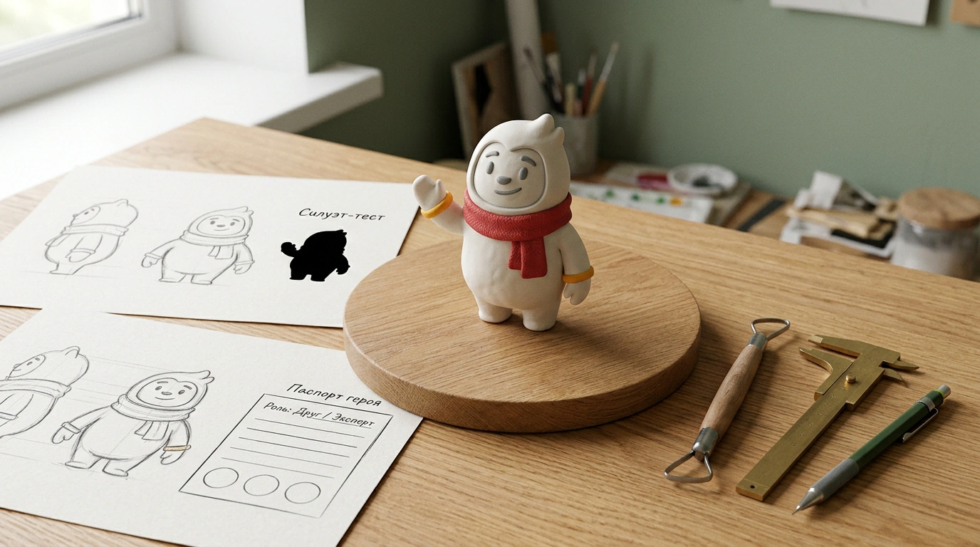
Only at step five is it time to start drawing. One iron rule governs this stage, and designers call it the silhouette test. Fill your sketch with solid black and shrink it down to the size of a messenger avatar or small sticker. If it turns into an unreadable blob, no shading, glossy eyes, or trendy gradients will save it. Mickey Mouse, Bibendum, and Duo the Owl read clearly in half a second even on a smartwatch screen.
Modern AI tools save plenty of time while exploring directions. Image generators let you test ten visual styles from a text prompt or reference in a single evening. For 3D needs like animation or merch, tools such as Meshy AI generate draft 3D meshes from text or images that artists can refine in pro 3D editors. Treat AI output strictly as a rough draft. A human designer still needs to finalize proportions, align colors with your brand palette, build an expression sheet, and compile a usage guideline.
Now let's talk money. Prices vary wildly because people order completely different scopes under the word "mascot" — from a single avatar illustration to a full 3D actor with custom animations.
| Production option | Budget range | Typical deliverables | Main risk |
|---|---|---|---|
| Freelance marketplace (e.g., Kwork) | 2,000 to 10,000 ₽ | Simple vector character in 1–2 poses for basic needs | Vague scope, no guidelines, no adaptation across formats |
| Professional illustrator or studio | Mid to high tier (varies by scope) | Personality development, character bible, multiple angles and expressions, social and packaging assets | Without a clear brief and steps 1–4, you may pay for "pretty art" disconnected from business goals |
| 3D model and animation | Custom estimate per project | 3D character, rigging (movement skeleton), animations for video and interfaces | High cost of late-stage revisions; hard to compare vendors on price alone |
Whichever budget tier you choose, check two dull but critical clauses in your contract before paying a deposit: full transfer of exclusive rights to the character and delivery of all source files. Otherwise, a year from now, when your mascot finally drives recognition, you'll have to pay again just to put a winter hat on it for a New Year promo.
Touchpoints, Three Fatal Mistakes, and an Honest Answer for B2B
Step six is making sure the finished files don't sit forgotten in a folder called "Branding_final_2." Put your character into real customer scenarios. The more often people meet the mascot in natural moments, the faster it locks onto your brand.
In digital products, micro-interactions shine. A classic example is Freddie (Freddie von Chimpenheimer IV), the chimpanzee in Mailchimp. After a marketer spends an hour building an email, double-checking the list, stressing over the send button, and finally clicking it, Freddie's animated hand pops up for a high five. It is a one-second detail that melts tension and earns a smile.
On social media, your character needs recurring series, reactions to holidays and news, in-character replies in comments, and shareable formats like sticker packs — SberCat's billions of sticker sends grew directly out of people using its images in private chats. Offline and in retail, physical presence works wonders on packaging, at points of sale, and at trade shows. When visitors snap selfies next to a life-size figure or clever box and post them to Stories, you earn free reach without spending a ruble on ads.
Before launch, run your concept past three classic mistakes that trip companies up most often:
- An overloaded, confusing look. Too many tiny accessories, a messy outline, or colors that muddle together when scaled down. Test it easily: show the sketch to a few target customers and ask them to describe it in two or three words. If one sees a sly fox, another sees a tired dog, and a third asks "what is that thing," simplify the drawing.
- Clash with brand values. A goofy comic hero on a luxury brand — or an aggressive jokester for a service selling safety and peace of mind — destroys trust. Write down your three core company values and test the character against them honestly. If your pillar is reliability, the hero can't look chaotic. If it is innovation, an outdated retro style won't fit.
- A copycat or generic cliché. Recoloring a famous character is a direct path to customer confusion and legal trouble. The opposite extreme is yet another "cute animal" or "friendly blue robot" already sitting on a hundred websites. If a sketch reminds people of someone else's mascot, change the core concept, not the scarf color.
Before publishing, verify that your mascot's silhouette and name don't overlap with registered trademarks or pop-culture icons. Lawsuits over Waiter (rights held by CD Land Contact) and strict licensing around Matroskin the Cat (Soyuzmultfilm) prove that 'we just used a meme for a post' won't hold up in court. Secure full rights to your own mascot in the designer's contract from day one, just as Walt Disney did with Mickey Mouse after losing Oswald the Rabbit.
To quickly check whether your idea is ready for an illustrator or still needs work, click through the short concept-check simulator below — it follows all six steps and three error filters.
Pre-Launch Mascot Concept Check Simulator
If you checked fewer than four boxes, hold your illustration budget for a week and tighten the concept on paper. That is the cheapest stage to adjust the idea without burning money on revisions.
One practical question remains that software founders and wholesalers ask often: do you even need a mascot in B2B? The usual stereotype says corporate deals only respond to blue ties and dry slide decks. In reality, B2B products are often the most complex, with wide pricing tiers and value propositions that are hard to explain in one short message. Here, a character acts as a visual anchor and translator, tying scattered materials into one recognizable thread. It doesn't have to look grim or boring — just test the associations with real clients early and track its impact honestly through campaign metrics.
