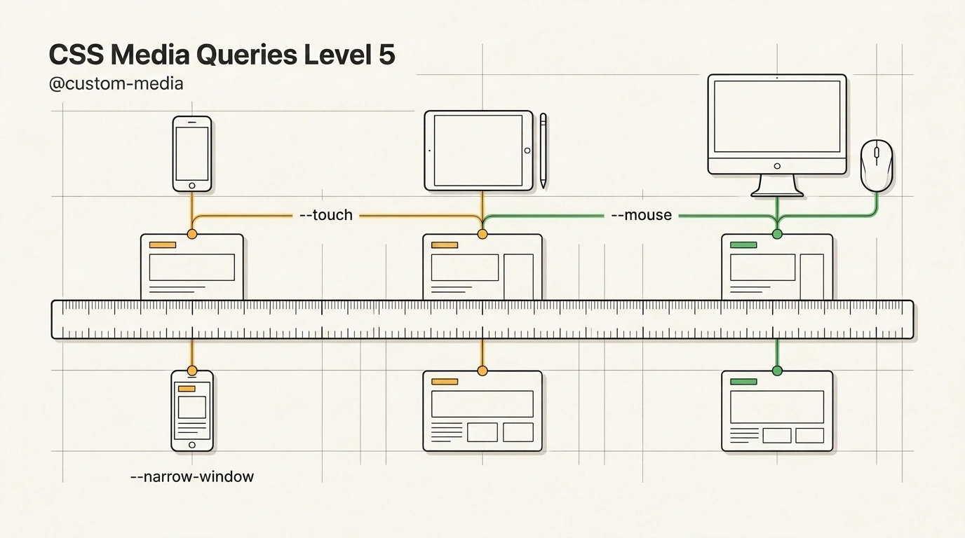
Open any older frontend repository and peek into its stylesheets. With 99% probability you will find a classic "scatter of magic numbers": dozens of @media (max-width: 768px) conditions strewn about, @media (min-width: 1024px) tucked away somewhere, and in a couple of components someone slipped by one pixel and wrote max-width: 767px, breaking the card grid right at the resolution boundary.
This problem has haunted the web industry for over fifteen years. We learned to extract colors, spacing, and fonts into CSS Custom Properties (variables like --primary-color), yet we still copy-paste media queries by hand.
The CSS Media Queries Level 5 specification fixes this historical injustice with the @custom-media at-rule.
Let's examine how this directive works and how practical presets from the Master.dev blog help bring crisp order to responsive layouts.
The Curse of Magic Pixels: Why Old Breakpoints Are Obsolete
The traditional approach to responsiveness suffers from three fundamental flaws:
- Duplication and maintenance hell: if the design team decides to shift the mobile layout boundary from 768px to 800px, engineers have to run global find-and-replace across hundreds of CSS modules. Something is bound to be missed, and a style mismatch lands in production.
- False device heuristics: historically we assumed "if the screen is narrower than 768px, it's a mobile touchscreen; if wider, it's a desktop with a mouse." Today that logic has completely broken down. A modern 13-inch iPad Pro with an external keyboard and trackpad can be wider than an office laptop, yet the user can tap the screen with a finger at any moment. Meanwhile, an 11-inch compact netbook is driven by a high-precision mouse. Relying solely on pixel viewport width is a dead end.
- Lack of semantics: an abstract
@media (hover: none) and (pointer: coarse)forces developers to recall spec details instead of immediately grasping the author's intent: "here we enlarge the button hit area for a finger on a touchscreen."
@custom-media Syntax: Variables for Logical Media Expressions
The @custom-media rule acts like a global variable declaration for @media rules. It binds a double-dashed identifier (--name) to any valid media query or logical combination:
/* Base definitions of named media queries */
@custom-media --narrow-window (max-width: 600px);
@custom-media --mouse (hover: hover) and (pointer: fine);
@custom-media --touch (hover: none) and (pointer: coarse);

/* Combining previously defined presets */
@custom-media --mobile-touch (--narrow-window) and (--touch);

/* Usage inside UI components */
@media (--mouse) {
  .interactive-card:hover {
    transform: translateY(-4px);
    box-shadow: 0 12px 24px rgba(0, 0, 0, 0.15);
  }
}

@media (--touch) {
  .interactive-card {
    min-height: 48px; /* Enlarged tap target for touch */
  }
}
Code becomes self-documenting. You declare semantic rules once at the project root and reuse them across the entire codebase.
Daniel Schwarz's Presets: Modular Grid, Input Modalities, and True HDR
Frontend architect Daniel Schwarz put together a ready-made system of named media queries split into three practical blocks:
- Input Modalities:
Instead of guessing gadget type from glass width, the presets check the actual physical mode of interaction:
--mouse:(hover: hover) and (pointer: fine)— a mouse or trackpad with a cursor;--touch:(hover: none) and (pointer: coarse)— a finger on a smartphone or tablet;--stylus:(hover: none) and (pointer: fine)— a high-precision stylus on a graphics tablet;--air:(hover: hover) and (pointer: coarse)— spatial gesture control (Apple Vision Pro, Meta Quest);--dpad:(hover: none) and (pointer: none)— a Smart TV remote control or gamepad.
- Modular 100px-Step Breakpoint Scale:
Schwarz recommends ditching subjective names like
--mobile,--tablet, and--desktop—which mean different numbers to every designer—in favor of a strict numeric scale:@custom-media --from-360 (min-width: 360px); @custom-media --from-480 (min-width: 480px); @custom-media --from-720 (min-width: 720px); @custom-media --from-1080 (min-width: 1080px); @custom-media --from-1440 (min-width: 1440px); - True HDR (High Dynamic Range):
@custom-media --true-hdr (dynamic-range: high) and (color-gamut: p3);
This preset lets you activate ultra-vivid Display P3 colors only on screens with hardware HDR support (OLED, mini-LED), preventing distortion on inexpensive office monitors.
Browser Status and Fallbacks: PostCSS vs. container style()
At the moment, native support for @custom-media is already implemented in the Gecko engine (Firefox 148+), though it remains behind the experimental layout.css.custom-media.enabled flag.
How can you use this syntax in production right now?
The primary battle-tested path is the postcss-custom-media plugin. At build time, the tool compiles named presets into standard CSS:
// postcss.config.js
module.exports = {
  plugins: [
    require('postcss-custom-media')({
      importFrom: 'src/styles/custom-media.css'
    })
  ]
};
A second modern path without preprocessors is using style container queries @container style():
:root {
  @media (dynamic-range: high) and (color-gamut: p3) {
    --is-hdr: true;
  }
}

@container style(--is-hdr: true) {
  .hero-glow-badge {
    background: color(display-p3 1 0.1 0.2);
  }
}
As we noted in our review of 12 modern CSS features, the native platform is step by step absorbing capabilities that once forced teams to pull in heavy Sass and Less preprocessors.
Adopting @custom-media presets at the design-system level frees teams from pixel confusion and lays a solid foundation for any future device.