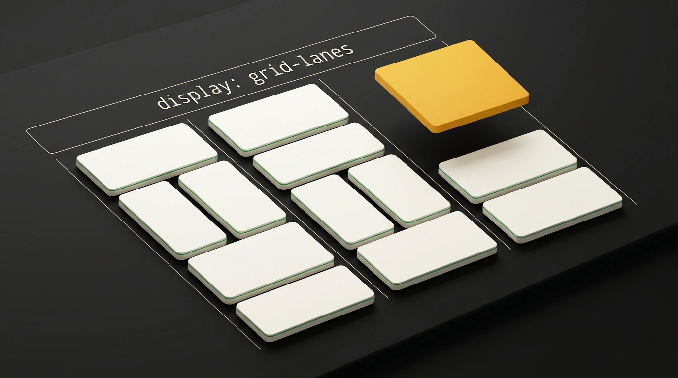
If you have ever built a product showcase or a Pinterest-style photo gallery, you know this classic pain point. Cards have different heights: some photos are vertical, some titles are longer. You want to pack them tightly together vertically into dense columns with no gaps—in web development, this is called a masonry layout.
Regular two-dimensional CSS Grid was never a good fit for this: its grid creates rigid intersections of rows and columns. If one item in the first row stretches to 500 pixels, the entire row dutifully expands, leaving gaping holes under neighboring blocks. Multi-column column-count did not save the day either: it fills columns from top to bottom, breaking the left-to-right reading order.
As a result, developers spent years wiring up scripts like Masonry.js. The library calculated coordinates at runtime via getBoundingClientRect() and applied inline top and left styles. I have seen many times how that led to layout shifts (CLS), janky scrolling, and battery drain. But the era of workarounds is over: browsers have agreed on the native display: grid-lanes mode.
Battle of the Giants: Why Agreement Took Almost Ten Years
The debate over masonry syntax in the CSSWG working group dragged on since 2017:
- The Mozilla and WebKit (Apple Safari) teams insisted that masonry layout should extend CSS Grid via
grid-template-rows: masonry. The main advantage is reusing familiar Grid tools:gapspacing,repeat()andminmax()functions, subgrids, and named lines. - The Google Chromium team argued that Grid is inherently strictly two-dimensional, whereas masonry controls only a single axis. Google proposed an isolated
display: masonrycontext with its own properties.
In late 2025, the W3C consortium approved a compromise. The specification entered the W3C CSS Grid Layout Module Level 3 draft under the name display: grid-lanes. The WebKit engine has already implemented the syntax in Safari Technology Preview 234 and Safari 26.4+, and the authors released an interactive reference, Field Guide to CSS Grid Lanes. Earlier, we covered draft approaches in an article on how display: grid-lanes is becoming a native alternative to JS grids, and fresh details were shared by Piccalilli and the Библиотека фронтендера channel.
Anatomy of the Mechanism: How the Browser Packs Cards into Lanes
The word "lanes" describes the concept accurately. Picture checkout counters at a supermarket: columns are the lines. A shopper with a cart (a content card) walks up to the checkout area and joins whichever line is shortest right now.
In standard Grid, the browser aligns blocks along rows and columns simultaneously. In Grid Lanes, a rigid grid is defined only along the track axis (usually columns), while along the packing axis items are placed independently by the fill algorithm:
- Lane sizing: the browser calculates column widths using familiar syntax:
.masonry-gallery {
  display: grid-lanes;
  grid-template-columns: repeat(auto-fill, minmax(16rem, 1fr));
  gap: 1.5rem;
}
- Height counters: the engine tracks the accumulated height of each column, accounting for
gapspacing. - Explicit position priority: items with
span 2or fixed coordinates are placed first, reserving space. - Auto-placement: for each subsequent item, the browser finds the lane with the smallest current height, places the card there, and updates the lane height.
All the math runs in C++ directly inside the browser's layout pipeline, delivering a steady 60 frames per second.
Taming the Chaos: Why Browsers Need the fit-tolerance Property
A greedy packing algorithm hides an unpleasant bug. Suppose column #1 is 400px tall and neighboring column #2 is 398px. A two-pixel difference is invisible to the eye, yet the algorithm considers column #2 strictly shorter. The browser drops the next card into the second column, breaking the natural left-to-right reading order.
To solve this, the working group introduced the fit-tolerance property:
fit-tolerance: 0— absolute density. The browser always picks the shortest column, ignoring HTML element order.fit-tolerance: 1em(defaultnormalvalue) — a sensible balance. Lanes whose heights differ within1emare treated as equal. Among them, the browser picks the one that preserves left-to-right reading order.fit-tolerance: infinite— strict markup order priority. Cards follow strictly in sequence, even if gaps remain at the bottom.
.masonry-gallery {
  display: grid-lanes;
  grid-template-columns: repeat(auto-fill, minmax(18rem, 1fr));
  gap: 1.25rem;
  fit-tolerance: 1em;
}

.card-featured {
  grid-column: span 2;
}
Subgrids and Brick Masonry: Hidden Superpowers of the Syntax
Integration with CSS Grid brings native support for CSS Subgrid. Inside a card, you might have an image, a heading, text, and a button. Thanks to subgrids, inner elements align to shared lines:
.recipe-card {
  display: grid;
  grid-template-columns: subgrid;
}
If you need a horizontal layout of variable width (a brick-wall effect), simply switch the track axis to rows:
.horizontal-brick {
  display: grid-lanes;
  grid-template-rows: repeat(3, 200px);
  gap: 1rem;
}
Cards will pack from left to right into three horizontal bands, always finding the shortest row.
Accessibility Pitfalls and Safe Production Rollout
Native masonry has a weak spot—accessibility (a11y). When items are placed into the shortest columns, the visual order on screen diverges from the physical order in the DOM.
A user navigating by keyboard (Tab) or screen reader moves strictly through the HTML tree. We covered in detail how automatic CSS Grid Lanes layout breaks interface accessibility under WCAG 2.4.3: if focus jumps erratically between columns, orientation becomes impossible.
If your cards form a connected chronological sequence, set fit-tolerance: infinite or mark up each card as a self-contained semantic <article> block.
For safe production deployment, use progressive enhancement with @supports:
/* Basic fallback for all browsers */
.cards-container {
  display: grid;
  grid-template-columns: repeat(auto-fill, minmax(18rem, 1fr));
  gap: 1.5rem;
  align-items: start;
}

/* Native lanes for supporting browsers */
@supports (display: grid-lanes) {
  .cards-container {
    display: grid-lanes;
    grid-template-columns: repeat(auto-fill, minmax(18rem, 1fr));
    gap: 1.5rem;
    fit-tolerance: 1em;
  }
}
Older browsers will show a classic top-aligned grid, while modern users get a rock-solid masonry layout without a single line of JS.