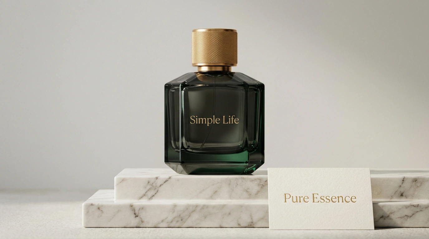
Every e-commerce founder and marketer eventually runs into the nightmare of commoditization. You spend years building manufacturing, inspecting stitch quality, and sourcing natural cotton, only to launch on a marketplace and see dozens of listings with identical photos and similar prints priced a third lower. Competitors copy your visuals, undercut your prices, and drag you into an exhausting price war where margins race toward zero.
That was the exact trap facing bedding and home textile brand Simple Life, despite more than sixteen years of manufacturing experience. The company had successfully supplied national retail chains before focusing on its own label. Shoppers genuinely praised the quality and came back for more, yet there was a fundamental flaw: people remembered a pretty bedding set, not the brand's name. To a marketplace shopper, it was just another decent textile among thousands of lookalike listings.
From Thread Count to Quality of Life: Finding a Unique Positioning
To break the vicious cycle of price dumping, the company brought in branding agency Supermarket. A niche audit exposed a market-wide blind spot: virtually every competitor shouted about discounts, promos, and dry technical specs—sateen density, thread count, or cotton percentage. They were selling a physical commodity with zero value system or emotional bond behind it.
In a series of in-depth interviews with founder Ekaterina Lebedeva, the marketers struck the brand's real nerve. Ekaterina didn't talk about looms and yarns; she talked about family coziness, the importance of restorative sleep, slow living, and self-care. Out of that came the overarching positioning platform: "Happiness starts with simple things."
Instead of an abstract textile factory, Simple Life was reborn as a warm lifestyle brand for home living. Its communication language shifted radically: emotions, calm aesthetics, and domestic harmony moved front and center, while fabric specs became natural proof points for those values. To explore the pitfalls of such a shift, check out our breakdown on pricing mistakes when moving into the premium segment, which maps out the key positioning forks.
Visual Identity, A/B Tests, and a Margin Surge
Next, the concept had to be brought to life visually. A minimalist ladybug became the brand's central symbol, evoking living nature, carefree summer days, and purity. The circle formed the geometric backbone of the identity, integrated into the logo, packaging, patterns, and product-card graphics.
The team didn't blindly roll out the new design across the entire catalog. First, they ran split tests on selected product-card groups, measuring click-through rate (CTR) and conversion depth. Only after confirming a clear lift from the new look did they scale the style across the whole assortment.
The financial impact of the rebrand from June to September 2026 beat expectations:
- Total sales volume grew 30%;
- Product-card conversion to purchase increased 30%;
- The share of full-price sales without discounts rose from 40% to 55%;
- An independent Brand Lift study among 1,500 buyers recorded a 4x jump in brand awareness;
- Social media communities expanded from 40,000 to 60,000 followers, while monthly engaged interactions skyrocketed from 4,200 to 25,000 without paid influencers.
According to a strategic report by Interbrand, Simple Life's gross margin across its product matrix jumped from 32% to 54% after moving away from commodity positioning, while its Net Promoter Score (NPS) settled at a solid 68 points.
When a product carries clear emotional meaning and is shielded by a cohesive brand, shoppers stop comparing you on bare price tags alone. Premium positioning isn't just a pretty logo—it is the strongest armor your business margin can wear.