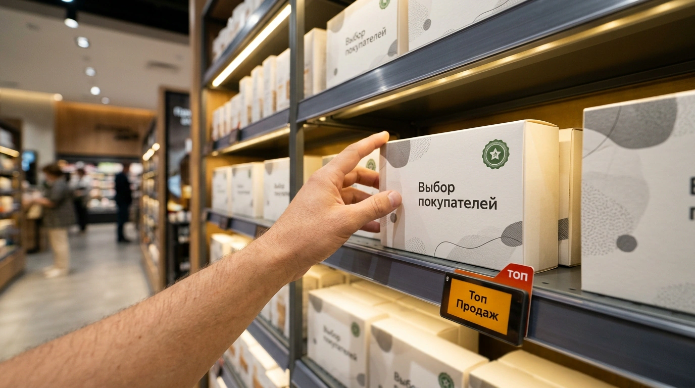
Have you ever walked into a supermarket just for bread and milk, only to unload two overflowing baskets at the register? Relax—there's nothing wrong with your willpower. You were up against an army of marketers, store architects, and behavioral analysts. A big retail floor isn't a warehouse; it's a finely tuned funnel where every square foot steers your steps and your gaze.
The wild part is that these principles have worked without fail for decades because they're rooted in pure physiology. Yet in digital marketing and e-commerce, we constantly reinvent the wheel while ignoring the lessons sitting on the shelves of the grocery store next door.
Anatomy of Offline Traps: From the Entrance to the Checkout Lane
Let's break down retail space mechanics piece by piece. Start with traffic flow. Most shoppers are right-handed, so people instinctively drift counterclockwise around the perimeter of a store, scanning what's to their right (the "right-hand rule"). That's exactly where retailers place their highest-margin categories, new arrivals, and bright promo displays.
The next lever for capturing attention is shelf height. In retail, there's the "golden shelf": the zone 120 to 160 centimeters off the floor, right at adult eye level. According to NielsenIQ research, this narrow band accounts for up to 40% of all retail sales in a category. Experiments show something remarkable: simply moving a product from the bottom tier up to eye level sends unit sales soaring by 78%—with zero discounts or extra ads. Bottom shelves are reserved for heavy bulk packs or low-margin staples that shoppers will bend down for anyway.
Another powerful lever is product adjacency. No smart merchandiser puts pasta sauce in the cleaning aisle. Placing complementary items shoulder to shoulder—pasta next to sauces, or snacks beside cold drinks—lifts average basket size by 18–22%. The retailer doesn't make you hunt; it sells you the whole meal scenario at once. At the end of the route awaits the checkout bottleneck. While you wait in line, your tired brain drops its guard and grabs chocolate, gum, or wet wipes—cheap impulse items with massive markups. At the same time, stores aggressively trim clutter: cutting duplicate SKUs from a planogram reduces decision fatigue and increases category turnover by 14%.
Digital Merchandising: Translating Retail Laws to Your Online Store
Now bring all of that online. A smartphone screen is the exact same store floor, just compressed to five inches. Your "golden shelf" here is the first screen of a category listing and the top three search results. Marketplace and e-commerce shoppers are lazy: the top rows capture 70% of clicks. If you bury your highest-margin flagship products in the footer or hide them on page three of pagination, you're handing revenue straight to your competitors.
Lesson two is basket bundling. Once a shopper adds an item to their cart or heads to checkout, don't send them wandering back into unrelated catalog pages. Build cross-sell blocks right into the checkout UI: "Frequently bought together," "Add batteries in one click," or "Screen protector at 20% off." When a customer only has to toggle one switch without re-entering payment details, upsell conversion skyrockets. In that sense, strong trust economics on marketplaces comes down to clear presentation and making the next step effortless.
And here is the golden rule I always come back to: spare your customers the agony of choice. A bloated catalog packed with dozens of near-identical items kills conversion. People get tired of comparing identical specs and leave empty-handed. Keep your core lines sharp and clear, spotlight bestsellers with "Customer Favorite" badges, and pave a frictionless path to payment. At the end of the day, the winner isn't the store with the most inventory—it's the one that makes buying feel easy and natural.