Testing Responsiveness Beyond the Viewport with Site Seeing
Think about your usual layout-testing ritual: you open DevTools, smoothly drag the window edge with your mouse, or click a mobile screen preset in the emulator. Everything looks tidy until a real user opens the site.
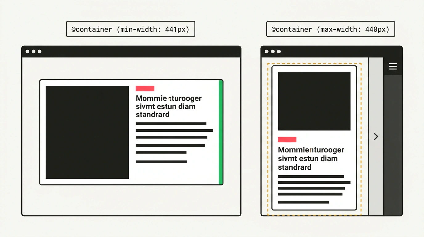
In reality, usable space gets squeezed by vertical tab bars in Arc and Edge, docked code inspectors, smartphone on-screen keyboards, and Split View on tablets. Ahmad Shadid's Site Seeing tool clearly shows where global media queries break. But true layout resilience starts with switching to container queries and dynamic height units.