Let's be honest: how do you usually check responsive layouts before a release? You open browser DevTools, drag the window edge back and forth, switch between iPhone and iPad presets in device emulation mode, and close the tab feeling accomplished. In theory, everything looks perfect: the grid neatly reflows at the 768px and 1024px breakpoints, blocks snap into place, and product cards stay aligned.
Yet the moment a real user opens that site in the wild, the layout starts cracking at the seams. The reason is simple: in modern web development, the idea of a "clean browser window" that matches a device's physical screen has long been a dangerous myth.
Frontend architect and creator of the popular course The Layout Maestro, Ahmad Shadid, introduced a research concept and interactive lab called Site Seeing, detailing how our everyday code breaks under non-standard yet completely ordinary conditions.
Real-World Contexts That Break Global Breakpoints
Look at what actually happens to a page's visible area on real users' computers and smartphones:
- Docked DevTools Panels: when a developer or tech-savvy user opens the console on the side of the screen, the usable page width instantly shrinks by 30–60%. The browser reports a narrower viewport, yet the device remains a desktop monitor with hover support.
- Vertical Tab Sidebars: browsers like Arc, Microsoft Edge, or custom Firefox builds reserve 60 to 280 pixels for a persistent sidebar. As a result, on a 1440px monitor your layout only gets 1200px of working width and unexpectedly falls into an awkward intermediate state.
- Split View Multitasking: a user splits an iPad or ultrawide monitor screen in half. A global
@media (min-width: 1024px)query honestly believes the screen is large, while the app frame's width is a modest 540 pixels. - Smartphone Virtual Keyboards: when focusing an input field, the system keyboard slides up from the bottom and covers up to half the vertical space. If a modal or confirmation button was rigidly tied to
100vh, it disappears under the keyboard or triggers uncontrollable screen jitter.
Moving from Global Viewports to Resilient Containers
The main takeaway from Shadid's research: it's time to stop tying component responsiveness to the global browser screen size. For individual widgets, cards, and navigation bars, native CSS Container Queries should be the de facto standard.
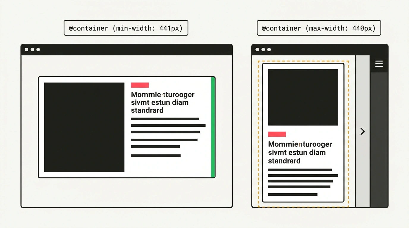
A component should react not to how wide the user's monitor is, but to how many pixels its immediate parent container gives it:
/* Declare the parent container as an inline-size measurement context */
.product-grid__item {
  container-type: inline-size;
  container-name: product-card;
}

/* The card decides how to look when compressed */
@container product-card (max-width: 440px) {
  .product-card {
    display: flex;
    flex-direction: column;
    gap: 0.75rem;
  }

  .product-card__gallery {
    aspect-ratio: 16 / 9;
    width: 100%;
  }
}

@container product-card (min-width: 441px) {
  .product-card {
    display: grid;
    grid-template-columns: 200px 1fr;
    gap: 1.25rem;
  }
}
And for mobile modals and full-screen sections, you should use modern dynamic height units dvh instead of the outdated vh, pairing the markup with a dedicated directive for managing the on-screen keyboard:
/* Resilient modal protected against keyboard overlap */
.checkout-modal {
  box-sizing: border-box;
  min-height: 100dvh;
  padding-bottom: max(1.5rem, env(safe-area-inset-bottom));
  display: flex;
  flex-direction: column;
  justify-content: space-between;
}
In the HTML viewport meta tag, it's now recommended to explicitly set interactive-widget=resizes-content: this tells the mobile browser to physically recalculate the document height when the keyboard appears, without breaking input field layouts.
We already saw similar isolation principles in Device Posture API and adapting to foldable screens, where a physical hinge splits the workspace into independent segments. Site Seeing reminds us of an obvious but often forgotten truth: web pages don't live in the laboratory vacuum of a code editor, but in the unpredictable environment of real window managers, browser panels, and user habits.
