When the first foldable phones hit the market a few years ago, most frontend developers shrugged them off as an exotic geek toy that would soon fade away. Instead, the hardware kept evolving. Screens folded vertically, unfolded into full tablets horizontally, and the arrival of the long-awaited iPhone Duo simulator in Xcode 27.1 beta 1 sealed the deal: foldables are now a mainstream consumer form factor.
That is where web development collided with physical hardware. For decades, we built layouts for flat rectangles. All our grids, flex containers, and absolute coordinates assumed pixels formed one continuous, flat plane. When a device folds in half, though, a physical hinge cuts right across your site—a seam of glass, plastic, and mechanics that warps imagery, splits text, and makes buttons awkward to tap.
How does a browser know when a device is bent, and how do you adapt a layout cleanly without hacks? Engineers behind the open-source Video.js player, led by Darius Cepulis, dug into native W3C standards and showed how to build a UI that bends with the hardware.
Old Hacks vs. W3C Standards
Previously, developers tackled foldables with brittle workarounds: sniffing the browser's User-Agent string, guessing the phone model, hardcoding pixel offsets in CSS, and praying the user wouldn't rotate the screen.
That approach broke the moment anything changed:
- the user rotated from portrait to landscape, and pixel margins drifted out of place;
- the OS scaled the UI, shifting the hinge away from hardcoded bounds;
- the user propped the phone half-open (laptop mode on a desk), while the site still treated it as a flat slab.
The W3C designed two complementary standards that have finally landed in Safari behind experimental flags: the Device Posture API and the CSS Viewport Segments API.
Device Posture API: Detecting the Physical Fold
The first standard answers a simple question: what physical state is the device hinge in right now?
In JavaScript, you read this from navigator.devicePosture. Its type property returns one of two values:
'continuous'— the device is unfolded flat, or it's a standard monolithic phone/laptop;'folded'— the screen is physically bent at an angle (for instance, sitting on a table like a mini laptop or held like an open book).
Better yet, the API gives you a standard change event:
if ('devicePosture' in navigator) {
  // Listen for physical changes in the hinge fold angle
  navigator.devicePosture.addEventListener('change', () => {
    console.log('Текущая поза устройства:', navigator.devicePosture.type);

    if (navigator.devicePosture.type === 'folded') {
      document.body.classList.add('device-is-folded');
    } else {
      document.body.classList.remove('device-is-folded');
    }
  });
}
And in CSS, you get a native media query to match it:
@media (device-posture: folded) {
  /* Styles apply only when the hardware is physically folded */
}
Viewport Segments API: Two-Screen Geometry
Knowing the screen is folded isn't enough on its own. You also need the exact coordinates and dimensions of each visible pane on either side of the hinge. That's what the Viewport Segments specification provides.
The browser splits the viewport into a 2D grid of segments addressed by (x, y) coordinates:
(0, 0)— top (or left) segment;(0, 1)— bottom segment (when folded horizontally);(1, 0)— right segment (when folded vertically).
The spec introduces new env() environment variables:
env(viewport-segment-width x y)— width of a specific segment;env(viewport-segment-height x y)— height of that segment;env(viewport-segment-top x y)andenv(viewport-segment-left x y)— segment origin coordinates relative to the top-left corner of the viewport.
Media queries like @media (vertical-viewport-segments: 2) and @media (horizontal-viewport-segments: 2) let you declaratively check how many segments the screen is split into along each axis.
Video.js Case Study: The Laptop-Style Player
The Video.js team prototyped a layout inspired by the Netflix and YouTube mobile apps.
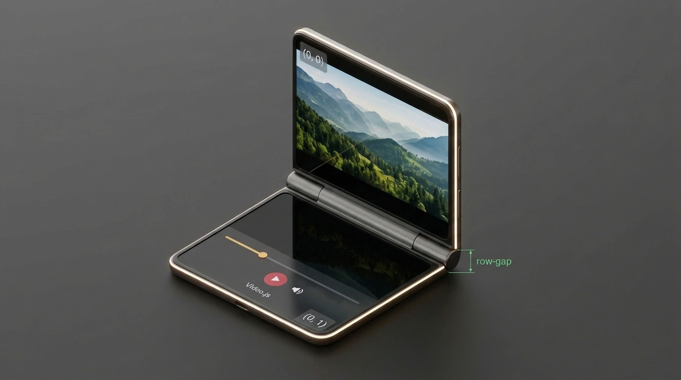
Diagram of an adaptive CSS grid for a foldable smartphone splitting the top video screen and bottom control deck.
Picture this: someone is watching a video on a train or at the kitchen table. They set their foldable phone down and bend it to 90 degrees. The top half faces them like a monitor, while the bottom half rests flat on the table like a laptop keyboard.
Stretching the video across the crease right through the actors' faces would look ridiculous. Instead, when folded, the video should lock cleanly into the top segment (0, 0), while every control—scrubber, volume, audio tracks, and captions—moves down into (0, 1) as a dedicated touch deck.
Here is how that adapts in pure CSS without a single line of JavaScript coordinate math:
/* Base state: monolithic flat screen */
.video-player-container {
  display: grid;
  grid-template-rows: 1fr auto;
  width: 100vw;
  height: 100vh;
  background-color: #000;
}

/* Adaptation for a foldable device in laptop posture */
@media (device-posture: folded) and (vertical-viewport-segments: 2) {
  .video-player-container {
    display: grid;

    /* The top grid row matches the exact height of the top screen,
       and the bottom row matches the exact height of the control deck */
    grid-template-rows:
      env(viewport-segment-height 0 0)
      env(viewport-segment-height 0 1);

    /* The gap between rows equals the exact physical thickness of the hinge! */
    row-gap: calc(
      env(viewport-segment-top 0 1) - env(viewport-segment-bottom 0 0)
    );
  }

  /* Center the video stream in the upper segment */
  .video-viewport {
    grid-row: 1;
    display: flex;
    align-items: center;
    justify-content: center;
    overflow: hidden;
  }

  /* Place the control panel in the lower segment resting on the table */
  .player-controls-panel {
    grid-row: 2;
    display: flex;
    flex-direction: column;
    justify-content: space-around;
    padding: 1.5rem;
    background: #181818;
    border-top: 1px solid #333;
  }
}
Look closely at that row-gap formula: subtracting the bottom edge of the top segment env(viewport-segment-bottom 0 0) from the top edge of the bottom segment env(viewport-segment-top 0 1) gives you the exact physical width of the hinge seam. Your UI is guaranteed never to disappear into the fold's blind spot.
Gotchas and Safari Quirks
As clean as these standards are, keep a couple of ecosystem realities in mind before shipping:
- Spec maturity: Both specs are still at W3C Working Draft status. Property names are stable, though experimental syntax can still shift. In Safari, support currently lives behind developer feature flags.
- The iOS Safari Fullscreen trap: In mobile Safari, tapping fullscreen normally hands playback off to the native iOS system player—which doesn't split controls across segments yet. To keep your custom Video.js split layout active in fullscreen, you need to opt into the extended custom Fullscreen flag.
Once again, the web platform proves how adaptable it is: with declarative media queries and environment variables, a browser can adjust to wild hardware form factors without bloating your client-side JavaScript.