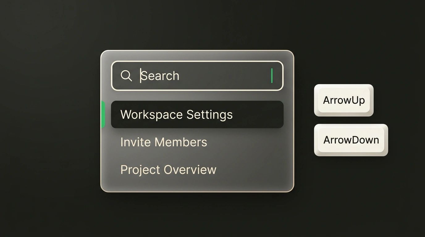
Think about how often you run into long dropdown action lists in modern web apps: country pickers, workspace switchers, quick command palettes, or file context menus in cloud storage. Once the list grows past ten items, users naturally expect a quick search bar right at the top of the popup.
It seems trivial: drop a standard <input> tag into the markup, wire up a local useState hook on input change, filter the string array with a plain .filter(), and render the filtered list. Yet if you open that DIY component with VoiceOver enabled or try navigating it with a keyboard alone, the UI turns into a minefield.
Input focus gets trapped in the input box, pressing ArrowDown scrolls the entire page instead of moving between items, the screen reader stays silent about how many results remain, and an accidental press of Escape closes the parent modal instead of the dropdown menu.
The MUI team (creators of the legendary Material UI) actively develops Base UI—an open-source library of unstyled, headless components for React. In recent versions of Base UI Menu, the engineers introduced a reference architecture for filterable dropdown menus, breaking down the accessibility problem down to the nuts and bolts.
Why Combobox and Menu Are Two Fundamentally Different Beasts
The root of most frontend developers' trouble lies in mixing up fundamental W3C accessibility specifications:
- Combobox pattern: designed for entering data into a form. The user types text, sees autocomplete suggestions, and selects one or more values that become a submitted form field.
- Menu pattern: designed strictly for performing actions or invoking commands. It's the web equivalent of an OS context menu ("Copy", "Delete", "Rename").
When a developer tries to turn a regular Menu into a Combobox just to get a search bar, they break the user's semantic expectations. In the WAI-ARIA spec, a menu must have an explicit menu role, its items menuitem, and the search input searchbox. Their keyboard maps are radically different: in a menu, arrow keys must cycle through items, whereas in a combobox, left and right arrows move the text cursor inside the input.
Compositional Model: FilterProvider, Input, and List
Instead of a monolithic "black box" with a dozen props, Base UI offers an elegant composition of declarative primitives. All filtering magic revolves around the Menu.FilterProvider context provider:
import * as React from 'react';
import { Menu } from '@base-ui/react/menu';
import styles from './actions-menu.module.css';

export function ProjectActionsMenu() {
  return (
    <Menu.FilterProvider>
      <Menu.Root>
        <Menu.Trigger className={styles.buttonTrigger}>
          Project actions
        </Menu.Trigger>
        <Menu.Portal>
          <Menu.Positioner sideOffset={6}>
            <Menu.Popup className={styles.dropdownPopup}>
              <div className={styles.filterContainer}>
                <Menu.Input
                  placeholder="Quick command search..."
                  className={styles.filterInput}
                  aria-label="Filter actions list"
                />
                <Menu.Clear className={styles.clearButton}>
                  Clear
                </Menu.Clear>
              </div>

              <Menu.Empty className={styles.emptyPlaceholder}>
                No matching commands found
              </Menu.Empty>

              <Menu.List className={styles.itemsScrollContainer}>
                <Menu.Item className={styles.menuItem} onSelect={() => console.log('Copy')}>
                  Copy link
                </Menu.Item>
                <Menu.Item className={styles.menuItem} onSelect={() => console.log('Export')}>
                  Export to JSON
                </Menu.Item>
                <Menu.Item className={styles.menuItem} onSelect={() => console.log('Permissions')}>
                  Manage access
                </Menu.Item>
                <Menu.Separator className={styles.divider} />
                <Menu.Item className={styles.dangerItem} onSelect={() => console.log('Delete')}>
                  Delete project
                </Menu.Item>
              </Menu.List>
            </Menu.Popup>
          </Menu.Positioner>
        </Menu.Portal>
      </Menu.Root>
    </Menu.FilterProvider>
  );
}
Let's trace how this chain works under the hood:
Menu.FilterProvider: intercepts text input, inspects the text content of all nestedMenu.Itemcomponents, and maintains an up-to-date list of visible indices.Menu.Input: automatically receives focus when the dropdown opens. The moment you pressArrowDown, focus smoothly jumps to the first visible menu item. PressingArrowUpon the first item returns focus back to the search bar.Menu.Empty: automatically renders only when the entered phrase matches none of the list items.Menu.Clear: a functional clear button that removes itself from the DOM whenever the search input is empty.
Isolating Nested Submenus
One of the trickiest UI scenarios is when a dropdown menu contains nested lists (for example, a "Share" item that opens a submenu to pick contacts).
In naive implementations, searching in the root menu starts filtering and hiding items inside collapsed submenus, causing chaos. In Base UI, a nested menu is wrapped in its own <Menu.SubmenuRoot> primitive, which can house its own independent <Menu.FilterProvider>:
// Isolated filtering inside a submenu without affecting the parent
<Menu.SubmenuRoot>
  <Menu.SubmenuTrigger className={styles.menuItem}>
    Share with user →
  </Menu.SubmenuTrigger>
  <Menu.Portal>
    <Menu.Positioner sideOffset={4}>
      <Menu.Popup className={styles.submenuPopup}>
        <Menu.FilterProvider>
          <Menu.Input placeholder="Search user..." className={styles.filterInput} />
          <Menu.List>
            <Menu.Item className={styles.menuItem}>Alexey Smirnov</Menu.Item>
            <Menu.Item className={styles.menuItem}>Ekaterina Volkova</Menu.Item>
          </Menu.List>
        </Menu.FilterProvider>
      </Menu.Popup>
    </Menu.Positioner>
  </Menu.Portal>
</Menu.SubmenuRoot>
Searching in the nested menu is completely isolated: typing a user's last name neither filters nor closes the top-level parent command list.
Comparison with Radix UI and Practical Takeaways
In modern React frontend development, Radix UI (the foundation of the popular shadcn/ui component kit) has long held the crown. However, Radix still lacks a built-in primitive for menu filtering: developers have to pull in third-party libraries like cmdk or build brittle workarounds on top of comboboxes.
Base UI's approach wins through sheer cleanliness: they don't try to rewrite web standards, instead wrapping them neatly into accessible building blocks. If your project is packed with complex dropdowns featuring dozens of options, moving to Base UI's headless primitives lets you meet 100% of W3C accessibility requirements without inventing your own keyboard focus manager.