Many service builders are convinced that because artificial intelligence runs under the hood, the storefront has to scream high-tech—black background, neon gradients, a floating orb, and a slogan about the "platform of the future." In practice, that combo immediately signals a fly-by-night wrapper. Visitors put their guard up right away: they see a thin skin around someone else's model where it feels unsafe to upload files or enter a credit card.
AI Automation Society founder Nate Herk studied over 10,000 AI websites in his breakdown, and the contrast caught my eye. Almost all of them have slick layouts yet convert below 1%, while mature products that businesses pay $1,000 to $10,000 and up for rely on five simple rules. Which UI and hero-section decisions help an AI service survive in an overheated market?
Why an Empty Chat Box Loses to a Live Canvas
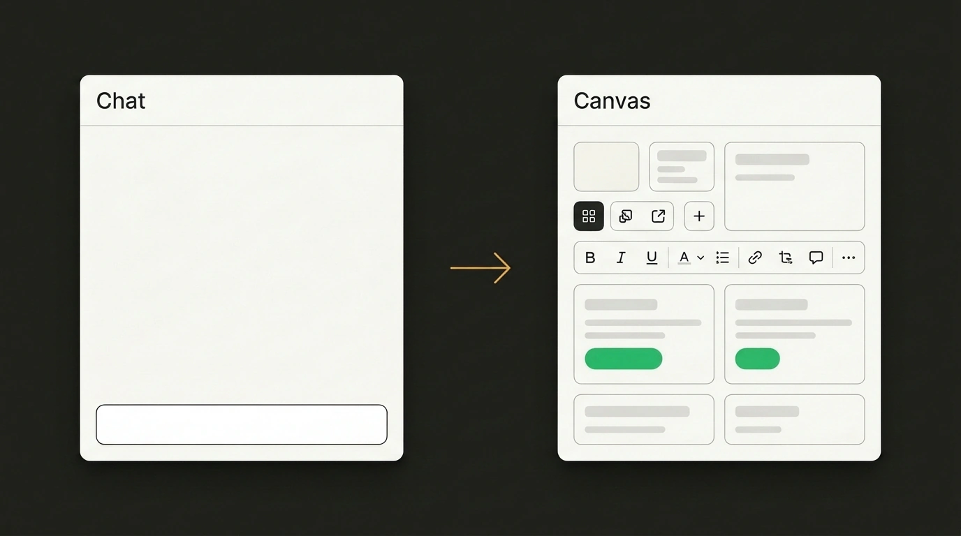
It all starts with the environment a visitor lands in. Suppose you are launching a presentation-generation startup so marketers can quickly turn notes into slides. Early on, it is tempting to save dev time and wrap the model in an empty chat box: "Describe your presentation topic." Yet an exhausted evening visitor freezes in front of the blinking cursor—what structure should they ask for, and won't the bot spit out a wall of text instead of a layout? They close the tab.
Why does a blinking cursor stall people so badly? An empty prompt dumps all the directing work onto the customer, like walking into a bakery and being handed a sack of flour instead of a display case of pastries. Audiences are tired of generic chat wrappers—they can chat with a model in the next tab over. People come to an applied service for a finished result on a Canvas UI. In your startup, instead of a text input, the visitor immediately sees a gallery of templates—from reports to pitch decks—where any block can be edited with a click.
Five Design Patterns That Turn Visitors into Customers
Even a thoughtful canvas won't save conversion if the cover scares people off with clutter or lag at the door. Herk identified five patterns that turn visits into paid accounts.
- The 3–5 Second Mirror Test. The headline reflects the visitor's pain and payoff (who the service is for, what it delivers, and where to click) instead of bragging about "algorithms." The trucking job board Trucker's Report was converting at 12.1%, but when CXL rewrote the screen around a long-haul driver's life on a smartphone on the road, conversions jumped another 79.3%.
- A 60-30-10 Palette Against the "Highlighter Effect." Without guardrails, AI generators splash bright colors across icons, borders, and badges all at once—like textbook pages soaked in highlighter where nothing stands out. Discipline gives 60% of the area to a calm background (in B2B, a light background converts 20–30% higher than dark), 30% to cards and menus, and 10% to a single accent strictly on buttons.
- Three-Layer Scene Depth and Typography. To keep a page from flattening into stacked boxes and a gray wall of text, build the screen in three planes: a soft backdrop behind, a bold headline with subhead and cards in the middle (one crossing a section border to break the rigid grid), and a shadowed button in front.
- Purposeful Motion Instead of Heavy "Cinema." Flying 3D shapes cost slow mobile loads and lost attention—Herk laughs about putting a starry ring on
nateherk.comonly to rip the distraction out soon after. Only the product itself in action earns motion; headlines and buttons must read instantly, and the user's reduced-motion OS setting must be respected. - A Free "Sample" of the Result Before Signup. Instead of a lead form at the bottom, strong services lead with a quiz, calculator, or template. Orthodontic network Docbraces put an Outgrow braces-cost calculator right at the entrance and hit roughly 45% conversion thanks to the "IKEA effect" documented by Harvard and Duke researchers: once people enter their own numbers, they already feel ownership over the result.
Watch how your presentation startup comes alive. The dark chat gives way to a bright screen reading: "Finished slides from your notes in a couple of minutes." No 3D spheres bog down a phone, and a live canvas sits open in the center. Without signing up, a visitor changes three revenue figures in a report, watches the chart update, and clicks the bright download button. The key is backing restraint with shots of the real product so minimalism doesn't feel sterile, and locking hierarchy rules into generation prompts just as in vibe-coding with AI agents.
Nate Herk sums it up bluntly: businesses don't pay for browser cinema, they pay for customers—so find the buyer's biggest question one minute before purchase and put a small, live tool on the hero screen that answers it in action.