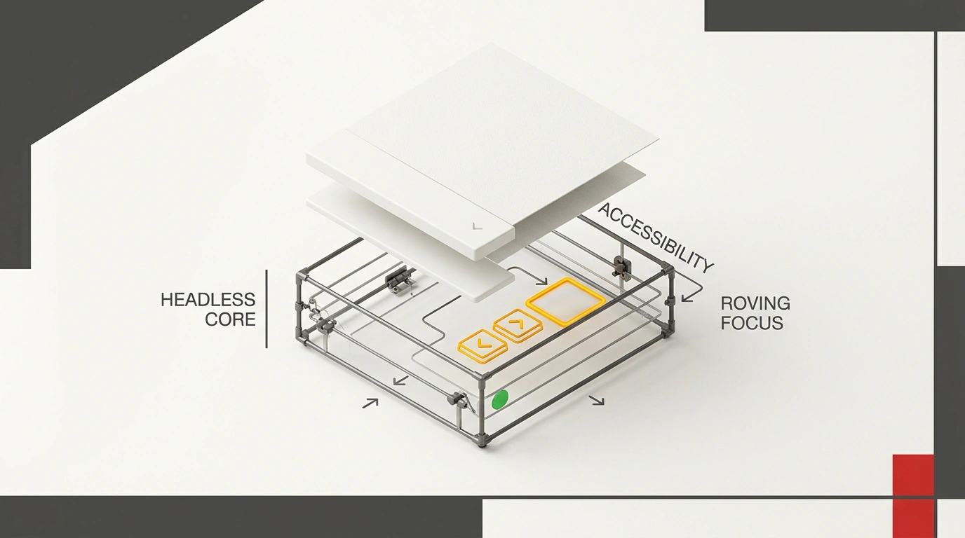
Monolithic libraries like MUI or Ant Design add 100–300+ KB of compressed styles and rigid markup to your bundle. Meanwhile, the behavioral core for fifty widgets—covering focus, keyboard navigation, popups, and drag-and-drop—weighs under 10 KB with zero external dependencies. In November 2026, Vercel Labs, shadcn/ui creator shadcn, Shu Ding, and Guillermo Rauch bet on that insight, launching the beta of UI SDK under the Apache-2.0 license on GitHub.
As shadcn put it in JavaScript Weekly #811: "We don't need the same UIs. We need the same UI behaviors." Let's see how it works under the hood and what trade-offs come with that lightness.
Why Developers Don't Want Someone Else's Markup—But Need Accessibility Rules
In any project with a custom design system, friction with ready-made UI kits shows up fast. You install Chakra UI or MUI, and a week later a designer hands you a custom menu layout—starting a battle against third-party CSS-in-JS and wrapper divs.
Dropping someone else's layout feels easy until you run into WAI-ARIA requirements. The standard enforces strict keyboard and focus rules for screen readers and keyboard-only users.
Opening a menu must move focus inside, Escape must close it, and closing must return focus to the trigger button. Arrow keys step through items without scrolling the page, while Tab exits the menu immediately. Writing those onKeyDown handlers by hand takes time, and AI agents frequently miss focus traps or aria-expanded states when generating components.
Your team needs a battle-tested state machine for keyboard and accessibility rules, while keeping your own design system's buttons and markup.
Headless Behaviors: How UI SDK Separates Logic from Visuals
Previously, libraries separated logic from styles using unstyled components. Popular Radix UI gives you <Dialog.Root> and <Dialog.Trigger> with no CSS, yet stays tied to JSX and the Virtual DOM. Adobe's React Aria covers WAI-ARIA nuances thoroughly, but binds hooks like useMenu to react-stately managers and only works in React.
The UI SDK authors went a layer deeper. The @ui-sdk/core package provides over 50 primitives—pure state machines with no framework coupling. Examples include createRovingFocus, createPopup, createSelection, createTypeahead, createFocusRecovery, createVirtualizer, and createDragDrop.
Installation takes two commands: the core package, plus an adapter for your stack.
pnpm add @ui-sdk/core
pnpm add @ui-sdk/react # or @ui-sdk/web-components
The @ui-sdk/core package is written in pure TypeScript as ESM with zero dependencies. Thanks to tree-shaking, a single primitive weighs 0.5–1.8 KB, and all 50+ behaviors together stay under 8–10 KB.
Weigh the trade-offs before jumping in. You shed third-party style baggage and get full control over the DOM, but the package ships zero CSS, icons, or animations—you write all visuals yourself. It is also in beta (0.1.0-beta.1 and 0.1.0-beta.2), so binding signatures can still change before 1.0.0.
Roving Focus, Typeahead, and Native Popups in a Custom Menu
Let's build a custom dropdown menu to see these primitives in action. First, two quick terms: roving focus keeps tabindex="0" only on the active item and sets tabindex="-1" on the rest, so pressing Tab leaves the list cleanly during arrow navigation. Typeahead jumps to matching items as you type letters quickly and resets its buffer after a pause.
Let's define both behaviors in menu-primitive.ts using definePrimitive:
// menu-primitive.ts
import { definePrimitive, createRovingFocus, createTypeahead } from '@ui-sdk/core';

export const MenuPrimitive = definePrimitive({
  setup() {
    const rovingFocus = createRovingFocus({ orientation: 'vertical', loop: true });
    const typeahead = createTypeahead({
      onMatch: (index) => rovingFocus.focusItem(index),
      timeout: 500,
    });

    return {
      getItemProps: (index: number, label: string) => ({
        tabIndex: rovingFocus.isFocused(index) ? 0 : -1,
        onKeyDown: (e: React.KeyboardEvent) => {
          rovingFocus.handleKeyDown(e.nativeEvent, index);
          typeahead.handleKeyDown(e.nativeEvent, label);
        },
      }),
    };
  },
});
Here loop: true wraps arrow navigation around the list, while createTypeahead holds a 500 ms buffer and calls focusItem. The getItemProps helper returns only tabIndex and onKeyDown without forcing specific HTML tags. Now let's wire the primitive into a React component, DropdownMenu.tsx:
// DropdownMenu.tsx
import { usePrimitive } from '@ui-sdk/react';
import { MenuPrimitive } from './menu-primitive';

export function CustomDropdownMenu({ items }: { items: string[] }) {
  const { getItemProps } = usePrimitive(MenuPrimitive);
  return (
    <ul role="menu" aria-label="Действия" className="custom-menu">
      {items.map((item, i) => (
        <li key={item} role="menuitem" className="custom-menu-item" {...getItemProps(i, item)}>{item}</li>
      ))}
    </ul>
  );
}
The usePrimitive hook connects focus logic straight into your own <ul> and <li> markup with whatever classes you want.
Next, the menu needs to open in the browser's Top Layer (no z-index wars), close on outside clicks (light dismiss), and restore focus to the button. For that, createPopup and createFocusRecovery build on native popover and <dialog>:
// popup-integration.ts
import { createPopup, createFocusRecovery } from '@ui-sdk/core';

export function setupPopup(trigger: HTMLButtonElement, popupEl: HTMLElement, dialogEl: HTMLDialogElement) {
  const focus = createFocusRecovery({ trigger });
  const popup = createPopup({
    useNativePopover: typeof popupEl.showPopover === 'function',
    onOpenChange: (open) => {
      trigger.setAttribute('aria-expanded', String(open));
      open ? popupEl.showPopover?.() : (popupEl.hidePopover?.(), focus.restore());
    },
  });
  popupEl.setAttribute('popover', 'auto');
  popupEl.addEventListener('toggle', (e) => popup.setOpen((e as ToggleEvent).newState === 'open'));
  trigger.addEventListener('click', () => popup.toggle());
  dialogEl.addEventListener('close', () => trigger.focus());
}
When opened, showPopover() lifts the menu into the Top Layer, the toggle event catches light dismiss or Escape, and focus.restore() puts focus back on the trigger (for modals, dialogEl.showModal() works the same way with the close event). The docs note one animation caveat: native hidePopover() removes the element from the Top Layer immediately and cuts off CSS exit transitions, so you'll want keepMounted: true or a transitionend wait for smooth exits.
Multi-Framework Architecture: One Behavior Layer for React, Vue, Svelte, Solid, and Web Components
In larger products, the main site often runs on React, the admin panel on Vue, and shared widgets on Web Components. With UI SDK, you don't rewrite accessibility logic for each stack.
The core binds definePrimitive slots straight to the DOM via bind(element, part) without a Virtual DOM. Event listeners attach with addEventListener, while tabindex, aria-selected, and aria-activedescendant update via setAttribute. Packages for @ui-sdk/react, @ui-sdk/vue, @ui-sdk/svelte, @ui-sdk/solid, and @ui-sdk/web-components act as thin adapters over the same core.
Here is how those same primitives work inside a plain Web Component with no framework:
// custom-menu-element.ts
import { createRovingFocus, createTypeahead } from '@ui-sdk/core';

export class CustomMenuElement extends HTMLElement {
  private roving = createRovingFocus({ orientation: 'vertical', loop: true });
  private typeahead = createTypeahead({ onMatch: (i) => this.focusItem(i), timeout: 500 });

  connectedCallback() {
    this.setAttribute('role', 'menu');
    const items = Array.from(this.querySelectorAll<HTMLElement>('[role="menuitem"]'));
    items.forEach((el, i) => {
      el.setAttribute('tabindex', i === 0 ? '0' : '-1');
      el.addEventListener('keydown', (e) => {
        this.roving.handleKeyDown(e, i);
        this.typeahead.handleKeyDown(e, el.textContent?.trim() || '');
        this.syncFocus(items);
      });
    });
  }

  private focusItem(i: number) {
    this.roving.focusItem(i);
    this.syncFocus(Array.from(this.querySelectorAll<HTMLElement>('[role="menuitem"]')));
  }

  private syncFocus(items: HTMLElement[]) {
    items.forEach((el, i) => {
      const active = this.roving.isFocused(i);
      el.setAttribute('tabindex', active ? '0' : '-1');
      if (active) el.focus();
    });
  }
}
In connectedCallback, we attach keydown once, and syncFocus updates tabindex and calls el.focus() without re-renders. Keep in mind that the adapters aren't all at the same maturity level yet: the React package is the most battle-tested, while Svelte, Solid, and Web Components are still catching up on test coverage.
Interfaces Built for the AI Agent Era
The authors call UI SDK "an x86 instruction set for UIs" aimed at coding agents. An llms.txt spec file ships with the package so models can assemble components against a clear contract instead of inventing fragile event handlers.
Beyond code generation, there is an Agent Bridge via createAgent with snapshot(), act(), and query() methods. An agent doesn't need screenshots or screen coordinates; it reads the state tree and triggers actions programmatically.
You won't need this layer everywhere: simple sites do fine with <button>, <details>, and <dialog>, and quick MVPs are faster on a ready-made UI kit. For a multi-framework design system or AI-generated interfaces, vercel-labs/ui is worth trying—just pin the beta version in package.json until 1.0.0 lands.