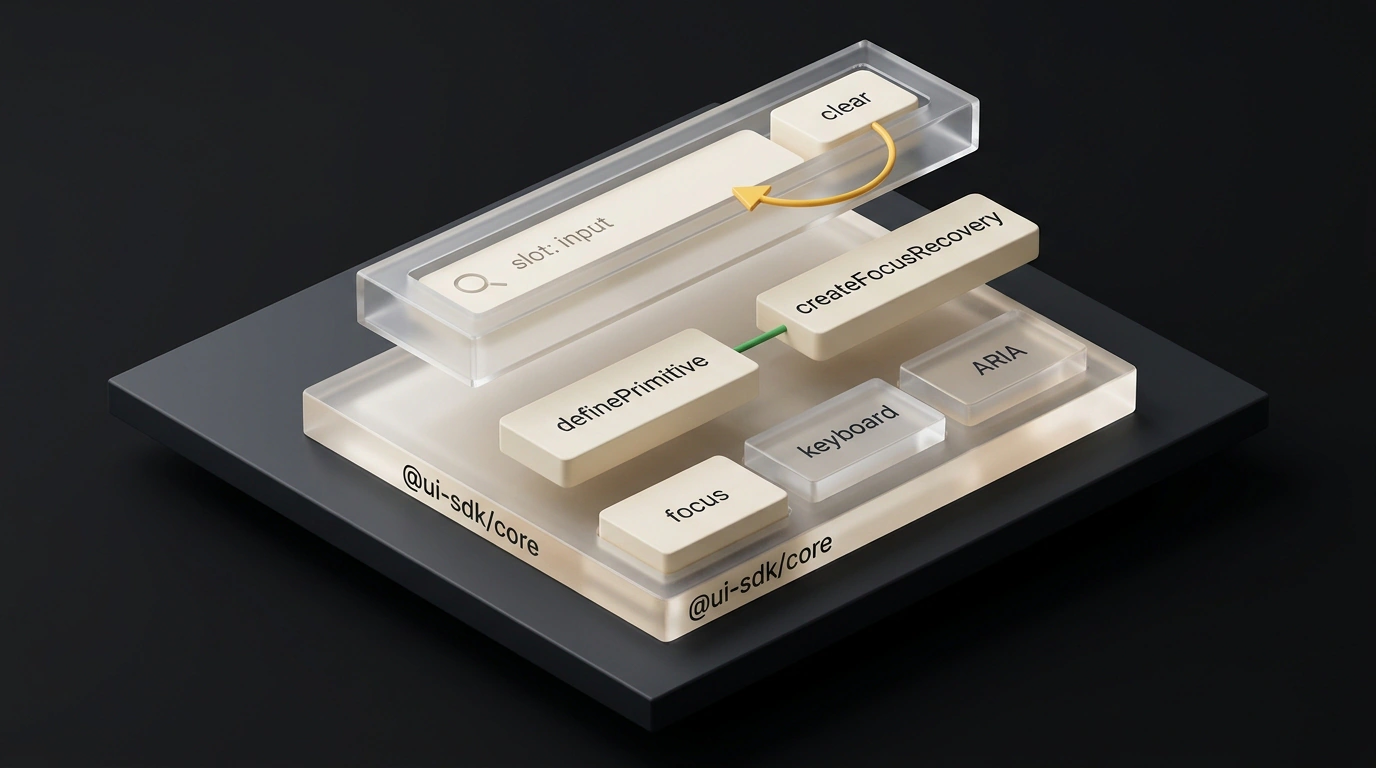
Vercel Labs has open-sourced UI SDK, and in its first month the vercel-labs/ui repo picked up 6.3k stars with five contributors. The name sounds like yet another button-and-modal kit, yet it's something quite different. It's a headless core—@ui-sdk/core—that houses complex behavior logic without a single line of CSS so AI agents stop breaking accessibility in custom components.
Vercel Labs UI SDK project card (Source: ui-sdk.dev)
Why Agent-Generated UI Breaks on the Details
Ask a coding agent to build a search field with a clear button or a dropdown menu. Half a minute later, a clean-looking component appears on screen. Then you test it with a keyboard, and the magic vanishes.
A user types a query, hits Tab, and presses Enter on the "Clear" button. The input clears, the button disappears from the DOM, and browser focus drops straight to <body>. To type another query, the user has to reach for the mouse. Along with focus, ARIA attributes (HTML hints for screen readers and keyboards), Escape-key popup closing, and selection states often break too.
@ui-sdk/core takes over that grunt work: keyboard navigation, focus management, selection, dismissal, popups, drag-and-drop, and the right ARIA wiring. Being headless means it ships only the logic, leaving you free to style any design.
Primitives, Slots, and an Agent Skill
Setup takes two commands. You install the core plus a framework adapter, then hand the agent the official skill—a rules file that keeps the model writing against the current API instead of guessing.
# Swap react for vue, svelte, solid, or web
npm install @ui-sdk/react @ui-sdk/core

# Official skill for your AI agent
npx skills@latest add vercel-labs/ui --skill ui-sdk
Next, you define the behavior once with definePrimitive. It holds three blocks: state, methods (api), and slots—named parts of the component such as the input field and clear button.
import { createFocusRecovery, definePrimitive } from "@ui-sdk/core"

export const searchField = definePrimitive({
  name: "search-field",
  state: () => ({ value: "" }),
  api: (ctx) => ({
    set: (value: string) => ctx.store.set({ value }),
    // If the button vanishes, focus returns to the input
    recovery: createFocusRecovery({
      fallback: () => ctx.element("input"),
    }),
  }),
  slots: (slot) => ({
    input: slot({
      attrs: (state) => ({ value: state.value }),
      on: {
        input: (e, { api }) =>
          api.set((e.target as HTMLInputElement).value),
      },
    }),
    clear: slot({
      // Button stays in the DOM while input is non-empty
      present: (state) => state.value !== "",
      attrs: () => ({ type: "button" }),
      press: ({ api }) => api.set(""),
      bind: (el, part) => part.api.recovery.bind(el, part),
    }),
  }),
})
The secret sauce sits in createFocusRecovery inside the clear slot: when the button disappears after a click, focus automatically returns to input. The README jokes that you won't have to learn this code yourself because agents will pick it up—though you'll still be the one reading these primitives in code review.
The finished search-field.ts file wires into React, Vue, Svelte, Solid, and Web Components via createParts:
// Rendering the same primitive in React
import { createParts } from "@ui-sdk/react/primitive"
import { searchField } from "./search-field"

const parts = createParts(searchField, { input: "input", clear: "button" })
const { Root, Input, Clear } = parts

export function Search() {
  return (
    <Root>
      <Input placeholder="Search" />
      <Clear>Clear</Clear>
    </Root>
  )
}
In Vue, Svelte, and Solid, only the adapter import changes. In @ui-sdk/web, it registers <search-field>, <search-field-input>, and <search-field-clear> tags using wrappedChild("input") and wrappedButton.
Beta Status, Requirements, and Alternatives
The project is open-source under Apache License 2.0, yet it sits in public beta 0.1.0-beta.x under Vercel beta terms: the API may break before 1.0.0. The adapters require bleeding-edge versions—React 19+, Vue 3.5+, Svelte 5.33+, and Solid 2.0—so it won't drop into older apps without an upgrade.
Compared to the broader ecosystem, Radix UI and Base UI offer mature components but tie you to React. Cross-framework tools like Zag.js and Ark UI build complete widgets on state machines, whereas UI SDK gives you a low-level behavior builder tailored for agent workflows. For prototypes on a modern stack it's a compelling idea, though for long-lived production apps it's smarter to wait for 1.0.