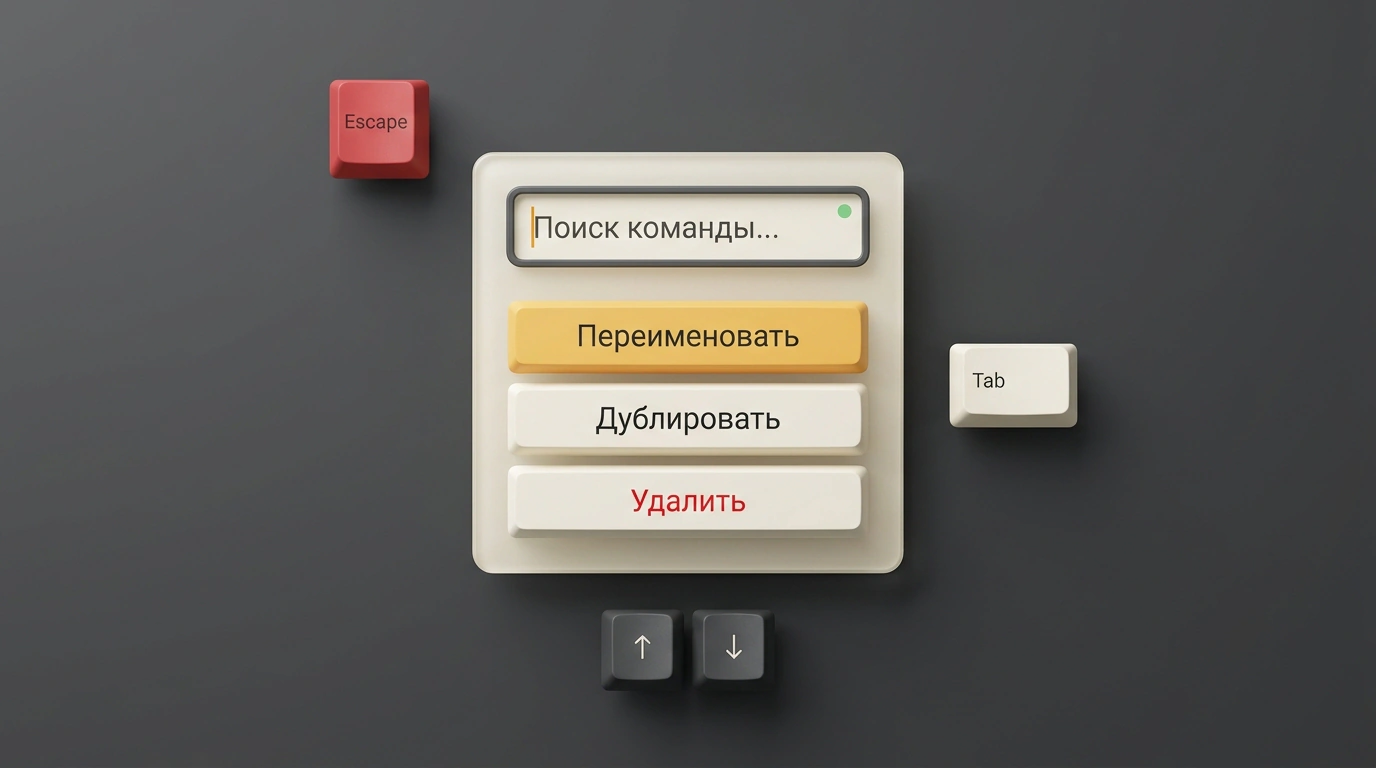
Think about how often you run into a dropdown menu with a built-in search bar in modern apps: the command palette in Notion, branch switching in GitHub, the action picker in Figma, or a tag selector in an issue tracker. On the surface, it looks trivial to any frontend developer: take a standard dropdown, drop an <input> inside, wire up an array filter, and call it a day.
Now try closing your eyes, turning on a screen reader, and navigating that component using only your keyboard. Nine times out of ten, things fall apart fast: input focus vanishes into thin air, the screen reader goes silent or reads out gibberish, arrow keys stop moving the text cursor, and pressing Escape closes the wrong overlay or wipes out the form you were filling in.
Base UI engineers Jenna Smith and James Nelson published a detailed architectural deep dive on building an accessible Filterable Menu. I dug into their reasoning to unpack why popular off-the-shelf patterns break accessibility standards and how to build a rock-solid component that pairs smooth keyboard navigation with honest WAI-ARIA semantics.
The W3C Principle: A Role Is a Promise
The #1 mistake developers make when building a searchable menu is mechanically slapping role="combobox" onto it. The logic seems obvious enough: there's a text input and a dropdown list below it, so it must be a combobox.
Yet the W3C WAI-ARIA Authoring Practices Guide (APG) lays down a foundational rule: "A role is a promise." When a screen reader announces a combobox to a blind user, they expect very specific behavior: they type characters, use the arrow keys to pick an option, press Enter—and the chosen value populates that exact input field (just like picking a city or country in a checkout form).
An Action Menu works completely differently at a conceptual level:
- Menu items aren't text values meant to fill a field. They are commands: "Rename file," "Duplicate," "Move to trash."
- Selecting an item triggers an application action and immediately closes the menu.
- The text box is merely a temporary sieve for filtering commands, not a standalone data field.
If you slap a combobox role onto an action menu, the screen reader promises the user a value picker, then executes a command on click instead. That is a jarring violation of accessibility expectations that leaves screen-reader users completely disoriented.
Why aria-autocomplete Doesn't Fit Here
The second common trap is reaching for aria-autocomplete="list". In the WAI-ARIA spec, that attribute is tightly coupled to managing a suggestion popup via aria-controls and aria-haspopup.
In an action menu, however, the popup is already open: the user clicked the trigger button, and the menu is on screen. Typing into the search box doesn't summon a new suggestion popup—it simply hides non-matching items in the list that is already displayed.
Worse, it creates an irreconcilable conflict with the Escape key:
- In a combobox, the first Escape press closes the suggestion list while keeping focus inside the input so the user can keep editing.
- In an action menu, pressing Escape must close the entire menu popup and return physical focus to the trigger button that opened it.
Trying to mash these two opposing interaction models into one component inevitably leads to brittle hacks and unpredictable navigation bugs.
Base UI's Architectural Choice: A Modal-Like Dialog
The Base UI team landed on a clean, principled design: the filterable popup menu is modeled as an accessible dialog (role="dialog"), inside which a search input and a classic command menu live side by side in isolation.
In the Accessibility Tree, the menu trigger declares aria-haspopup="dialog", and the popup container carries role="dialog" with a descriptive aria-label. When it opens, screen readers (VoiceOver, NVDA, JAWS) clearly announce entry into a dialog containing an isolated search box and menu items.
That gives the user immediate context: they know they're inside a temporary interactive overlay that they can exit at any moment with Escape or Tab.
Virtual Focus: Keeping DOM Focus in the Input
The next critical engineering hurdle is keyboard focus management. When the user opens the menu and starts typing, the browser's physical focus sits inside the <input>. The moment they press the Down Arrow key to pick a command, you hit a fork in the road:
- If you physically move DOM focus onto a
<button role="menuitem">, focus leaves the input. The user can no longer keep typing or hit Backspace to tweak their query without clicking back into the search box. - If you leave focus in the input without notifying the screen reader, a blind user has no idea which menu item is currently highlighted.
Infographic diagram of virtual focus in the DOM: input focus stays in the search field while aria-activedescendant links navigation to the menu item.
To resolve this tension, Base UI uses virtual focus powered by the aria-activedescendant attribute.
Physical input focus always stays locked inside the <input>. When the user presses Up or Down Arrow, DOM focus doesn't budge—the input keeps accepting keystrokes. Instead, JavaScript updates aria-activedescendant on the input to point to the ID of the currently highlighted menu item (for example, aria-activedescendant="action-rename").
The screen reader intercepts that attribute change and immediately announces the highlighted command, while sighted users see the familiar highlight bar. Both groups get a seamless, consistent experience.
Keyboard Navigation Nuances: Home, End, and Tab
When a text editor and a command list share the same component, standard navigation keys start stepping on each other's toes. Base UI's engineers established strict rules to resolve those collisions.
How Home and End behave:
- If there is already text in the filter input,
HomeandEnddo their natural job: jumping the caret to the start or end of the typed string. - If the input is empty, pressing
Homeimmediately highlights the first item in the menu, andEndjumps the highlight to the last available item.
How Tab behaves: pressing Tab cleanly closes the menu and moves focus to the next element on the page without a focus trap. Meanwhile, the input is rendered as type="text" with an explicit role="searchbox", avoiding native browser clear buttons (the little "X" icons) that break custom styling in WebKit and Chromium.
import { Menu } from '@base-ui/react/menu';

export function ActionMenu() {
  return (
    <Menu.FilterProvider>
      <Menu.Root>
        <Menu.Trigger aria-haspopup="dialog">Действия</Menu.Trigger>
        <Menu.Portal>
          <Menu.Positioner>
            <Menu.Popup role="dialog" aria-label="Меню действий">
              <Menu.Input
                type="text"
                role="searchbox"
                aria-label="Фильтровать действия"
                placeholder="Поиск команды..."
              />
              <Menu.Clear aria-label="Очистить поиск" />
              <Menu.Empty>Команды не найдены</Menu.Empty>
              <Menu.List>
                <Menu.Item id="action-rename">Переименовать</Menu.Item>
                <Menu.Item id="action-duplicate">Дублировать</Menu.Item>
                <Menu.Item id="action-delete">Удалить</Menu.Item>
              </Menu.List>
            </Menu.Popup>
          </Menu.Positioner>
        </Menu.Portal>
      </Menu.Root>
    </Menu.FilterProvider>
  );
}
Let's look at how the key-splitting logic works inside the input's keyboard event handler:
function handleInputKeyDown(
  event: React.KeyboardEvent<HTMLInputElement>,
  activeItemId: string | null,
  menuItems: string[]
) {
  const input = event.currentTarget;
  const isTextEmpty = input.value.length === 0;

  switch (event.key) {
    case 'Home':
      if (isTextEmpty && menuItems.length > 0) {
        event.preventDefault();
        setVirtualActiveDescendant(menuItems[0]);
      }
      break;

    case 'End':
      if (isTextEmpty && menuItems.length > 0) {
        event.preventDefault();
        setVirtualActiveDescendant(menuItems[menuItems.length - 1]);
      }
      break;

    case 'ArrowDown':
      event.preventDefault();
      moveToNextMenuItem(activeItemId, menuItems);
      break;

    case 'ArrowUp':
      event.preventDefault();
      moveToPreviousMenuItem(activeItemId, menuItems);
      break;
  }
}
If your menu includes multi-level nested submenus (cascading lists), each submenu must be wrapped in its own independent Menu.FilterProvider. Otherwise, virtual focus IDs from the parent and child levels will collide, and screen readers will start announcing hidden items from a neighboring branch.
Engineering Takeaways for Design Systems
Base UI's research is a great reminder that accessibility isn't a checkbox in a Lighthouse audit—it's a serious engineering discipline rooted in browser event architecture and W3C standards.
When designing components for your own design system, stick to three core rules:
- Don't confuse command menus with value pickers: if clicking an item triggers an action, use dialog and menu semantics—not a combobox.
- Don't steal focus from the user: virtual addressing via
aria-activedescendantkeeps text input uninterrupted while navigating the list. - Respect system keybindings: predictable handling of Home, End, Tab, and Escape is what separates a mature, reliable UI from a fragile prototype.