In modern web development, accessibility (a11y) too often feels like going to the dentist: everyone agrees it's vital, yet everyone puts it off until the last possible second. Most teams only remember WCAG standards when Legal gets a regulatory notice or an enterprise client demands a compliance certificate before signing.
In a panic, developers start sprinkling aria-label and role="button" onto plain <div> tags, hoping screen readers will somehow sort it out. The result is classic cargo-cult engineering: the attributes are technically there, yet a blind user or someone with a motor impairment still can't submit the form or close a modal with Escape.
To break that cycle, the UK's leading inclusive-design consultancy released the open-source TetraLogical Accessible Components Library (source code on GitHub), authored by renowned accessibility specialist Craig Abbott.
Let's look at why this library deserves close attention from any frontend developer—whether you write React, Vue, Svelte, or plain JavaScript.
Eight Core UI Patterns with Zero Framework Dependencies
TetraLogical's first—and smartest—architectural call was ditching frameworks and third-party runtimes entirely. There are no dependencies on React, Tailwind, Redux, or heavy polyfills. Every component is built with native semantic HTML5, clean CSS, and lean Vanilla JavaScript.
The initial release covers eight foundational interactive patterns that make up 90% of real-world interfaces:
- Accordion: expandable sections with proper up/down arrow key handling.
- Alerts: system notifications wired with
aria-live="polite"live regions. - Breadcrumbs: navigation trails wrapped in
<nav aria-label="...">. - Disclosure: a compact toggle button for showing and hiding extra content.
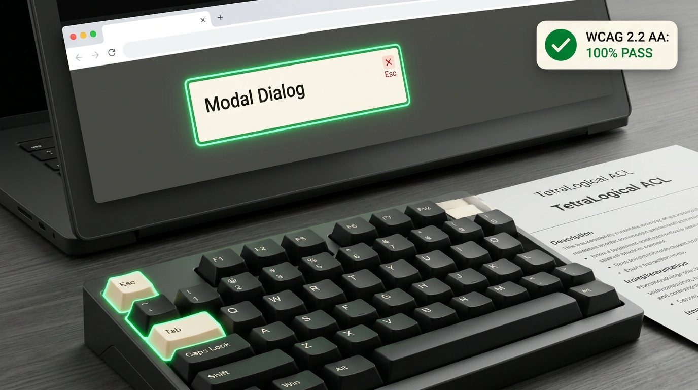
- Modal Dialog: an isolated dialog with strict Focus Trap behavior and background inertness.
- Pagination: page-by-page navigation announcing the active page via
aria-current="page". - Tabs: a tab group with proper
tablist,tab, andtabpanelroles plus arrow-key navigation. - Tooltip: a hint popup that opens on focus and dismisses on Escape. If you're tracking native browser tooltips, check out our look at Firefox 157 and native tooltip styling.
Anatomy of an Accessible Modal in Plain HTML and JS
Let's peek inside the modal implementation. In most third-party UI libraries, a modal is a bloated <div> plastered with event listeners. TetraLogical builds on the native HTML5 <dialog> element paired with careful focus management:
<!-- Accessible dialog markup -->
<dialog id="confirm-modal" aria-labelledby="modal-title" aria-describedby="modal-desc" class="c-modal">
  <div class="c-modal__inner">
    <h2 id="modal-title">Confirm account deletion</h2>
    <p id="modal-desc">This action is irreversible. All your projects will be permanently deleted.</p>

    <div class="c-modal__actions">
      <button type="button" class="btn btn--danger" id="confirm-delete">Delete forever</button>
      <button type="button" class="btn btn--secondary" id="cancel-delete">Cancel</button>
    </div>
  </div>
</dialog>
And here is the minimal JavaScript focus controller:
// Modal controller with focus management
class AccessibleModal {
  constructor(dialogElement) {
    this.dialog = dialogElement;
    this.previousFocus = null;

    // Close on Escape and restore focus
    this.dialog.addEventListener('keydown', (e) => {
      if (e.key === 'Escape') {
        e.preventDefault();
        this.close();
      }
    });
  }

  open() {
    this.previousFocus = document.activeElement;
    this.dialog.showModal(); // Native browser API that blocks background interaction

    // Move focus to the first interactive element
    const firstFocusable = this.dialog.querySelector('button, [href], input, [tabindex="0"]');
    if (firstFocusable) firstFocusable.focus();
  }

  close() {
    this.dialog.close();
    // Return focus to the element that triggered the modal!
    if (this.previousFocus && typeof this.previousFocus.focus === 'function') {
      this.previousFocus.focus();
    }
  }
}
Look closely at close(): returning focus to the exact element that opened the modal is a core WCAG 2.2 requirement that 8 out of 10 developers forget. Without it, closing the dialog drops screen-reader focus back to the top of the page, leaving a blind user completely disoriented.
Automating 97% of Accessibility Checks with Playwright and Cucumber
The most impressive engineering achievement in TetraLogical's project isn't the component code itself—it's the test suite.
Historically, accessibility testing was treated as purely manual work: you sat a specialist down with a screen reader (NVDA on Windows, VoiceOver on macOS) and clicked through the UI by hand. Static linters like axe-core only catch surface-level issues such as color contrast and missing attributes—at most 30–40% of real defects.
Craig Abbott's team went much further: they wrote each component's behavioral requirements in human-readable Gherkin via Cucumber and automated them in real browsers using Playwright!
Here is an example Gherkin test scenario:
Feature: Keyboard navigation in modal dialog
  Scenario: Closing the modal with Escape restores focus
    Given the modal is opened by clicking the "Delete" button
    When the user presses the "Escape" key
    Then the modal should be hidden
    And focus should return to the "Delete" button
With that setup, the authors automated 97% of all WCAG 2.2 acceptance criteria for their components. The suite verifies tab order, arrow-key handling, focus visibility, and role announcements across real Chromium, WebKit, and Firefox engines.
How to Use It in Your Projects
The library ships under a permissive MIT license, and you can adopt it in two ways:
- As a living reference specification: when building components for your company's React, Vue, or Angular design system, open TetraLogical's repo and copy the exact HTML structure, keyboard handling, and ARIA attributes.
- As a lightweight foundation: drop the native scripts and styles straight into your project and theme them via CSS variables with zero framework runtime overhead.
Inclusive design isn't charity or red tape—it's a marker of engineering maturity and respect for every person using your product.