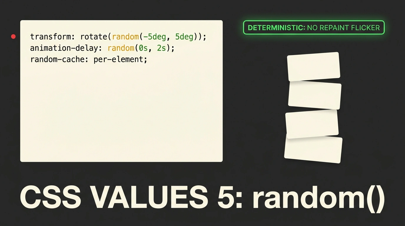
How many times have you caught yourself thinking: "Why on earth can't CSS just generate a random number yet?"
Every time designers ask for an organic touch—scattering snowflakes across a holiday landing page, tilting review sticky notes by a random 2–3 degrees, making background stars twinkle, or staggering card entrance delays in a catalog—frontend developers hit a brick wall.
Historically, we only had two workarounds:
- Preprocessors (Sass / SCSS): they offer a
random()function, but it runs once at build time on the server. Your compiled CSS ends up with hardcoded numbers that look identical for every visitor and bloat stylesheets with hundreds of clunky:nth-child(n)selectors. - JavaScript workarounds: computing
Math.random()in component code and piping values into inline styles likestyle="--delay: ...". That clutters markup, adds virtual DOM overhead, and breaks the declarative elegance of CSS.
Things are finally changing: the CSSWG has added a native random() function to the official working draft of the CSS Values and Units Module Level 5 specification.
Let's unpack how this function works, what pitfalls await layout engineers, and why its arrival in browsers is a long-awaited milestone for web animation.
Syntax and Grammar: Units, Ranges, and Step Size
Unlike JavaScript's Math.random(), which returns a unitless float between 0 and 1, CSS random() is built from the ground up for real web units: pixels, percentages, degrees, seconds, and relative font units.
The basic signature takes a minimum and maximum value, plus an optional discretization step:
/* Basic random tilt from -5 to 5 degrees */
.sticky-note {
  transform: rotate(random(-5deg, 5deg));
}

/* Random font size snapped to 4px steps */
.tag-cloud-item {
  font-size: random(12px, 28px, 4px);
}

/* Random animation delay in tenths of a second */
.animated-card {
  animation-delay: random(0s, 1.5s, 0.1s);
}
Pay attention to that third argument—the step. Write random(10px, 50px, 10px), and the browser picks strictly from discrete values: 10px, 20px, 30px, 40px, or 50px. That lets you snap random spacing and sizing straight to your design system's modular grid, avoiding blurry fractional pixels on standard-density displays.
The Core Architectural Challenge: Flickering and Determinism Keys
Sounds simple enough, right? Yet when browser engine engineers started designing randomness into rendering, they ran into a fundamental problem: the repaint and reflow lifecycle.
Imagine giving a button a random rotation angle. A user hovers over it (:hover), scrolls the page, or resizes the window. The browser triggers style recalculation. If random() generated a fresh number every time, the button would jitter uncontrollably on every mouse move! Re-rendering a table would make the entire layout jump around, causing catastrophic Cumulative Layout Shift.
To solve that, the spec introduces a clever concept: a caching key (seed identifier), detailed by Google Chrome developer Bramus Van Damme on the Bramus blog.
With an explicit key, the syntax looks like this:
/* Generated once and stably bound to each specific element */
.gallery-photo {
  transform: rotate(random(--photo-seed, -4deg, 4deg));
}
Here's what happens under the hood:
- The first argument starting with a double hyphen (
--photo-seed) acts as the generator's identifier. - The browser computes a pseudorandom value once per matching DOM element and caches it.
- Hovers, scrolls, or parent class changes never disturb that value: the element stays visually rock-solid for the lifetime of the page.
Better yet, if you want to synchronize multiple properties on the same element (say, keeping a random bubble's width and height proportional), you reuse the exact same key:
.particle {
  --size: random(--bubble-seed, 10px, 60px);
  width: var(--size);
  height: var(--size);
  /* Delay needs its own independent roll, so use a different key! */
  animation-delay: random(--time-seed, 0s, 3s);
}
Sibling Function random-item() for Lists of Values
Beyond numeric ranges, the spec adds a companion function called random-item(). Instead of picking from a continuous interval, it selects randomly from an arbitrary list of keywords, colors, or identifiers:
/* Pick a random accent color from the design system palette */
.badge {
  background-color: random-item(--badge-color, var(--color-blue), var(--color-emerald), var(--color-purple));
}
That completely eliminates sprawling :nth-child(4n + 1) cascades just to paint blog tags in rotating brand colors.
Where random() Shines—and Where to Avoid It
random() breathes fresh life into pure CSS, provided you use it with restraint:
Great use cases:
- Organic background patterns (starfields, rain, floating dust particles).
- Desynchronizing looped animations so 20 floating elements don't march in lockstep like soldiers.
- Subtle handcrafted imperfections (typewriter-style letter jitter, natural card tilts).
Dangerous cases to avoid:
- Grid and Flexbox track sizes: random column widths wreck responsive predictability and cause chaotic line wrapping.
- Critical text colors: random hues will inevitably violate WCAG contrast ratios against light or dark backgrounds.
If you keep up with emerging web platform standards, check out our roundup on Chrome 156 features: random numbers in CSS,