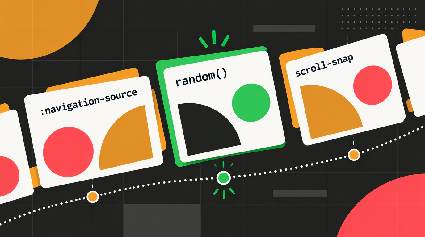
Every Chromium release is a milestone for frontend engineers. While minor updates often focus on patching regressions and tuning V8 under the hood, Chrome 156 lands with several long-awaited web standards that genuinely simplify day-to-day UI work.
The headline feature is the official implementation of the random() math function from the CSS Values and Units Module Level 5 draft spec. What used to require injecting inline styles with JavaScript or compiling thousands of lines of Sass loops now runs natively inside Blink’s stylesheet engine.
Let’s walk through the biggest additions in Chrome 156, inspect the syntax, and see how they change modern CSS layouts.
Native random() in CSS: Organic Chaos Without JS
Until now, adding subtle, organic imperfection to a web UI was surprisingly tedious. Picture a common design request: you’re laying out sticky notes on a board, confetti particles, or a grid of blog cards, and you want each card tilted slightly between -4 and +4 degrees with a slightly varied background tint.
Previously, you either wrote JavaScript to walk the DOM and set inline custom properties like card.style.setProperty('--angle', Math.random() * 8 - 4 + 'deg'), or generated thirty .card--1, .card--2 modifier classes in Sass. The JS route cluttered markup, fought SSR, and caused jarring hydration flashes; the Sass route bloated your CSS bundle by tens of kilobytes.
In Chrome 156, random() handles it cleanly and declaratively:
/* Basic syntax: a random value within a given range */
.sticker {
  /* Random angle from -4deg to 4deg in 0.5deg steps */
  transform: rotate(random(-4deg, 4deg, by 0.5deg));

  /* Random wobble animation duration */
  animation-duration: random(2s, 5s);

  /* Random hue in the modern Oklch color space */
  background-color: oklch(0.85 0.12 random(0, 360));
}

/* Festive confetti effect in pure CSS */
.confetti-particle {
  left: random(0vw, 100vw, by 5vw);
  animation-duration: random(1.5s, 4s);
  background-color: hsl(random(0, 360), 85%, 60%);
}
How Caching Works: No Infinite Repaint Loops
Any thoughtful engineer’s first question is obvious: "If my stylesheet calls random(), won’t the browser frantically re-roll the PRNG on every animation frame or hover state, triggering an endless Repaint/Reflow cycle?"
Both the W3C spec authors and Blink engineers built in safeguards:
- Evaluated during the Style Cascade: the random value is generated once when the style cascade applies to a given DOM element.
- Seed Keys: the function accepts an optional seed identifier as its first argument. Pass a custom ident or an element attribute, and the generated value stays locked to that key:
/* Using a custom identifier for deterministic randomness */
.gallery-card {
  --seed: attr(data-id type(<custom-ident>));
  width: random(--seed, 280px, 340px);
  transform: rotate(random(--seed, -3deg, 3deg));
}
Even if the user scrolls repeatedly, resizes the window, or triggers layout recalculations nearby, the card with data-id="card-42" keeps the exact width and tilt it got on initial render.
Progressive Enhancement
Since Chrome 156 is the first browser to ship native random()—with WebKit (Safari) and Gecko (Firefox) still working on it—make sure to wrap production usage in @supports:
.sticker {
  transform: rotate(0deg); /* Safe baseline fallback */
}

@supports (transform: rotate(random(0deg, 10deg))) {
  .sticker {
    transform: rotate(random(-4deg, 4deg, by 0.5deg));
  }
}
The
The second major addition in this release is the :navigation-source pseudo-class.
Infographic of CSS pseudo-class selectors: adaptive page styling based on how the user navigated to the page.
Until now, a web page had no idea in CSS how the user arrived. Did they click a link from search results? Hit the browser’s Back button? Submit a POST form? Or mash Ctrl+R to reload?
Now that navigation context is exposed directly to CSS selectors, unlocking super clean transition logic:
/* Navigation animations paired with View Transitions */
@media (prefers-reduced-motion: no-preference) {
  /* User navigated back via history (BFCache / Back-Forward) */
  :root:navigation-source(traverse) .page-container {
    animation: slideInFromLeft 0.35s ease-out;
  }

  /* Standard forward link navigation (Push navigation) */
  :root:navigation-source(push) .page-container {
    animation: slideInFromRight 0.35s ease-out;
  }

  /* Page was explicitly refreshed via F5 or reload */
  :root:navigation-source(reload) .status-toast {
    display: block;
    animation: fadeInOut 3s forwards;
  }
}
The selector supports push, replace, reload, and traverse, letting you ditch brittle JavaScript history interceptors and control screen slide directions purely in CSS.
We also covered how smooth scrolling and platform controls are evolving in scroll customization in Chrome 154 and new features in Chrome 155.
Kinetic Scrolling Optimizations for scroll-snap
scroll-snap-type has become the standard way to build carousels and full-screen sections. On touchscreens, though, a fast flick (inertial kinetic scrolling) often caused a frustrating glitch: the container would overshoot the target item, bounce awkwardly, or stall halfway between two slides.
In Chrome 156, the inertial scrolling math was rewritten:
.story-carousel {
  display: flex;
  overflow-x: auto;
  scroll-snap-type: x mandatory;
  scroll-behavior: smooth;
  -webkit-overflow-scrolling: touch;

  /* Strict snapping in Chrome 156: prevents skipping multiple slides in one swipe */
  scroll-snap-stop: always;
}

.story-card {
  flex: 0 0 100vw;
  scroll-snap-align: center;
}
The browser now continuously calculates the deceleration vector and smoothly magnetizes to the nearest slide even on aggressive swipes, making web carousels feel indistinguishable from native iOS and Android screens.
What Else Landed in Chrome DevTools?
- Scroll-driven Animations Range Inspector: the Elements panel now includes an interactive timeline scrubber. Dragging the virtual scroll thumb lets you see in real time how properties interpolate at
entry 0%,cover 50%, andexit 100%. - Live Dead-Style Highlighting: the Styles pane now dynamically grays out selectors that technically matched an element but were completely overridden by higher-specificity rules or had zero visual effect on rendering.
Chrome 156 makes one thing clear: modern CSS is steadily turning into a self-sufficient, expressive, and remarkably smart UI language.