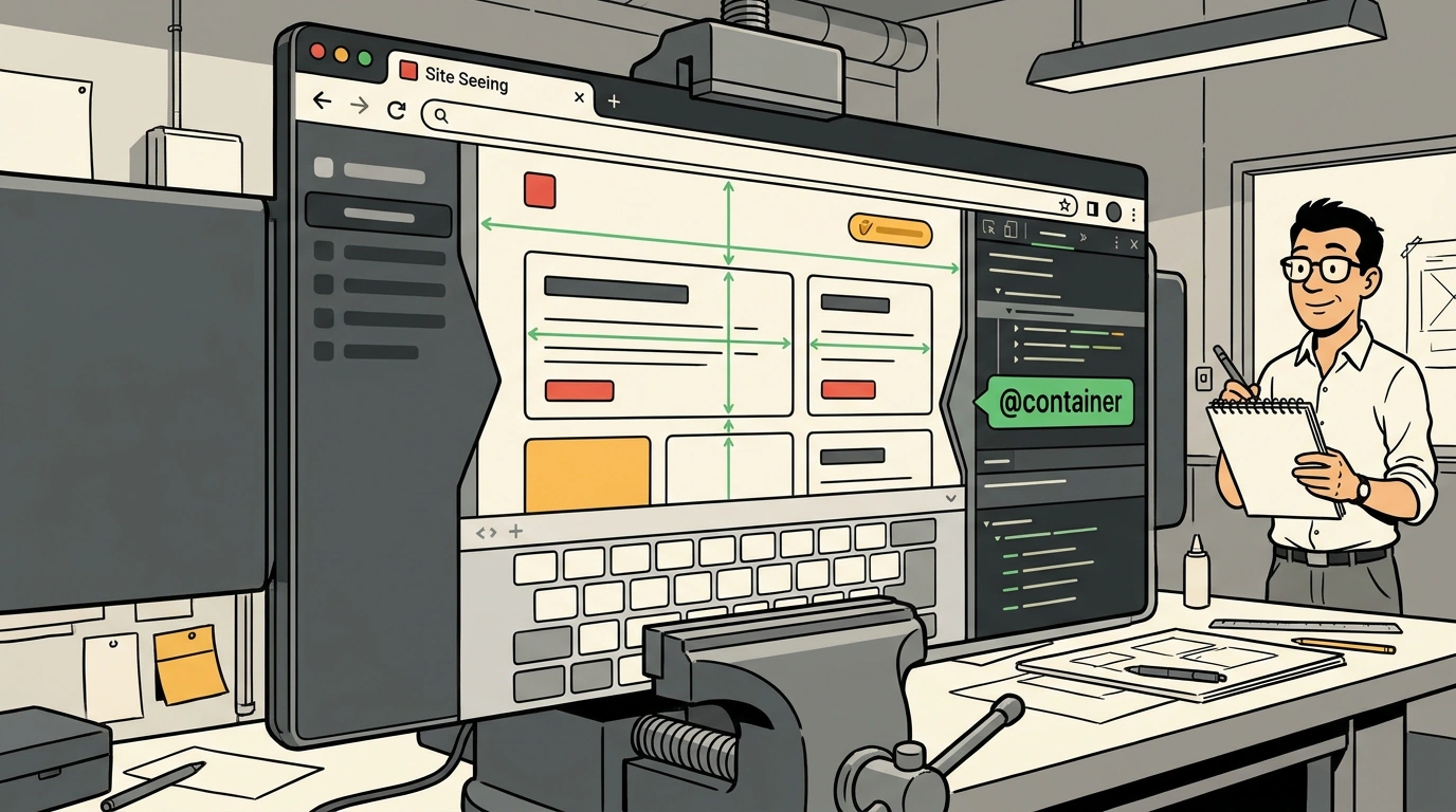
How do most developers test whether a site is responsive? They open Chrome DevTools, pick something like an iPhone 14 Pro from the device list, drag the window left and right a couple of times, and close the tab with peace of mind: "Works on mobile, looks great on desktop."
Yet real users have long lived in a far weirder environment. Some browse the web with a vertical tabs sidebar in Arc, Edge, or Brave eating up 300 pixels horizontally. Others keep a site in Split View right next to a code editor. And developers and testers constantly keep an inspector panel docked on the right.
As a result, the actual viewport takes on extreme proportions: for example, a desktop width of 450 pixels at a height of 900 pixels. And in that "gray zone," classic layouts built around standard media query breakpoints (375px, 768px, 1200px) fall apart completely.
Frontend engineer and UI designer Ahmad Shadeed has released Site Seeing, a tool that vividly demonstrates UI issues outside familiar frames, as we recently noted in our overview of responsive testing with Site Seeing.
Let's look at the scenarios this playground exposes and how to protect your interfaces with defensive CSS techniques.
Life Beyond Breakpoints: Side Tabs and Docked DevTools
The core idea of Site Seeing is to place a web page inside the context of real browser chrome:
- Docked developer tools: When the DevTools panel is pinned to the side of the screen, the rendering area shrinks to smartphone dimensions, yet the browser retains desktop input devices (mouse hover states, no touchscreen). Scripts that naively check screen width to switch to a mobile UI start behaving erratically.
- Vertical browser tabs: A sidebar eats 200 to 350 pixels. A page designed for a 1024px breakpoint suddenly collapses into tablet view on a 1280px laptop screen or breaks a three-column grid.
- Browser Zoom: At 125% or 150% zoom, system fonts and spacing grow faster than containers, causing unwanted horizontal scrolling.
- On-screen smartphone keyboard: When a user taps an input field, the virtual keyboard takes up to half the screen height. If the page has a
position: fixedheader and footer, the usable content area collapses into a tiny 150-pixel slit.
Defensive CSS: Layout Survival Rules in Extreme Proportions
Analyzing interfaces in Site Seeing leads to a clear set of Defensive CSS engineering rules that prevent breakages:
- Never trust a rigid
100vh: On smartphones, the classic100vhunit ignores the appearance of the keyboard and the floating address bar. For full-screen blocks, use dynamic units likemin-height: 100dvhor a safe percentagemin-height: 100%. - Move from Media Queries to Container Queries (
@container): Global screen breakpoints are helpless when sidebars are open. A product card or comments block should adapt its internal layout to the width of its parent slot, not to a mythical "browser window width." - Protect flex items from overflow:
By default, flex children have
min-width: auto. If a long word, URL, or email sits inside, the block stretches its parent and breaks the layout. Combiningmin-width: 0withoverflow-wrap: break-wordguarantees safe line wrapping under extreme viewport compression.
Ahmad Shadeed's tool is available online and runs right in the browser. It's a great playground for joint code reviews with designers, helping you craft flexible, resilient interfaces without relying on outdated screen templates.