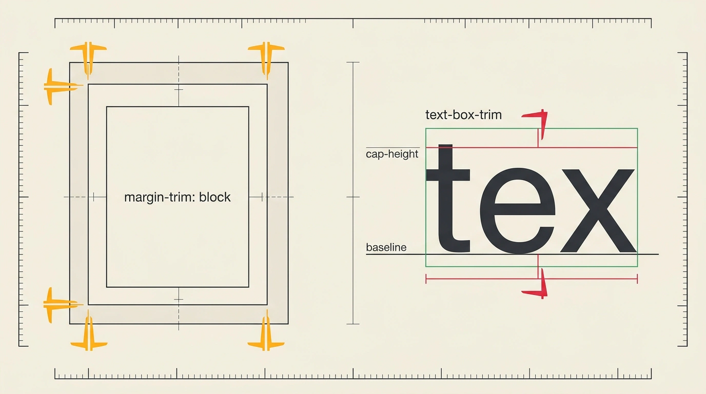
There are a couple of things in UI layout that trip up everyone at first—both beginners opening their very first stylesheet and seasoned frontend engineers. You give a product card an even padding: 1.5rem on all sides, drop in a heading with three paragraphs of description, add an order button with matching top and bottom padding—and on screen, it still looks off. There's an awkward blank strip above the heading, and the label inside the button visually sinks toward the bottom. Your first instinct is always to hunt for a bug in your cascade or blame the designer's mockup.
In reality, you didn't do anything wrong: that's just how the CSS box model and browser font metrics have historically worked. The real question is how to get rid of extra spacing inside cards and off-center button labels using modern CSS—without piling up brittle :first-child selectors or nudging paddings by hand. What I loved in recent browser updates is that with Chrome 155 and the evolution of CSS Inline Layout Module Level 3, native properties margin-trim, text-box-trim, and text-box-edge now handle this geometric busywork for you.
Where Extra Card Gaps Come From and Why Old Selector Tricks Break Layouts
Take a typical .card component with a heading and three paragraphs. To keep the text from jamming together, you give the elements margin-top: 1rem and margin-bottom: 1rem. Between paragraphs, those margins maintain a clean 1rem rhythm. But at the top edge of the card, the first element's margin-top: 1rem meets the container's padding: 1.5rem and stacks on top of it. The result is a 2.5rem gap at the top and bottom instead of 1.5rem, throwing off your vertical rhythm.
For years, we patched this asymmetry on the child elements: resetting the top margin on the first child with .card > :first-child { margin-top: 0; } and the bottom margin on the last with .card > :last-child { margin-bottom: 0; }, or offsetting it with a negative margin-top: -1rem. That workaround survives only until the first template edit.
The moment a teammate wraps the card text in a semantic <article> or <div>, or a framework dynamically hides the last block, :first-child clears the margin on the outer wrapper while the nested heading pushes the content right back down by 1rem. And at the bottom of that same card sits the second classic trap: the order button, where symmetrical vertical padding still leaves the label sagging toward the bottom border because of invisible air baked into font metrics.
How margin-trim Slices Edge Margins in Block and Multi-Column Containers
The old hacks treated the symptom on child elements, even though the parent container is the one responsible for its own edges. That's the shift behind margin-trim, covered in Frontend Developer's Library following Rachel Andrew's October web platform roundup. Instead of chasing the first and last tags, you tell the container itself to automatically trim child margins wherever they touch its boundaries.
Put simply, .card acts like a cookie cutter along the perimeter of its padding. The browser keeps the 1rem spacing between the heading and the three paragraphs inside the card, while collapsing any outer margin flush against the container edge down to zero. The property follows logical flow axes:
margin-trim: none— default behavior, margins stay untouched;margin-trim: block— trims start (margin-block-start) and end (margin-block-end) margins along the block axis (top of the first child, bottom of the last);margin-trim: inline— strips side margins at the container edges, which helps in multi-column layouts (column-count);margin-trim: block inline— trims margins along all four edges of the container.
Safari has supported the property since version 16.4, and Chrome 155 enabled margin-trim for block (display: block) and multi-column containers. One important detail: support for Flexbox and Grid is still in the works, and Firefox doesn't understand it yet, so in production design systems I recommend keeping a @supports safety net.
Let's style our product card with three paragraphs using margin-trim: block and a safe fallback:
.card {
  display: block;
  padding: 1.5rem;
  margin-trim: block;
}

.card h3,
.card p {
  margin-top: 1rem;
  margin-bottom: 1rem;
}

@supports not (margin-trim: block) {
  .card > :first-child { margin-top: 0; }
  .card > :last-child { margin-bottom: 0; }
}
In Chrome 155 and Safari, the engine finds the outermost nodes inside .card on its own and zeros out the heading's top margin-top: 1rem and the third paragraph's bottom margin-bottom: 1rem. Distance from the card edges to content becomes an exact 1.5rem all around, while the 1rem rhythm between paragraphs stays intact. Even if someone adds a <div> wrapper later, the outer margin still gets trimmed cleanly, and @supports preserves the layout in older browsers.
Precision Button Centering: How text-box-trim and text-box-edge Strip Half-Leading
At the bottom of our card sits the order button, which was the focus of the channel's second breakdown. Why do two fonts at the exact same size leave different amounts of empty space above and below the letters? Just like lead type blocks in a printing press, every digital glyph lives inside an invisible rectangular box with built-in vertical headroom.
The browser splits the difference between font size and line-height in half and adds it above and below—that's half-leading. On top of that, letters sit on an invisible shelf called the alphabetic baseline. Below it, the font reserves a basement for descenders like y and p, while above the tops of capital letters (cap-height) it leaves room for diacritics. In an uppercase or title-case "Order" button, that bottom descender space sits empty, so the optical center of the capital letters ends up higher than the middle of the line box. Hacks like line-height: 1 or manual padding-top tweaks break fast: swap the font and centering drifts, or wrap the label onto two lines and the lines collide.
Pairing text-box-trim and text-box-edge (or the text-box shorthand) hands control over font metrics back to you:
text-box-trimpicks which sides lose half-leading: top (trim-start), bottom (trim-end), or both (trim-both—short notes sometimes call itboth, but the standard keyword istrim-both);text-box-edgesets the trim targets:cap alphabeticslices the top right atcap-heightand the bottom at thealphabeticbaseline, whileex alphabeticaligns the top with lowercase x-height.
Let's dial in exact centering for our card's order button and badge:
.card__button {
  display: inline-flex;
  align-items: center;
  padding: 0.75rem 1.5rem;
  line-height: 1.4;
  text-box-trim: trim-both;
  text-box-edge: cap alphabetic;
}

.card__badge {
  padding: 0.25rem 0.625rem;
  text-box: trim-both cap alphabetic;
}
The engine trims excess half-leading above the first line and below the last line of .card__button, measuring 0.75rem straight from the top of capital letters and the alphabetic baseline. Meanwhile, a two-line button still keeps a comfortable line-height: 1.4. What I find especially practical is that this pair already works in Chrome 133+, Safari 18.2+, and Firefox 154+, and older browsers simply ignore it without breaking the button.
For buttons with capital letters, use cap alphabetic. For small tags set in lowercase (like #css or online), switch to ex alphabetic so the box aligns cleanly to lowercase x-height.
We covered other native replacements for old workarounds in our roundup of 12 modern CSS features without preprocessors and our look at Chrome 155's symbols() function and JPEG XL support.
You can test both features live in two minutes right in your browser: open DevTools on your current project, grab your base .btn class, add text-box: trim-both cap alphabetic, and put margin-trim: block on any text card. Toggle the checkboxes on and off—you'll immediately see phantom pixels vanish and text snap dead-center inside its frame without a single hack.