"It's not every day our browser launches on a brand-new platform," WebKit engineers wrote in their official announcement, immediately reassuring developers: "Chances are, you don't need to do anything at all."
Sounds tempting, doesn't it? Apple launched the Apple HomeView smart home display, put WebKit-powered Safari on it—alongside macOS, iOS, iPadOS, and visionOS—and promised websites would work out of the box. Yet when I dug into the release's technical guidance, a crucial caveat stood out: "do nothing" only holds if your layout doesn't make rigid assumptions about screen shape and input. How do you prepare a site for a square kitchen display with voice control so the interface doesn't break on the very first popup?
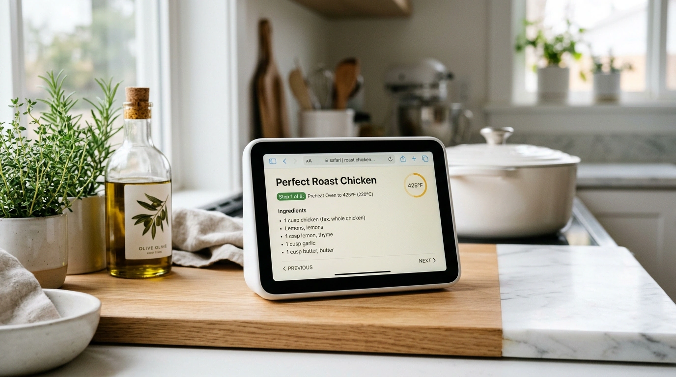
Let's test this against the end-to-end example from WebKit's docs—a "Perfect Roast Chicken" recipe page. Someone is standing at the counter with messy hands, HomeView is glowing beside them, and they ask by voice to open the recipe. Let's see what constraints the page runs into and which techniques keep it working smoothly.
A 7-Inch Square Screen: How Apple HomeView Differs From Phones and Tablets
For years, responsive design rested on a simple mental model: you're either looking at a tall smartphone screen or a wide laptop monitor. Classic grids assumed that even on a narrow mobile viewport, you always had at least 600 pixels of height to spare.
Apple HomeView breaks that assumption. It's a stationary 7-inch touchscreen built for a kitchen counter or hallway with a nearly square display (roughly a 1:1 aspect ratio). In Safari's developer emulation mode, the viewport measures just 448×364 pixels.
A height of 364 pixels is nearly half that of a smartphone. At the same time, how people interact with the page shifts too:
- Two interaction distances: up close, someone taps the 7-inch screen with a finger (requiring generous tap targets), while from across the room they control the browser by voice.
- Noisy environment: water is running and the range hood is humming, so recipe videos get watched with captions on.
- Stationary setup: this is a tabletop or wall-mounted display that doesn't install phone apps.
Under the hood, it's the same up-to-date WebKit engine. But the moment "Perfect Roast Chicken" lands in a 364-pixel-tall window, every hardcoded assumption about a "tall mobile screen" turns against you. We ran into a similar constraint in our article on testing responsiveness beyond familiar viewports, when on-screen keyboards or sidebars squeeze workspace height. On HomeView, that squat square is the permanent default.
The 448×364 Short-Viewport Trap and Fixing Modals With svh
What happens to a cooking site inside a 448×364 window? Fixed headers and footers (position: fixed or sticky) deal the first blow. On a phone, a top nav bar and a bottom cookie banner take up a modest slice of the screen; at 364 pixels tall, they swallow almost the entire viewport, leaving a tiny mail slot for the recipe.
Modal dialogs are even worse—say, a newsletter signup popup over "Perfect Roast Chicken." If the card assumes more than 600 pixels of height, its top edge with the close × button shoots right off the 364-pixel screen, trapping the reader.
To keep popups from clipping on a short square display, cap their height with small viewport units and enable internal scrolling:
.modal {
  max-height: 90svh;
  overflow-y: auto;
}
The 90svh (Small Viewport Height) unit ties the block's height ceiling to 90% of the visible area with Safari's UI chrome accounted for. On HomeView's 364-pixel-tall screen, the signup modal shrinks to roughly 327 pixels: the close button stays reachable, and overflow-y: auto adds a vertical scrollbar inside the card.
A second trap hides in browser headers. Safari on HomeView sends iOS in its User-Agent string. Here, the old habit of guessing hardware from the browser string backfires: any script doing User-Agent sniffing mistakes the kitchen display for an iPhone and pops up a "Download our app!" banner.
Dropping User-Agent parsing takes minimal effort and pays off big in reliability:
- Check API support with Feature Detection, just as with adapting interfaces for foldable screens in Safari.
- Instead of custom overlays, use native Smart App Banners—Safari automatically recognizes HomeView and hides the mobile app banner.
Open your site on a smartphone in landscape mode—the short height immediately exposes cramped headers and popups. For exact debugging on a Mac, switch on Safari's Responsive Design Mode and set the viewport to 448×364.
Hands-Free Voice Control and Cooking Mode via Schema.org Recipe
Once screen geometry is sorted out, distance control takes center stage. A cook standing by the oven isn't clicking a mouse on "Perfect Roast Chicken"—they're issuing voice commands.
Someone speaking to a page doesn't point at coordinates; they call out an element by name. If a timer button is built as <div onclick="...">, the voice assistant can't target it. That makes semantic HTML critical on HomeView: real <button> and <a> tags, plus form fields with explicit labels. And so video clips (theshow.mp4 and theshow.webm) stay readable in a loud kitchen, attach WebVTT captions to <video controls> using <track default kind="captions" srclang="en" label="English" src="captions.vtt">.
The biggest platform perk unlocks through structured data. If you mark up "Perfect Roast Chicken" with Schema.org Recipe in JSON-LD, Safari offers a dedicated native cooking view:
<script type="application/ld+json">
{
    "@context": "https://schema.org",
    "@type": "Recipe",
    "name": "Perfect Roast Chicken",
    "image": "https://example.com/roast-chicken.jpg",
    "prepTime": "PT15M",
    "cookTime": "PT1H20M",
    "recipeYield": "4 servings",
    "recipeIngredient": [
        "1 whole chicken (4–5 lb)",
        "3 tbsp unsalted butter, softened"
    ],
    "recipeInstructions": [
        { "@type": "HowToStep", "text": "Preheat the oven to 425°F (220°C)." },
        { "@type": "HowToStep", "text": "Rub the butter all over the skin." }
    ]
}
</script>
When Safari spots "@type": "Recipe" inside <script type="application/ld+json">, it reads the dish name ("Perfect Roast Chicken"), photo, prep time ("PT15M"—15 minutes), cook time ("PT1H20M"—1 hour 20 minutes), yield ("4 servings"), recipeIngredient list, and recipeInstructions steps from HowToStep objects. Over the page, the system renders a clean kitchen UI with large buttons for browsing ingredients and stepping through instructions—from preheating the oven to 425°F (220°C) to rubbing butter over the skin.
Of course, every tool has its place: a news portal or B2B dashboard doesn't need Recipe schema and will lean on flexible grids and semantic elements instead. There's no magic button that adapts a cluttered UI to every new form factor without an engineer's touch. But Apple HomeView's rules are clear: test at 448×364, cap modals with 90svh, swap User-Agent sniffing for Feature Detection, and give voice control semantic markup with structured data.