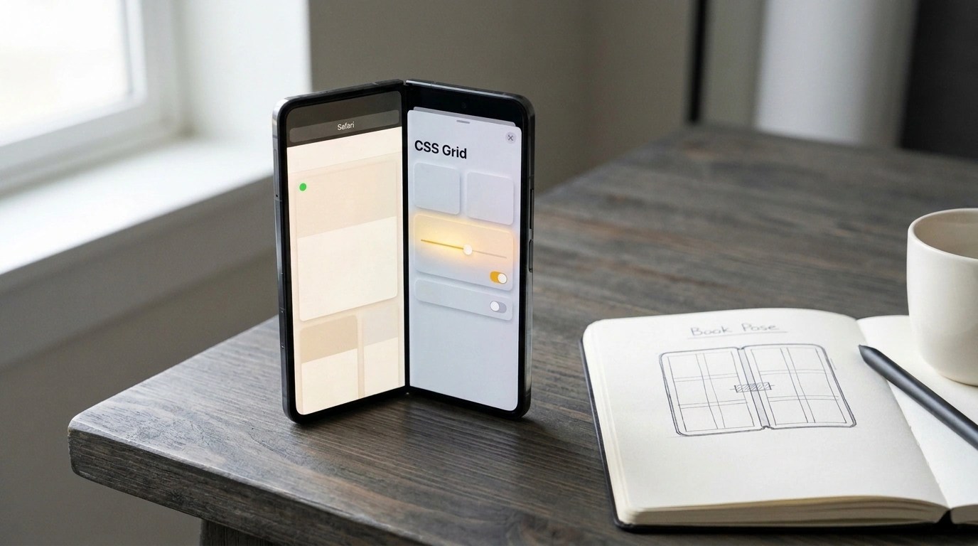
For a long time, foldable mobile devices looked like niche curiosities to web developers. Most frontend engineers treated flexible smartphones like ordinary tablets—assuming a standard @media (min-width: 768px) query would kick in and cleanly split the layout into two columns.
That optimism hits the physical reality of a foldable display. Right down the middle runs a physical crease or mechanical hinge. If your site isn't built with that boundary in mind, the fold slices straight through text, breaks headings, and bisects clickable buttons. Reading becomes an obstacle course.
Alongside the foldable iPhone Duo, Apple shipped Safari 27.1 on WebKit, detailed in WebKit Features for Safari 27.1. This release brings developer preview support for two core W3C specifications: the W3C Device Posture API and the Viewport Segments API.
The web platform now has standardized math for building dual-screen interfaces without fragile hacks. Let's look at how these APIs work under the hood, how to use them in CSS and JavaScript, and why User-Agent sniffing belongs in the past.
Dual-Screen Geometry: Anatomy of iPhone Duo Viewports and Physical Poses
The iPhone Duo hardware packs two independent displays:
- Cover Display (outer screen): Active when the device is folded shut. It's a compact smartphone screen tuned for one-handed use, with Safari 27.1 placing the address bar and tab bar at the bottom.
- Inner Dual Display: Revealed when you unfold the phone. The browser tab bar moves automatically to the top and compacts as you scroll. In landscape orientation, Split View lets you run two independent browser windows side by side.
Here are the physical viewport dimensions in Safari 27.1 measured in CSS pixels:
| Mode and Device Orientation | Width (px) | Small Height (SVH, px) | Large Height (LVH, px) | Layout Characteristics |
|---|---|---|---|---|
| Cover display, portrait | 382 | 580 | 618 | Compact mobile viewport, edge controls |
| Cover display, landscape | 594 | 368 | 406 | Ultra-compact height, collapsed URL bar |
| Inner display, portrait | 669 | 867 | 902 | Close in proportions to an iPad mini |
| Inner display, landscape | 951 | 585 | 620 | Wide dual-screen spread with a center fold |
| Inner display, two side-by-side windows | 385 | 571 | 609 | Each tab receives an independent mobile viewport |
The foldable form factor introduces Device Poses:
- Continuous (flat pose): The display is opened flat to 180 degrees—or folded shut with the cover display active. The hinge does not split content into separate zones.
- Book Pose: The screen is partially folded along the vertical axis between 90 and 150 degrees, held in two hands like an open book.
- Laptop Pose: The device is folded horizontally at a right angle on a desk—bottom half flat, top half upright facing you.
- Tent Pose: Set up like an inverted V with the hinge at the top for watching video.
Safari 27.1 even bakes in native behavior: open a web PDF and fold the phone into Book pose, and Safari automatically switches to a two-page spread. Flatten it back out, and pages snap into a single vertical scroll.
Device Posture API: How the Web Detects a Physical Fold
The W3C Device Posture API answers one question: what physical state is the screen in right now?
The spec defines two canonical states:
continuous: The screen surface is flat; the hinge creates no angled break.folded: The screen is bent at an angle, forming two tilted planes (book or laptop pose).
In CSS, you query this with the device-posture media feature:
/* Base single-column layout for a flat screen */
.article-content {
  max-width: 720px;
  margin: 0 auto;
  padding: 20px;
}

/* Automatically switch to a spread when the screen folds */
@media (device-posture: folded) {
  .article-content {
    max-width: 100%;
    display: grid;
    grid-template-columns: 1fr 1fr;
    gap: 40px;
  }
}
In JavaScript, the state lives on navigator.devicePosture:
// Track physical device posture via JavaScript
function setupPostureListener() {
  if (!('devicePosture' in navigator)) {
    console.log('Device Posture API is not supported in this browser');
    return;
  }

  function onPostureChange() {
    const currentPosture = navigator.devicePosture.type; // 'continuous' or 'folded'
    document.body.dataset.devicePosture = currentPosture;

    if (currentPosture === 'folded') {
      enableDualScreenMode();
    } else {
      resetToDefaultView();
    }
  }

  onPostureChange();
  navigator.devicePosture.addEventListener('change', onPostureChange);
}

setupPostureListener();
The change event fires at the hardware level whenever hinge-angle sensors detect the device folding or unfolding.
In Safari 27.1, both standards sit behind Developer Preview flags. To test them, open Settings → Apps → Safari → Advanced → Feature Flags and toggle on 'Device Posture API' and 'Viewport Segments API'.
Viewport Segments API: Coordinate Grid and Six env() Variables
The Viewport Segments API describes the exact geometry of each screen segment on either side of the hinge.
Technical diagram of the dual-screen Viewport Segments API coordinate grid for Safari 27.1 showing env() variables and hinge gap.
The spec introduces two media features:
@media (horizontal-viewport-segments: 2): The viewport is split by a vertical fold into two segments side by side (Book pose).@media (vertical-viewport-segments: 2): The viewport is split by a horizontal fold into two segments stacked vertically (Laptop pose).
To query exact coordinates for each segment, W3C extended CSS env() with zero-based x (left-to-right column) and y (top-to-bottom row) indices:
env(viewport-segment-width <x> <y>)— segment width in pixels.env(viewport-segment-height <x> <y>)— segment height.env(viewport-segment-top <x> <y>)— top edge offset.env(viewport-segment-bottom <x> <y>)— bottom edge offset.env(viewport-segment-left <x> <y>)— left edge offset.env(viewport-segment-right <x> <y>)— right edge offset.
For a horizontal book spread (horizontal-viewport-segments: 2):
- The left half is indexed
0 0. - The right half is indexed
1 0.
The distance between the left segment's right edge env(viewport-segment-right 0 0) and the right segment's left edge env(viewport-segment-left 1 0) equals the physical width of the hinge. Using calc(), we can set that exact gap in CSS Grid so not a single pixel of content falls under the fold.
Layout Workshop: Adapting a Storefront to Book Pose and a Video Player to Laptop Pose
Let's walk through two practical scenarios.
Scenario 1: Dual-Screen E-Commerce Product Card (Book Pose)
On a standard phone, a product page flows vertically: photo on top, description and buy button below. Unfold iPhone Duo into Book Pose, and the UI splits cleanly: photo gallery on the left, checkout block on the right.
/* Base styles for standard flat screens */
.product-card {
  display: flex;
  flex-direction: column;
  padding: 16px;
  background: #ffffff;
}

.product-gallery {
  width: 100%;
  aspect-ratio: 1 / 1;
  object-fit: cover;
}

/* Adapt to dual-screen spread */
@media (horizontal-viewport-segments: 2) {
  .product-card {
    display: grid;
    /* Columns sized strictly to hardware segments */
    grid-template-columns:
      env(viewport-segment-width 0 0)
      env(viewport-segment-width 1 0);
    /* Grid gap matches the exact center hinge width */
    column-gap: calc(
      env(viewport-segment-left 1 0) - env(viewport-segment-right 0 0)
    );
    padding: 0;
    height: 100vh;
  }

  .product-gallery {
    grid-column: 1;
    height: env(viewport-segment-height 0 0);
    overflow-y: auto;
  }

  .product-info {
    grid-column: 2;
    height: env(viewport-segment-height 1 0);
    overflow-y: auto;
    padding: 32px;
  }
}
The browser computes segment widths automatically and inserts a gap so the hinge sits in empty space between the columns.
Scenario 2: Video Player in Laptop Pose
When a user sets the half-folded phone on a desk, video plays on the upper screen while the lower half turns into a control deck:
/* Laptop pose: horizontal hinge splits the screen top and bottom */
@media (vertical-viewport-segments: 2) and (device-posture: folded) {
  .theater-layout {
    display: grid;
    grid-template-rows:
      env(viewport-segment-height 0 0)
      env(viewport-segment-height 0 1);
    height: 100vh;
    background: #000000;
  }

  .theater-video-screen {
    grid-row: 1;
    display: flex;
    align-items: center;
    justify-content: center;
  }

  .theater-control-deck {
    grid-row: 2;
    background: #1c1c1e;
    padding: 24px;
    display: flex;
    flex-direction: column;
    justify-content: space-between;
  }
}
Inspecting Segments in JavaScript
To read segment bounds programmatically, inspect window.viewport.segments: it returns DOMRect objects with x, y, width, and height for each screen segment.
Progressive Enhancement: Why User-Agent Sniffing Is Dead for Good
In the Safari 27.1 announcement, the WebKit team issued a clear warning: never use UA sniffing for foldables!
The User-Agent string on iPhone Duo is intentionally identical to standard Safari on a regular iPhone. A server cannot tell an iPhone Duo apart from an iPhone 16 by browser headers—Apple designed it that way so the web stays unified.
Modern web design relies on Feature Detection:
- Progressive enhancement: Write your base layout as a clean single-column Flexbox flow so older browsers get a great, working site.
- Native media queries: Use
@media (horizontal-viewport-segments: 2)to opt into dual-screen grids. - Simulator debugging: The Device Hub utility in Xcode 27.1 lets you toggle virtual iPhone Duo postures and test
env()variables without buying the hardware.
Together, the Device Posture and Viewport Segments APIs give frontend engineers a reliable, W3C-standardized toolkit for the foldable screens ahead.