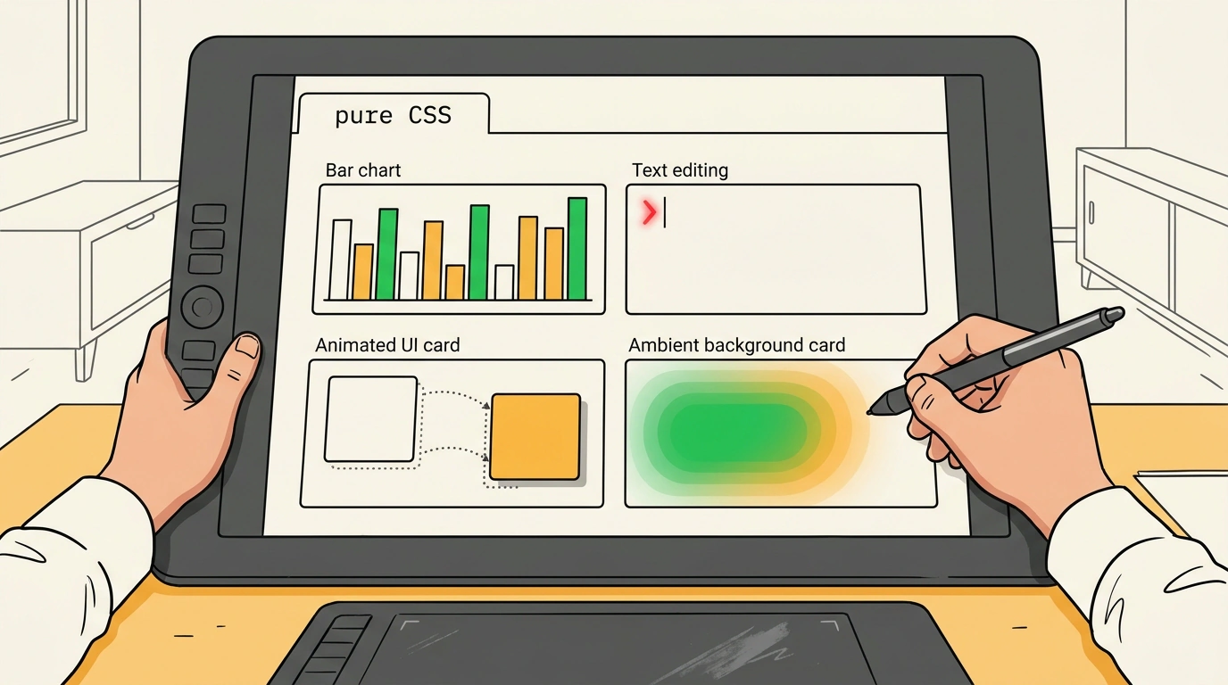
Frontend Focus #767 highlighted a neat example: Keith Cirkel took an ordinary HTML table, added a couple dozen lines of CSS, and got a live bar chart—no JavaScript, no SVG. Turn off styles and you still have a readable table for screen readers. Alongside it came three more gems: Sara Soueidan on caret-* properties, Adam Argyle's smooth PropFLIP technique, and the Aura gradient catalog. Together they show how much work pure HTML and CSS can now handle, and where the rough edges still hide.
Charts in HTML and CSS: Semantic Table Charts Without JS or SVG
When someone asks for a simple admin chart, the instinct is to reach for Chart.js or D3.js. For a couple dozen data points, though, pulling in a heavy script is unnecessary. In Charts in HTML and CSS, Keith Cirkel built 11 chart types with zero JS or SVG—from <meter> and radial gauges to bars, heatmaps, donuts, scatter plots, and maps.
The pattern rests on three pieces. Markup stays semantic using <table>, <meter>, or <data>. Values pass into CSS through --v (or the new typed attr(value number, 0) on <meter>). CSS functions handle rendering: linear-gradient() draws bars, conic-gradient() with masks builds donuts, color-mix() powers heatmaps, atan2() draws lines, and :has() adds hover interactivity. Hover a bar below—its neighbors dim while the exact value appears on top.
Bar chart built from a plain HTML table
The core <table> and --v trick works in all modern browsers today. Newer helpers like attr(value number), sibling-index(), and sibling-count() aren't everywhere yet, so stick to inline custom properties in production. As a bonus, the page ships an html-graphs agent skill that teaches coding agents to build lightweight charts instead of installing heavy libraries.
The caret-* Properties and Text Cursor Accessibility
For text cursors (carets) inside inputs, CSS used to offer only caret-color. Now the CSS Basic User Interface Module adds caret-shape and caret-animation, and on November 16, 2026, Sara Soueidan published a guide to caret-* and accessibility.
caret-shape switches the cursor between auto, bar, block, and underscore, while caret-animation: manual disables system blinking so you can drive it with @keyframes. Sounds fun, except caret-shape only works in Chromium behind Experimental Web Platform Features, and block renders semi-transparently, easily losing contrast.
The bigger trap is caret browsing, where users navigate regular page text with a keyboard. Browsers apply caret-color to both form inputs (insertion caret) and caret browsing (navigation caret). Set it on body and you can ruin contrast across the entire page.
/* Style the caret only inside editable inputs
   so caret browsing on page text stays untouched */
textarea,
[contenteditable="true"],
input[type="text"],
input[type="password"] {
  caret-color: #9C0C60;
}

/* Guard custom blinking behind motion preferences */
@media (prefers-reduced-motion: no-preference) {
  input[type="text"] {
    caret-animation: manual;
    animation: color-transition 1s linear infinite;
  }
}

@keyframes color-transition {
  0% { caret-color: #9C0C60; }
  50% { caret-color: #175928; }
}
Under WCAG, carets fall under contrast (1.4.11 AA), visible focus (2.4.7 AA), and flash thresholds (2.3.1 A), though their small area means they can't satisfy 2.4.13 AAA or replace a focus ring. Worse, users on macOS and Windows can turn off cursor blinking or thicken the cursor in OS settings—and CSS can't detect that (not even via prefers-reduced-motion), meaning author styles override system choices. Go easy on caret-shape and caret-animation.
PropFLIP: FLIP Animations Using Four @property Variables
Moving a card smoothly across a grid is a classic headache. Animating left, top, width, and height directly forces layout recalculations on every frame. That's why developers use FLIP (First, Last, Invert, Play): measure the start box, update the DOM, measure the end box, pull the element back with transform, and transition the offset to zero.
On November 10, 2026, Adam Argyle introduced PropFLIP. The Invert step writes into four typed @property rules (--tx, --ty, --sx, --sy), and standard CSS transition handles the rest. Separate properties give you two perks: different durations per axis (making the card arc smoothly) and inherits: true on scale, which lets inner elements divide out the stretch so border-radius and text never squish (UnSquish). Click the button below—and try clicking again mid-flight.
Live PropFLIP: card transition using @property
@property already works across all major browsers, so for a few transitions you can skip GSAP Flip. Just avoid reading el.offsetHeight inside loops over hundreds of elements without batching, or layout thrashing will slow the frame. Also, if a card's aspect ratio changes drastically, inverse scaling alone won't stop long wrapped text from looking stretched.
Aura: 200+ Luminous Gradients with Multi-Layer CSS Blend Modes
A single linear-gradient() often looks flat. To make a background glow like real light, teams used to export heavy PNGs or spin up WebGL. Cristian Olivera released Aura (GitHub repo) under MIT: 206 ready-made gradients across 8 categories, from Mesh and Nebula to Glass, Grain, and Flux.
The setup is simple. A base color sits on body (#faf8f2 for light mode or #100e0b for dark), while .aura-bg stays transparent so layers blend with the backdrop. Above it sit gradient layers using mix-blend-mode (such as hard-light), filter: blur(), and GPU promotion via transform: translateZ(0). Here's a glow inspired by the Sunrise Drift preset.
Multi-layer luminous gradient in the style of Aura
In the Aura editor, you can tweak every gradient—adjusting layers, blend modes, blur, opacity, and film grain. It exports to CSS, Tailwind, CSS variables, CSS-in-JS, SVG, or PNG, and includes a Copy Prompt button for AI assistants. Just go easy on mobile GPUs: stacking large filter: blur() layers with will-change: transform eats video memory, so dial down blur on phones (as Aura does) or serve a static PNG.
