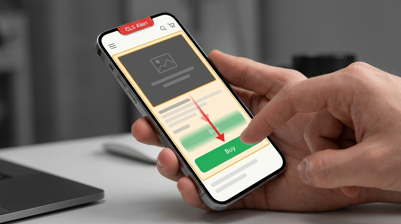
You open a site on your phone, reach for the "Buy" button, and at the last second /desk.jpg finishes loading above it. The layout drops down and your finger taps the wrong link. Few things on the web are more annoying.
Google measures that pain with CLS (Cumulative Layout Shift), one of the three Core Web Vitals alongside LCP and INP. CLS isn't measured in seconds—it's a unitless score reflecting how much of the viewport shifted and how far. Good is ≤ 0.1 for at least 75% of visits, while > 0.25 puts you in the red. In an updated guide on web.dev, Addy Osmani and Barry Pollard laid out a systematic way to stop layout jumps.
How the Browser Reserves Space Before Files Load
When responsive design arrived, developers stripped width and height off <img> tags in favor of max-width: 100%; height: auto;. While /desk.jpg downloads, its height stays zero; once it arrives, it shoves the button down.
Modern browsers solved this years ago—just put unitless integer width and height attributes back on the tag:
<!-- Unitless dimensions: the browser computes aspect ratio upfront -->
<img
  src="/desk.jpg"
  width="1200"
  height="800"
  alt="Office desk"
>
During HTML parsing, the browser infers aspect-ratio: auto 1200 / 800 and reserves the height immediately. The auto keyword protects against typos: if the actual file ratio differs slightly, the real ratio takes over once loaded. Chrome and Safari show this rule in the inspector, and Firefox applies it internally. Keep this in CSS for fluid sizing:
/* On narrow screens the photo shrinks, yet space stays reserved */
img {
  max-width: 100%;
  height: auto;
}
If you serve multiple resolutions with srcset, make sure every file shares the same aspect ratio. For art direction—serving different crops on mobile and desktop—you can now put width and height directly on <source> inside <picture>, which works across Chrome, Firefox, and Safari:
<!-- Different aspect ratios for mobile and desktop on <source> -->
<picture>
  <source
    media="(max-width: 799px)"
    srcset="desk-480w-cropped.jpg"
    width="480"
    height="400"
  />
  <source
    media="(min-width: 800px)"
    srcset="desk-800w.jpg"
    width="800"
    height="400"
  />
  <img
    src="desk-800w.jpg"
    width="800"
    height="400"
    alt="Office desk"
  />
</picture>
Now the browser knows the height of both the mobile crop and the wide version ahead of time, keeping the button below rock steady on any screen.
Ads, Embeds, Web Fonts, and the 500 ms Trap
Fixed your images, yet the page still twitches? Ads, embedded maps, <iframe> videos, and banners are usually to blame. Reserve their slot ahead of time using min-height (matching the smallest or most common creative, with @media queries if needed) or aspect-ratio:
/* Ad slot: hold the height and never collapse when empty */
.ad-slot {
  min-height: 250px;
}

/* Embedded video or widget with a known aspect ratio */
.embed-wrapper {
  width: 100%;
  aspect-ratio: 16 / 9;
}
Watch out for a common mistake: if no ad fills the slot and a script collapses it to 0px, the browser counts that collapse as a layout shift too. Leave a placeholder instead. Also avoid injecting banners above existing text without user action—show a skeleton or overlay them out of flow.
Another trap is the 500 ms window. Shifts within half a second after a click or key press don't count toward CLS (if loading takes longer, render a skeleton inside that window). However, scrolling and hovering are excluded: lazy-loaded content without reserved height hurts your score right away. Also replace top/left animations with transform: translate(...), tame web fonts with font-display: optional, size-adjust/ascent-override, and <link rel="preload">, and avoid breaking bfcache (instant back/forward navigation cache).
Why Lighthouse Shows Zero While CrUX Turns Red
You run Lighthouse and see a clean zero, yet Google Search Console flags a red alert. There's no mystery. Lighthouse only measures initial page load, whereas CrUX (Chrome UX Report) collects field data across the entire page lifecycle, including scrolling and SPA navigation.
Compare both numbers in PageSpeed Insights (check the top-right toggle to be sure you're viewing URL data, not origin-wide data). If CrUX and Lighthouse both fail, the bug happens on load: record a reload in Chrome DevTools → Performance and check the Layout Shifts track. Purple bars group shift clusters, diamonds mark individual shifts (sized by impact), and clicking one plays an animation with details in Summary and Insights. Remember that Lighthouse and web-vitals report the victim elements pushed down, while the culprit was inserted above them.
If Lighthouse is clean while CrUX complains, open Performance → Live Metrics, then scroll and click around—the live CLS counter catches the culprit in real time (and Lighthouse User Flows helps catch regressions). The one blind spot for on-page RUM scripts is shifts inside cross-origin <iframe> embeds, which CrUX still records accurately.