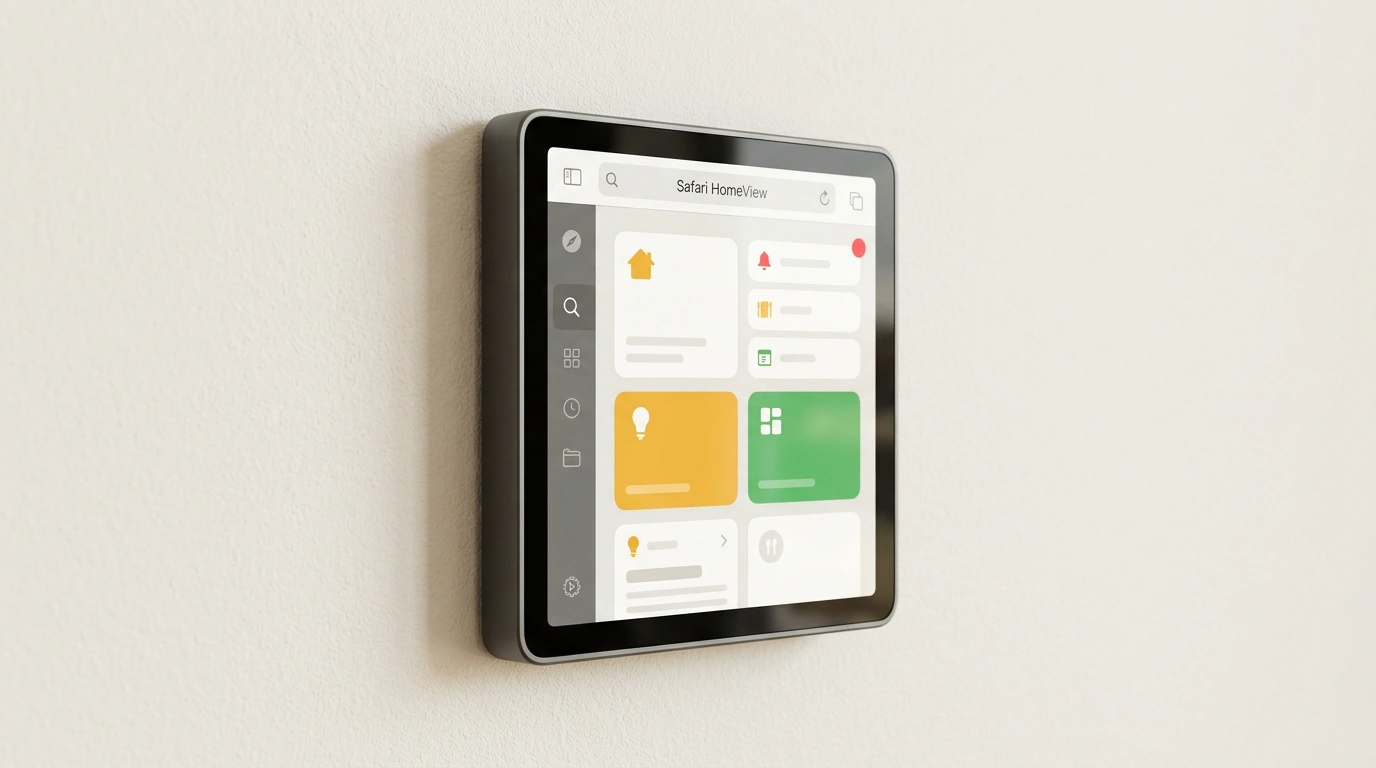
When you test responsive design in DevTools, you instinctively drag the window horizontally: 375px for mobile, 768px for tablet, 1280px for desktop. Almost nobody squeezes viewport height below 600px. That habit seems harmless—until your site meets Apple HomeView.
In November 2026, Safari launched on this 7-inch square display. People keep it in the kitchen or hallway, tapping it up close and controlling it by voice from across the room. On the WebKit blog, Jen Simmons walked through how normal websites behave on the new screen. Good news: you don't need a separate site for HomeView. Bad news: three common layout assumptions break right away.
A 448×364 Viewport: When Height Drops Below 600 Pixels
Physically the screen is square, yet Safari's usable viewport (the visible area in CSS pixels) is only 448×364. That breaks the usual mental model of "either a tall narrow phone or a wide desktop" and the belief that you always have 600px+ of vertical room.
Problems appear immediately. Sticky headers (position: fixed or sticky) and bottom bars eat half of those 364px, leaving a tiny slit for content. Cookie banners and signup modals overflow off-screen, putting the Close button out of reach. The sandbox below is 364px tall—see how two fixes from the WebKit post handle it.
448×364 viewport: 90svh modal and unsticking the header
Notice svh (small viewport height—1% of the minimum viewport height accounting for browser bars). Jen picks 90svh over 100vh or dvh so the modal never jumps when bars appear and always fits a short screen. You don't even need HomeView hardware to test this: type 448×364 into Safari Responsive Design Mode or rotate a smartphone to landscape.
The iOS User-Agent Trap and DIY App Banners
Second assumption: if the User-Agent header (the string a browser sends to identify itself) contains iOS, the visitor must be on an iPhone. On HomeView, that fails—Safari there also sends an iOS User-Agent, even though it's a home display.
Sites doing User-Agent sniffing give themselves away fast by showing misplaced "Download our iPhone app" popups or iPhone-only hacks. The rule is straightforward: use feature detection (testing APIs directly, like 'share' in navigator, as MDN recommends) and stop guessing devices from User-Agent strings. If you want to promote a native app, use Safari's standard Smart App Banner and let the browser decide whether to show it.
Voice Control, Unlabeled Icons, and Extra Perks
The third blind spot is assuming users always click with a mouse or finger. In a voice-driven UI—say, hands covered in flour while cooking—users speak button names out loud. If you used <div onclick="..."> with a bare SVG icon and no label, the voice engine can't target it.
<!-- Native Smart App Banner instead of a UA-sniffed popup -->
<meta name="apple-itunes-app" content="app-id=123456789" />

<!-- Real button with an accessible name for voice commands -->
<button type="button" class="icon-btn" aria-label="Close dialog">
  <svg aria-hidden="true" viewBox="0 0 24 24" width="24" height="24">
    <path d="M6 6l12 12M18 6L6 18" stroke="currentColor"
      stroke-width="2" />
  </svg>
</button>
Use real <button>, <a>, and <input> elements with linked <label> tags, give icon buttons an accessible name via aria-label, and keep tap targets generous for close-up touch. One cleanup pass fixes your site for HomeView, screen readers, split-screen windows, and landscape phones at the same time.
Bonus for content sites: adding JSON-LD schema.org/Recipe markup (HowToStep, recipeIngredient, prepTime, cookTime) automatically unlocks Safari's step-by-step cooking view, while WebVTT captions via <track default kind="captions" src="captions.vtt"> keep videos usable on mute.
