Every time a new project needs an internal admin panel or customer portal, developers step on the exact same rake. You tell yourself, "How hard can it be? We'll throw together a couple of tables, a chart, and a login form over the weekend." Three weeks later, you're buried alive in responsive sidebar layouts, dark-mode toggles, endless dropdown hacks, and trying to make pagination behave on mobile screens.
To save my own nerves and hours, I always keep solid open-source starters in my back pocket. On that front, the new major release of Shadcnstore Dashboard (codenamed Chronicle in the community) is well worth a close look. It ships under the MIT license, and you can click around a live build on the template demo page.
Goodbye Radix: Why the Authors Switched to Base UI
The most interesting change in this release is tucked under the hood. For a long time, the shadcn/ui ecosystem was practically synonymous with Radix UI primitives. That worked great for years, but Radix gradually accumulated baggage: redundant DOM wrappers, noticeable lag when opening heavy modals, and headaches around deep keyboard-focus customization.
In version 2.0, the template team made a bold call and migrated all core headless primitives to Base UI (@base-ui/react), the library now actively maintained by the Material UI team. Dropdowns, tooltips, accordions, and dialogs now emit clean HTML without nested div soup. For accessibility (a11y), that's a huge win—screen readers no longer trip over sprawling element trees.
Pure CSS Without tailwind.config.js: Tailwind CSS v4 Magic
The second tectonic shift is moving the project onto Tailwind CSS v4. If you've ever wired up a complex dark theme in Tailwind v3, you probably remember wrestling with a 200-line tailwind.config.js packed with plugins, regexes, and rgb(var(--...)) helpers.
In Tailwind v4, that config file goes straight to the history bin. Your entire design system now lives right inside CSS via the @theme directive and native CSS Custom Properties:
@import "tailwindcss";

@theme {
  --color-background: var(--background);
  --color-foreground: var(--foreground);
  --color-primary: var(--primary);
  --color-primary-foreground: var(--primary-foreground);

  --color-card: var(--card);
  --color-card-foreground: var(--card-foreground);

  --radius-lg: var(--radius);
  --radius-md: calc(var(--radius) - 2px);
  --radius-sm: calc(var(--radius) - 4px);
}

:root {
  --background: oklch(1 0 0);
  --foreground: oklch(0.145 0 0);
  --primary: oklch(0.205 0 0);
  --card: oklch(1 0 0);
  --radius: 0.625rem;
}

.dark {
  --background: oklch(0.145 0 0);
  --foreground: oklch(0.985 0 0);
  --primary: oklch(0.985 0 0);
  --card: oklch(0.145 0 0);
}
Feel the difference: colors are defined in the modern OKLCH color space, giving you predictable perceptual brightness and smooth palette transitions. There's zero client-side JavaScript runtime overhead—the browser resolves theme variables natively in its rendering engine. If you like clean utility-class patterns, it's also worth revisiting how the lightweight cn utility library fits right into this setup.
Hands-On: Building an Analytics Widget and Table
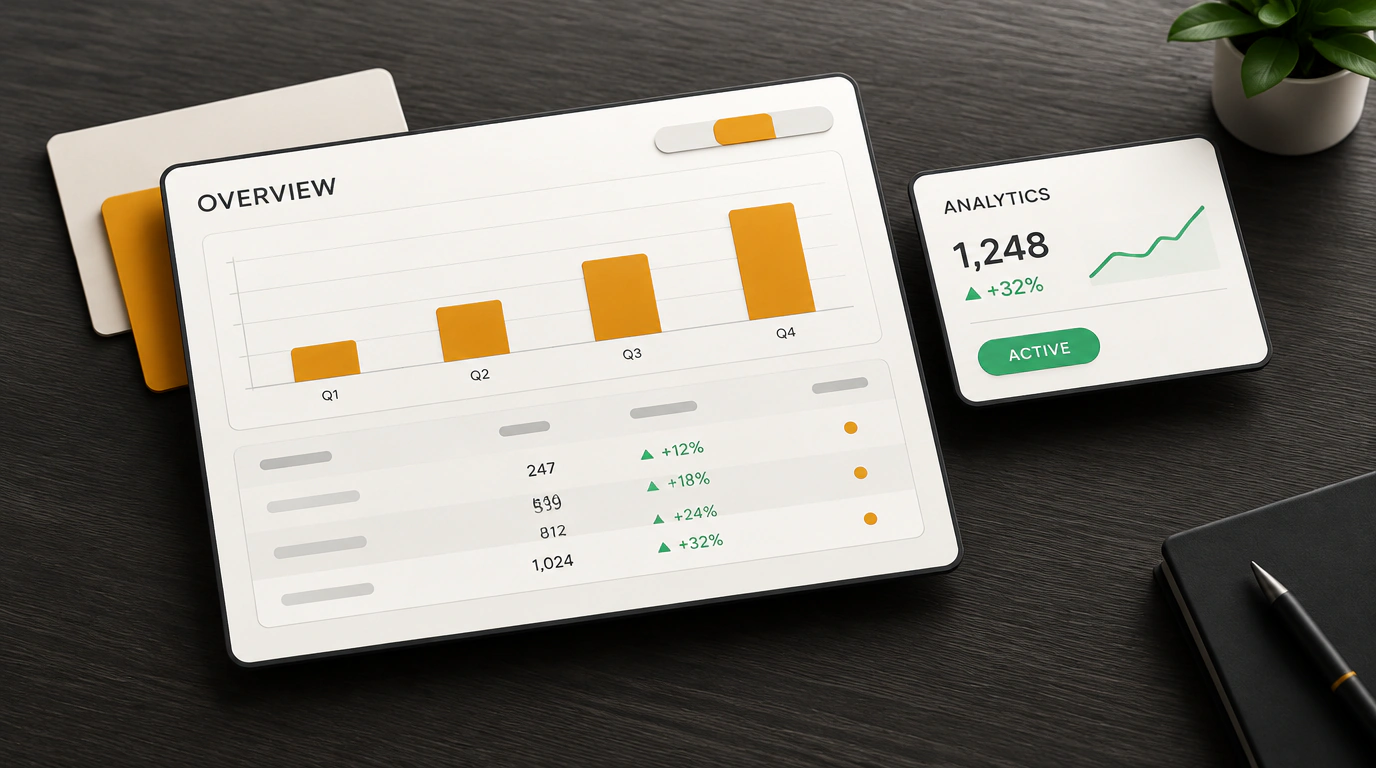
What's great about this template is that it doesn't force you to invent a module structure from scratch. The repo ships with two setups out of the box: an ultra-light SPA on Vite with React Router, and a full server-rendered app on Next.js 16 (App Router). You get over 30 fully built screens: two main dashboard flavors (Overview and Analytics), mail modules, a Kanban board, chat, calendar, and user management.
Here's how clean and compact an analytics card component looks:
import React from react;
import { Card, CardHeader, CardTitle, CardContent } from @/components/ui/card;
import { ArrowUpRight, Users } from lucide-react;

interface MetricWidgetProps {
  title: string;
  value: string;
  change: string;
}

export function MetricWidget({ title, value, change }: MetricWidgetProps) {
  return (
    <Card className="rounded-xl border bg-card p-6 text-card-foreground shadow-sm">
      <CardHeader className="flex flex-row items-center justify-between pb-2">
        <CardTitle className="text-sm font-medium text-muted-foreground">{title}</CardTitle>
        <Users className="h-4 w-4 text-muted-foreground" />
      </CardHeader>
      <CardContent>
        <div className="text-2xl font-bold tracking-tight">{value}</div>
        <p className="mt-1 flex items-center text-xs text-emerald-500">
          <ArrowUpRight className="mr-1 h-3.5 w-3.5" />
          <span>{change} по сравнению с прошлым месяцем</span>
        </p>
      </CardContent>
    </Card>
  );
}
Data tables are powered by TanStack Table, so you get draggable columns, one-click sorting, and multi-condition filtering out of the box. Charts are built with Recharts and already tuned to your active theme palette so they don't blind anyone with a white background in dark mode.
Where the Catch Lies
For all its strengths, there's a trade-off to keep in mind. Because the template runs on Tailwind CSS v4, any legacy Tailwind v3 plugins—custom animation utilities or older component libraries—will need adaptation. Base UI is also still evolving rapidly: while core primitives are rock-solid, community documentation for some edge-case interactions is still catching up.
Still, if you need to ship a sharp, accessible, fast SaaS interface without spending weeks on boilerplate markup, Shadcnstore Dashboard saves dozens of hours of product engineering.