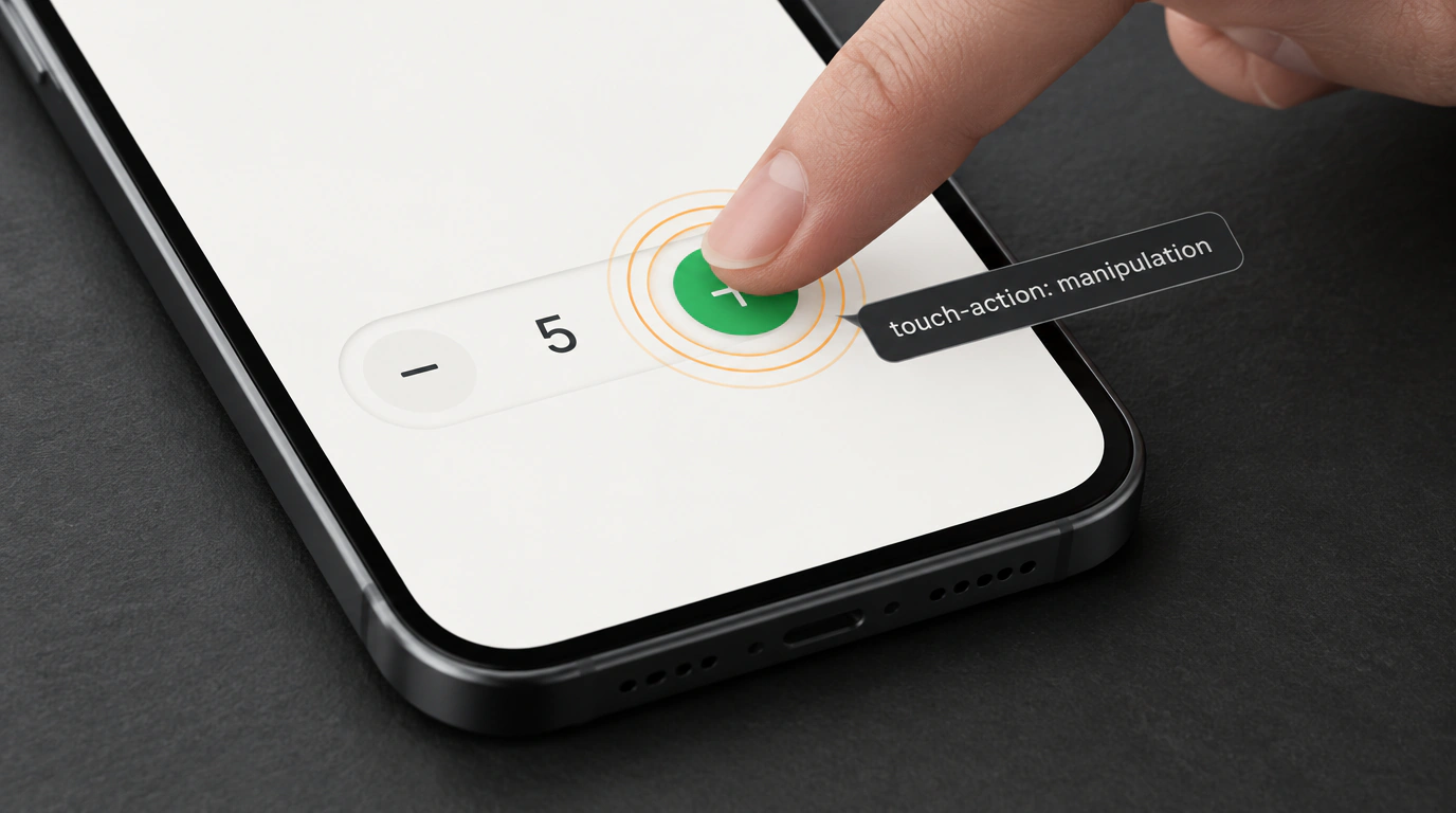
Picture an everyday mobile scenario. Someone opens an online store on their phone, finds what they want, and tries to add five packs to their cart. They fire off a quick burst of taps on the plus button: tap-tap-tap-tap. Instead of getting five items in the cart, the screen suddenly lurches, zooms in 2x, and pans off toward the right corner.
What happened? The mobile browser—whether Safari on iOS or Chrome on Android—dutifully interpreted those rapid taps as a double-tap-to-zoom gesture meant for reading tiny text on non-responsive sites. The user gets annoyed, the cart count is off, and conversion drops.
Why user-scalable=no Is a Dangerous Anti-Pattern
Back in the day, frontend developers "cured" this headache with a blunt hammer: dropping a viewport meta tag into the document head to ban all zooming:
<!-- Strictly outdated and harmful approach! -->
<meta name="viewport" content="width=device-width, initial-scale=1.0, maximum-scale=1.0, user-scalable=no">
Never do this. First, it's a direct violation of WCAG 2.1 accessibility criteria (Success Criterion 1.4.4 Resize Text)—low-vision users lose the ability to zoom in on small copy or inspect product photos. Second, modern mobile browsers (including WebKit on iOS) intentionally ignore user-scalable=no anyway to protect a user's basic right to pinch-to-zoom.
The Surgical Fix: touch-action: manipulation
A clean, 100% W3C-compliant solution was highlighted by frontend engineer Andy Bell (Piccalilli). It relies on the standard CSS property touch-action, which controls how the browser handles touch gestures before passing events to JavaScript.
Instead of disabling zoom across the entire site, we turn off double-tap zoom strictly on the interactive controls where rapid taps happen:
/* Base interactive class for stepper buttons and media player controls */
.btn-stepper {
  touch-action: manipulation;
  user-select: none;
  -webkit-user-select: none;
}
Here's what happens under the hood: manipulation is a standardized shorthand for pan-x pan-y pinch-zoom. The browser disables double-tap detection on that specific button while keeping horizontal scrolling, vertical scrolling, and two-finger pinch-to-zoom completely intact.
Here's a clean markup example for a cart quantity stepper:
<div class="cart-stepper" role="group" aria-label="Количество товара">
  <button type="button" class="btn-stepper" aria-label="Уменьшить количество">-</button>
  <span class="stepper-value" aria-live="polite">3</span>
  <button type="button" class="btn-stepper" aria-label="Увеличить количество">+</button>
</div>
Paired with user-select: none, the button won't flash with an accidental text-selection highlight during rapid clicks, making the UI feel crisp and native. If you enjoy declarative CSS tricks like this, check out our earlier breakdown of CSS anchor positioning, where pure CSS replaces dozens of lines of JavaScript.
Where the Hidden Catch Is
There's just one rule to watch out for: never slap touch-action: manipulation globally onto * or body. Do that across the whole page, and users lose the handy double-tap gesture to zoom into text blocks on phones.
Apply it surgically—on audio player skip buttons, game controls, calculators, and cart steppers—and your mobile UI will feel rock-solid without a single hack.